
The title of this blog post sounds rather boring and technical but it is anything but. Over the last week there has been a seismic change with the tool I use to generate images, that I use to design book covers. And it would be remiss of me not to talk to you authors about it.
So here goes.
But there is a little bit of groundwork to get through before we talk about how powerful Sref is. My favourite new little toy in MidJourney.
We’re definitely travelling very much into the future with this one. So maybe get yourself a futuristic beverage, get comfy, because we’re about to travel into the future of aesthetics.
Aesthetics: The Medium is the Message
When it comes to book cover design, a lot of the time the medium is the message. But what do I mean by that?
Let’s break down what a book cover actually consists of.
It’s very easy to think in terms of the subject on a book cover, for example it’s really easy to say something like ‘there’s a knight standing in a forest’ on the book cover, but there is a lot more that’s going on with an image.
Things we can break down.
Things that convey tone.
Things that will always speak to a potential reader, other information that we need to consider, when designing a book cover.
So I would split off the information into probably two very simple categories. Something like this:

So you can think of these things as the stuff on the cover (the subject) and the way you present the stuff (the aesthetics).
If you’ve read my earlier essay: What Makes a Book Cover Intriguing, you’ll know that any good book needs to hit that sweet spot between what people have seen a thousand times before and what is new! That blog post is a bit of a long one, about 25-30 minutes to read, but it’s well worth becoming acquainted with that information.
But one thing that I say in that essay (near the end) is you can easily achieve this ‘intrigue’ by being playful with the aesthetics. You don’t want to confuse potential readers by sending out the wrong signals about your book, but you do have wiggle room to be different.

What do I mean by that? Let me explain.
You can go and look through any category on Amazon books and find the sort of cover presented in the same aesthetic over and over again in each category with the same sort of aesthetic.
You know the drill; all horror covers will be moody or grungy or blurry, all thriller books will feel muted and desolate, all rom coms will be presented as twee and cute simple vector graphics. Etc. Etc.
They are aesthetic tropes that work. And they work because they convey a message about the book. And the thing I hear and read a lot in ‘The Cult of Self-publishing’ is stick to the tropes, don’t confuse the reader. You will sell more books. And to that, I say poppycock.
There is a tension at play here, one that doesn’t get considered when people talk in this way, a tension with my job as a book cover designer. And that’s actually getting your book noticed.
As a book cover designer, that’s what my job is! It’s my primary directive.
Think about it, if everyone uses exactly the same aesthetic tropes how are you going to get noticed? It’s just going to be a set of images that all look the same. As if everyone’s turning up to the party in the same dress.
And that’s where playing with these aesthetics comes in.
Creating something that’s ever so slightly different. Something that gives potential readers that little brain fizz of The New!
If a book cover looks a little different, then potential readers are going to think, this book is a little bit different from the standard fare. Do you want that subtle psychological advantage or not? I thought so.
Everyone likes to think that their book is a little different from everyone else’s, right?
That is the message we’re trying to get across and we can only do that with the aesthetics, if your book is about a forest knight and you want a forest knight on your cover.
So that being said, this little blog post is about my new tool I have at my disposal to achieve that. An aesthetic toy.
But before that let’s talk about how MidJourney actually works. I might be ‘teaching your grandma to suck eggs’ here but it’s worth covering.
What’s Prompting
We will get onto Sref, but let’s first talk about how prompting works.
If you’ve not been hiding under a rock for the last year or so you’ll probably know about AI Image Generation and it works with something we call ‘prompting’.
Prompting works with natural language, or sort of, because it’s an art until itself. So you basically just tell MidJourney what you want and it creates an image for you.
So to take it back to the original thing I mentioned, what you generally do is as it for those two things: the subject, what you want it to draw, and the aesthetic, how you want it to draw the thing.
So let’s take ‘the knight in a forest’ and do a few very simple prompts just so I can show you how the prompting works.
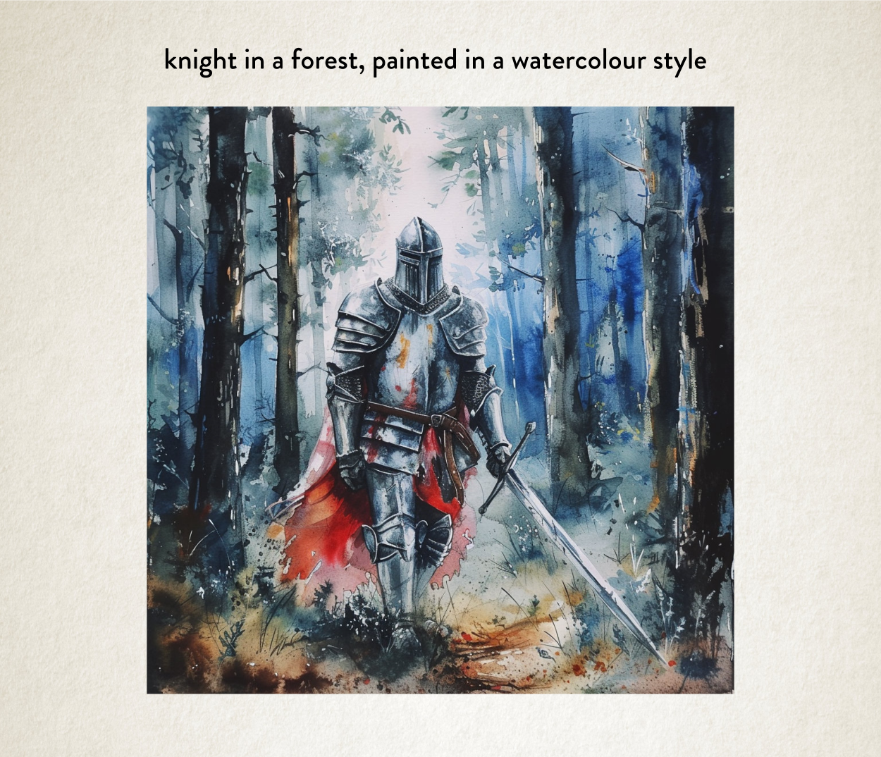
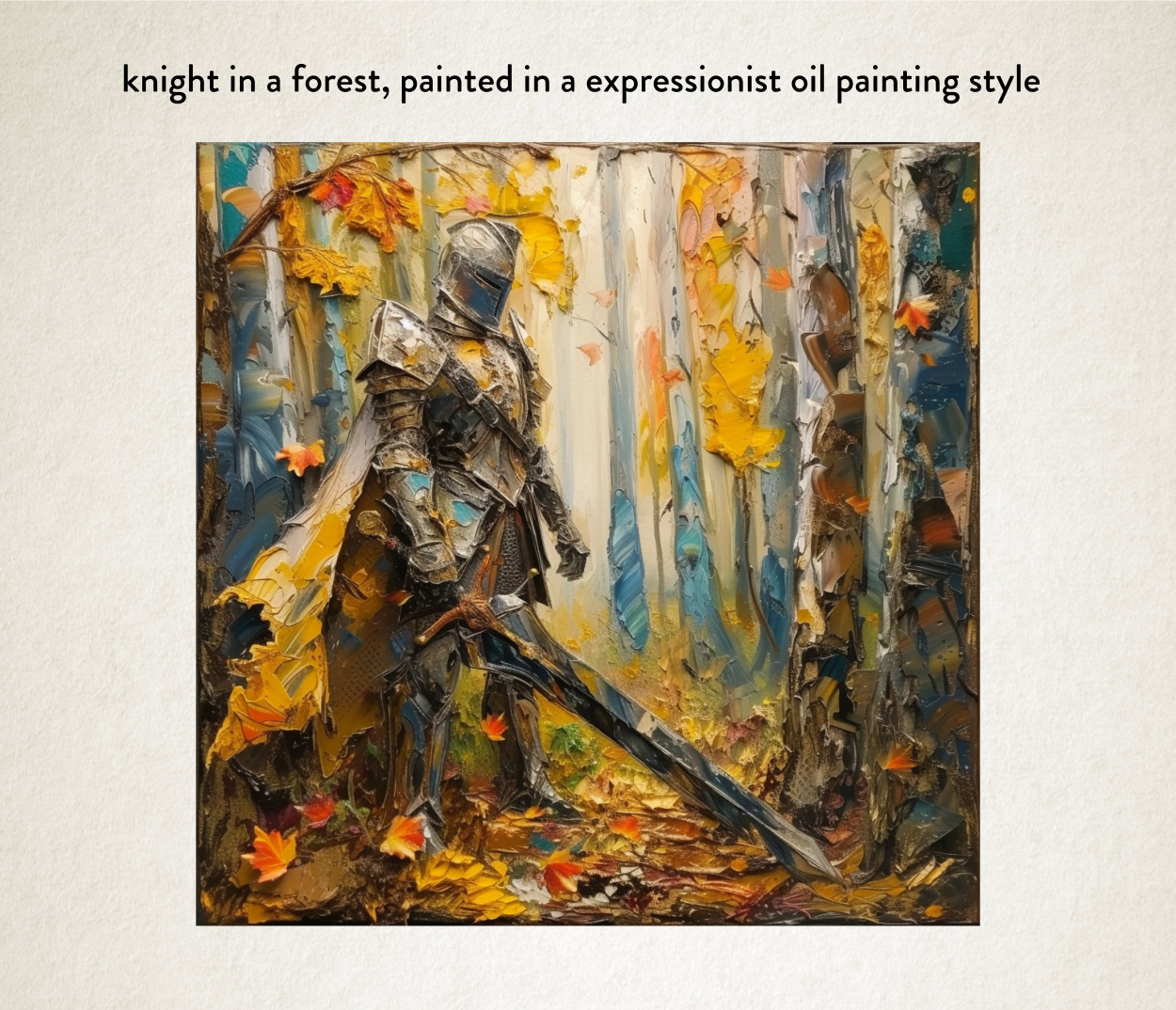
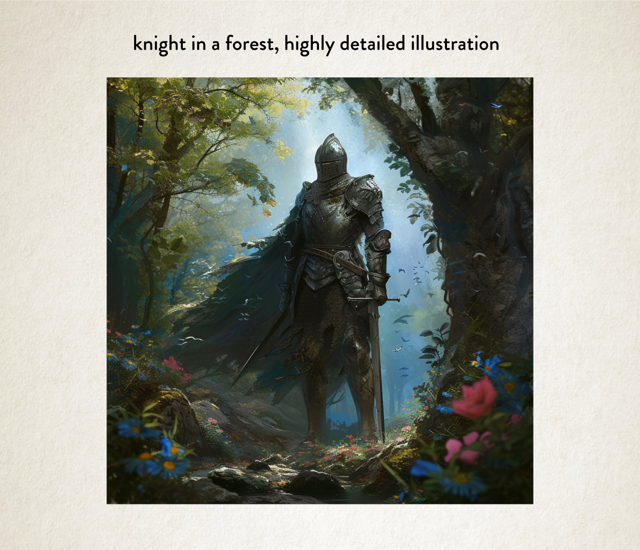
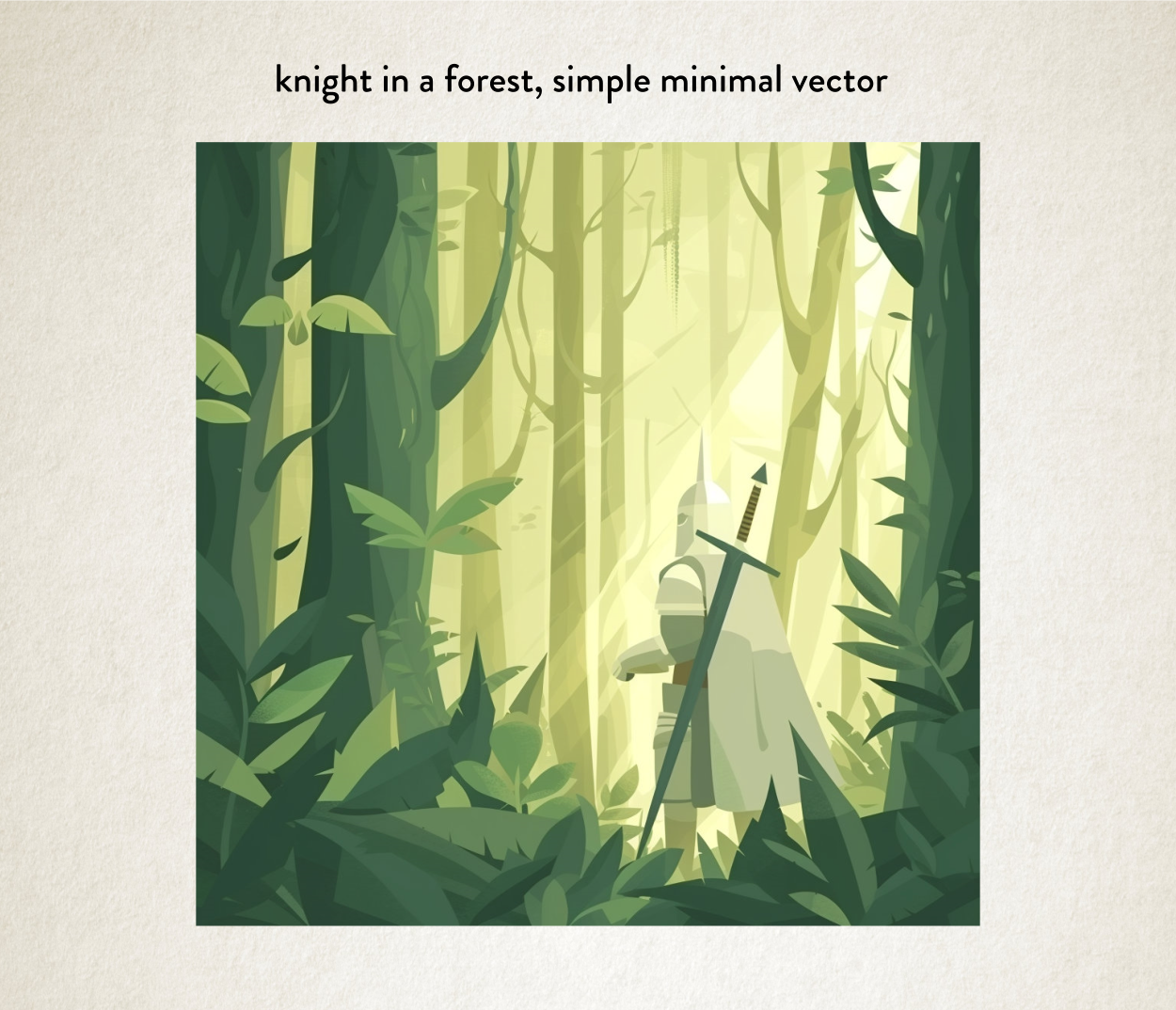
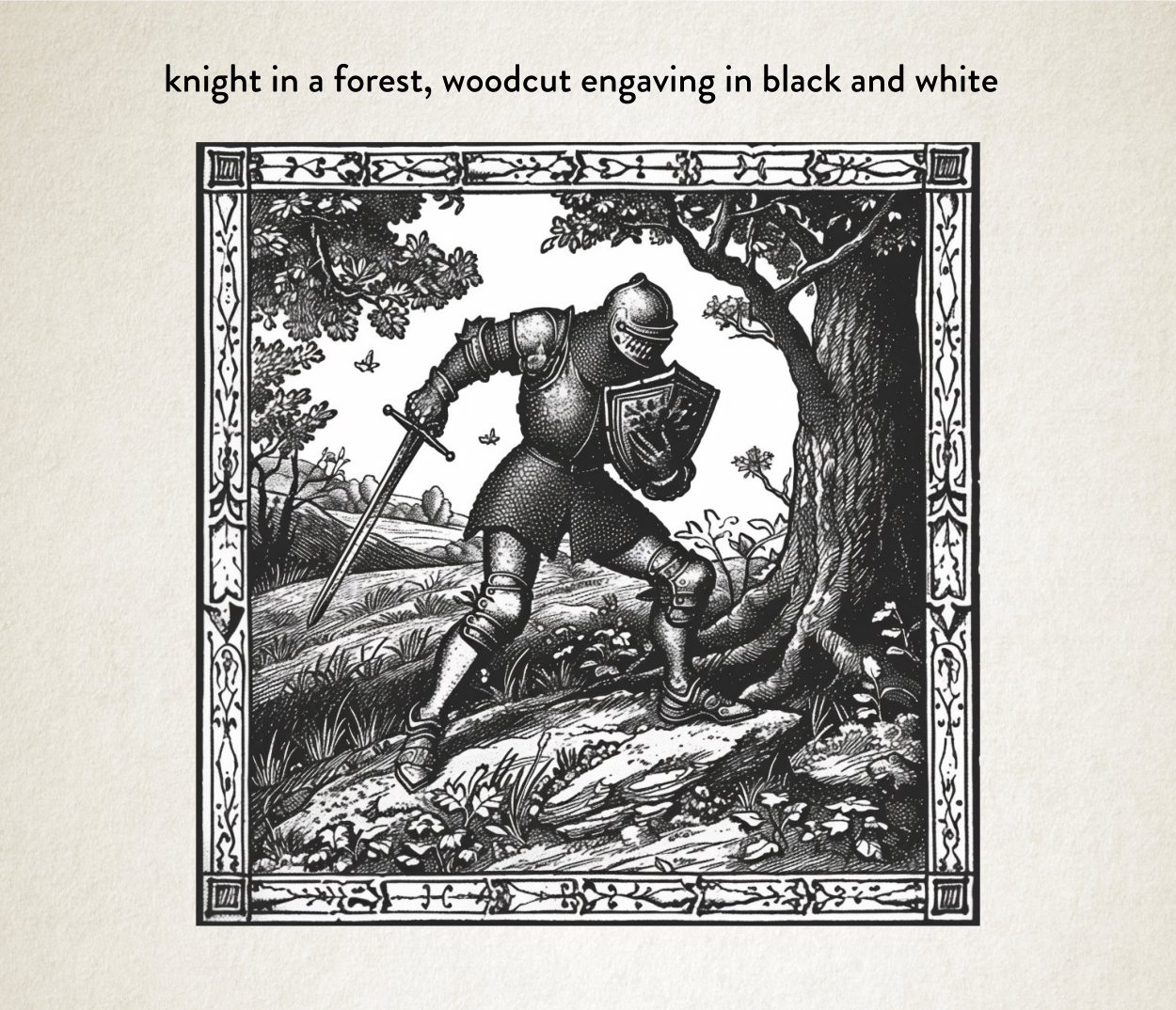
Quality prompting, to make something interesting, is a bit more complex that just those simple terms. But you can see from these images that we can get very different images from the same subject.
These different aesthetics say very different things to a potential reader about what this sort of story they are in store for. The aesthetic informs the reader.
So, for example, the minimal vector image might say: this book is more for children. The woodcut engraving version might say to potential readers, this book is more historically accurate because you’ve chosen a more historically accurate way of presenting the image.
All aesthetics have a message they convey. They set a tone and expectation.
In fact, in terms of design, aesthetics the best tool at our disposal to stand out. And we can play around with the prompting to our heart’s content to get the messaging right and keep the book cover eye-catching.
In fact, half of my job these days is simply about learning how I mix prompts together and come up with the right amazing tone for you authors.
The other half of my job is learning new prompting tricks from others, by playing around myself, and then remembering to note down what the prompt things were. I’m 50 and my memory wasn’t what it used to be.
But my job has just got a lot more interesting with ‘Sref’.
So let’s have a chat about it.
Introducing Sref
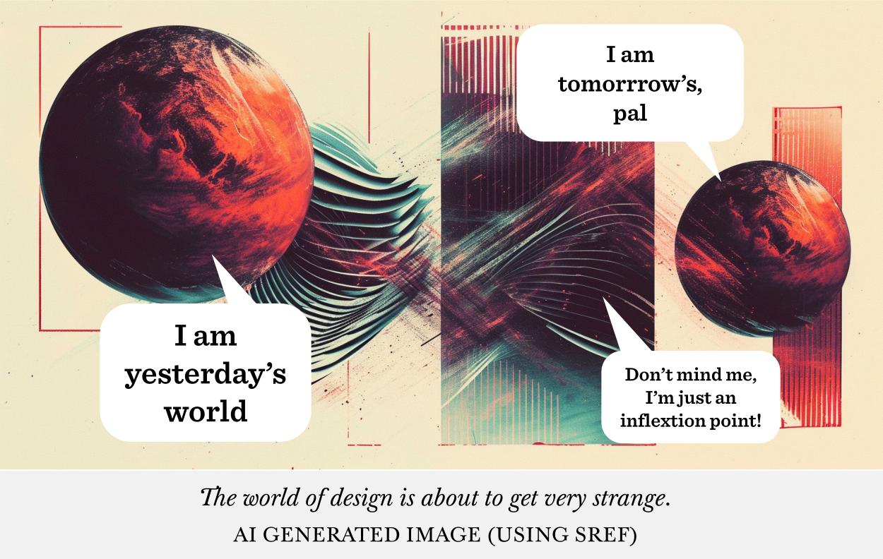
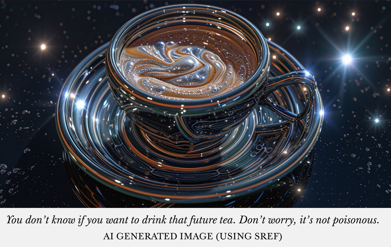
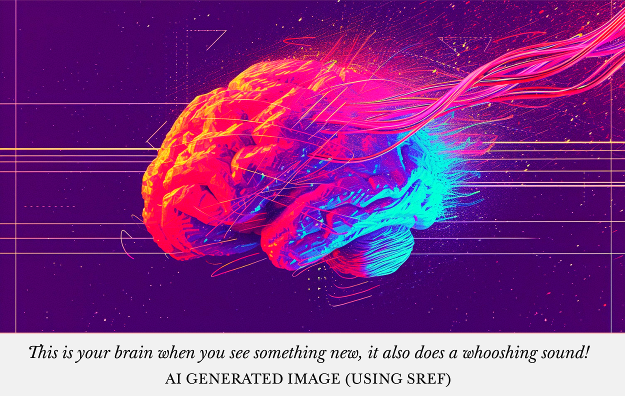
Sref, or Style Referencing, is something that came out for MidJourney about a week ago, at time of writing (start of Feb 2024). And it’s been so fun, I’ve just had to sit down and write a blog post about it. Simply because it is the perfect tool for achieving exactly what we need to achieve this ‘ever so slightly different’ aesthetic we need to catch potential reader’s eyes. Our sweet spot.
What that is, is a way of taking a style reference from a picture and using that to make a new picture. Almost like the AI is learning styles on the fly and applying them to your subject.
So where I’d normally put the aesthetic part of the prompt, such as watercolour, I can simply use an image as a reference instead. Or even both! Some style prompting and a style image reference.
But let me show you what I mean, because it’s easier that way.
So let’s take our knight in a forest and do a few generations using different images as reference and see what we get.
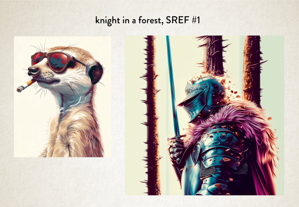
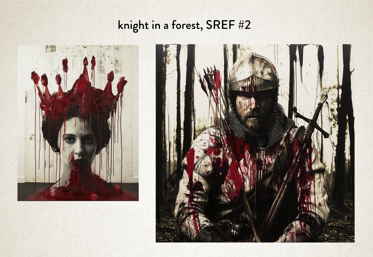
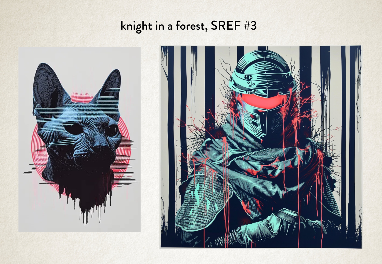
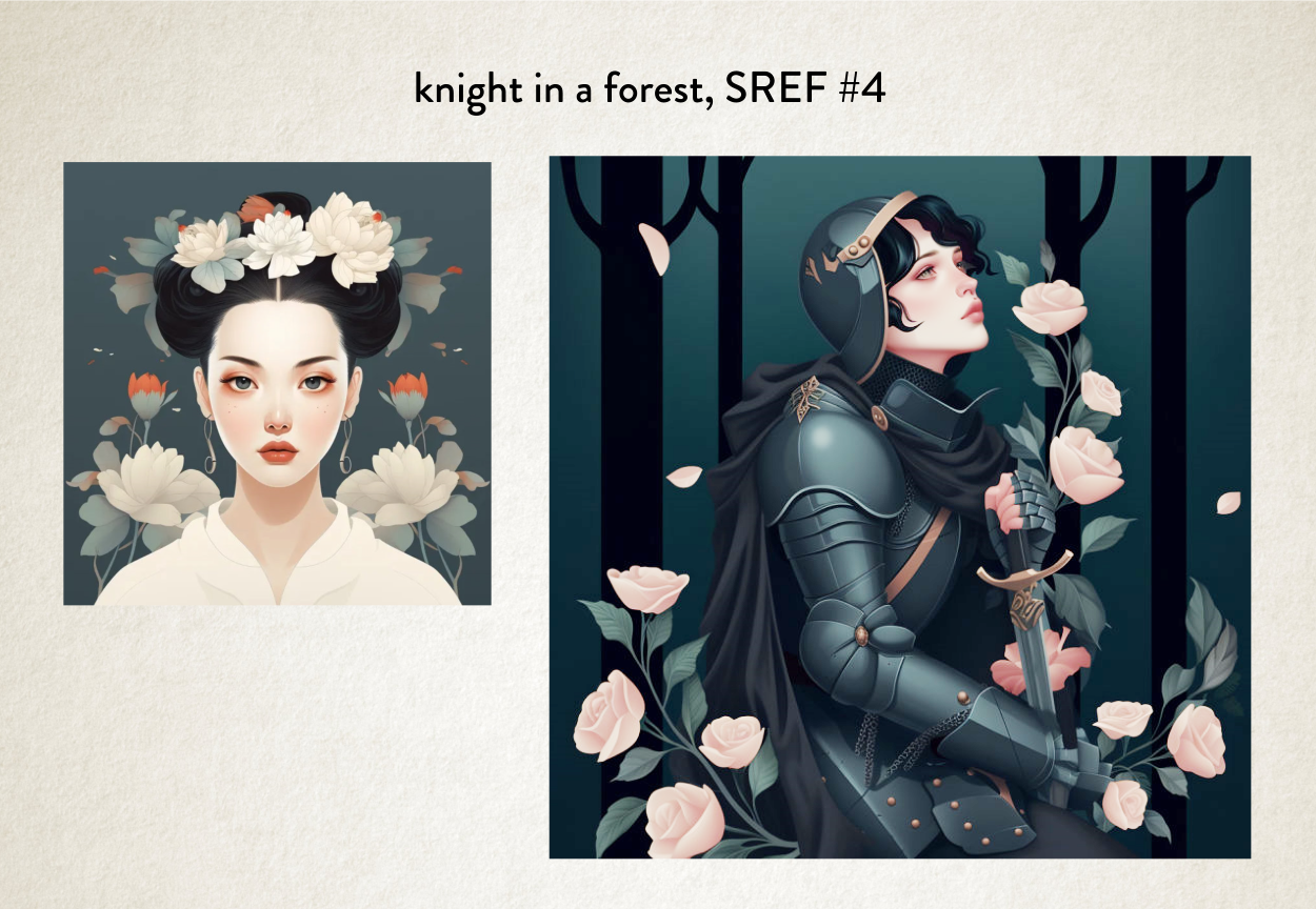
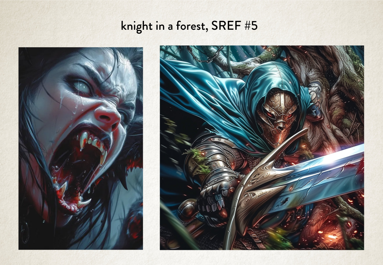
Admittedly some of these would work better than others for a book cover, but you start to see the power of what MidJourney can now do with Sref.
It seems to be able to take the colour palette and the structure of the way something is presented, and the style it’s drawn in, angles of composition, and make brand new images using that complete aesthetic. Which is a game changer (more of that soon).
But not only can we take a reference image, we can also take more than one image and use both aesthetics to make a third.
So let’s take two of the images we’ve already made as style references, and make a third new image. See what happens.
So let’s try that, shall we.
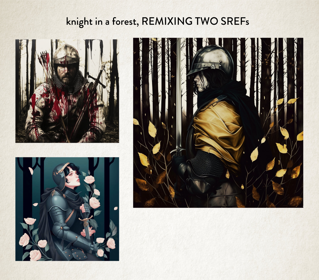
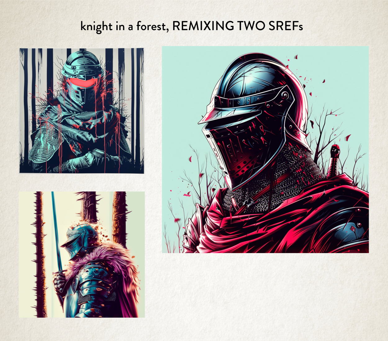
Pretty stunning results, with aesthetics I’ve never seen before! Brand spanking new aesthetic pulled from the ether.
And any of these aesthetics I could keep and then use them later for something completely unrelated or even remix them yet again with some other aesthetics. On and on.
Let’s take our remix and make something new with it.
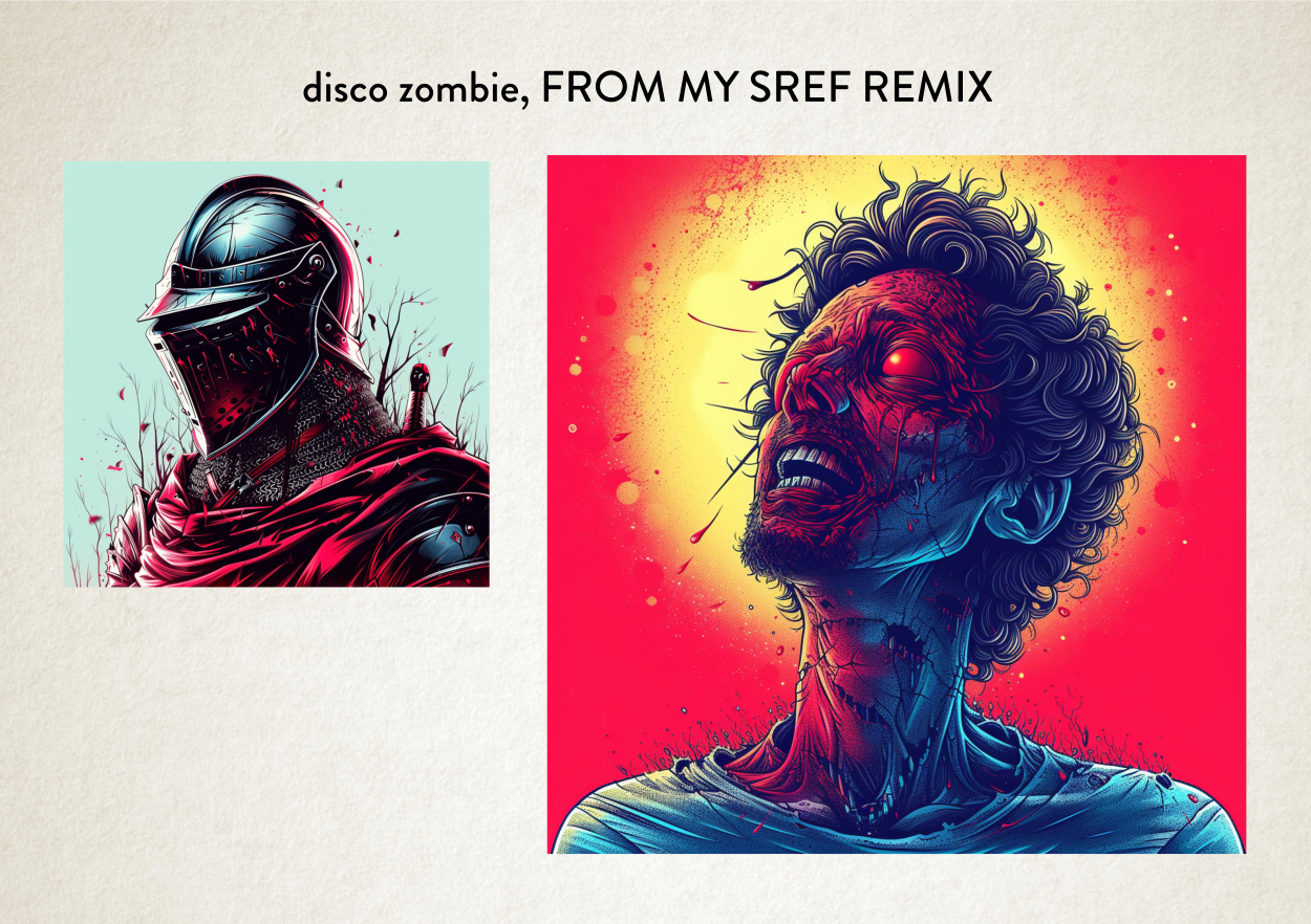
Pretty interesting. It’s a mix of a mix with a new subject.
But why is this so important, why am I telling you all this? Why is it so seismic? Well there’s a good few reasons, so let’s go through them.
Important Reason #1: I Like The New
I have some friends that sort of like the same sort of music. Which is fine. But that’s not my path. It’s sort of the reason why I hate trap music, it’s sonically too samey. ‘Sonically’ being the audio equivalent of visual’s ‘aesthetic’. Trap is always that same heavy 808 kit and the same crispy 32 bar snares. Always. Zzzzz.
So I always go hunting for new tunes, new sonics, this is my jam at the moment, just for example. Nutty stuff. Great video. Maybe because it appeals to the sonic mixing of an African sound and a Berlin sound.

It’s also why I like going to fancy restaurants with odd flavour pairings.
What makes me happy is The New.
And this doesn’t just extend to my down-time. In my job, what keeps me interested in doing book cover design work is The New.
So at the moment I’m as giddy as a Kid at Christmas with a new Lego set. Yep, as a kid I was given Lego every single Christmas! Loved that stuff. Because I could make stuff from it. I never followed the instructions.
Important Reason #2: The Creative Journey
I think anyone who is honest with themselves creatively has learnt to let go of their ego and just let the process take over at certain points in your journey when making anything. Sometimes the art just takes over at some point and the destination you had in mind actually changes.
Something new is discovered along the way. Things change and you accept the change. And then you end up with your glorious result.
This letting go makes good art.
Imagination is always just a guide and not the be all and end all.
Trusting yourself to go with the flow and be in the moment.
And this Sref stuff is the perfect example of this 50% my idea and 50% letting the process take over.
Previously when you needed to use words it seemed a way more rigid way of working. Like: this prompt didn’t work, I have a vision, how do I make it work. Right, change some words. That’s closer. Frustrating.
With this new way of working, I get to let go a lot more and get my hands dirty and make a mess and just see what comes out of the other end. And everyone loves the mess of finger painting. It’s pure joy!

Important Reason #3: Peak Sweet Spot
You’ll see with some of our previous examples of aesthetic applied using Sref to our ‘Knight in a forest’, they probably wouldn’t cut the mustard for a book cover. Maybe the green background one for a female night with more romantic overtones, or the bloodier one for a more gruesome fantasy novel. But that’s not to say we couldn’t take style references to make something just a bit different.
And that’s what I always try to do. Make something different.
At the time of writing I’ve just had only two or three working days playing with Sref, but what’s become abundantly clear is its power and I need to start building and collecting my own images together as aesthetic reference to remix to my heart’s content.
So don’t worry. I’ll be making work that hits that perfect sweet spot between trope and far too zany. Collecting the perfect new aesthetics for each genre and remixing them to my heart’s content.
Important Reason #4: Peak Correctness
And he is where it gets even more interesting. On Friday night me and my good friend Mike were watching Leeds United play — something we do on the regular over facetime. We won, by the way.
But afterwards I wanted to show him the power of Sref; I love the fact that he takes interest in my work.
So we started with this picture here. Yep, vintage Leeds United team photo.
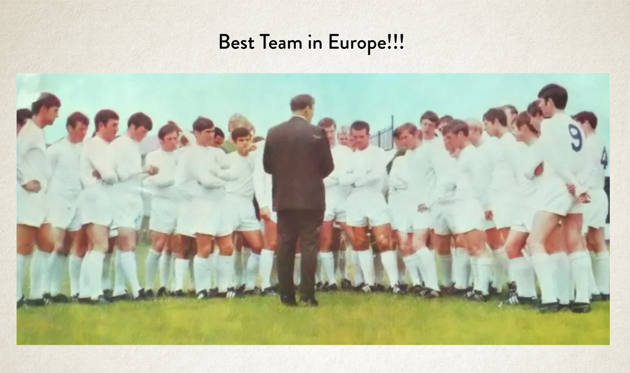
It’s an awful picture in terms of quality, but it completely says 1970s, it has that perfect blur and colouration. It’s so time-specific.
So, I asked him what he wanted to make from that photo. Suffice it to say we’d had a few beers watching the match, it was Friday night after all. These were our examples. Quite daft, I know.

But amazingly aesthetically-correct results based on the original reference. It sort of blew our tiny beer-addled minds.
So I now hope that example has got your brain cogs whirring, of how I can make anything aesthetically-correct! All by just using the correct reference, some prompt-craft and a little bit of imagination.
So just off the top of my head, here are some random examples.
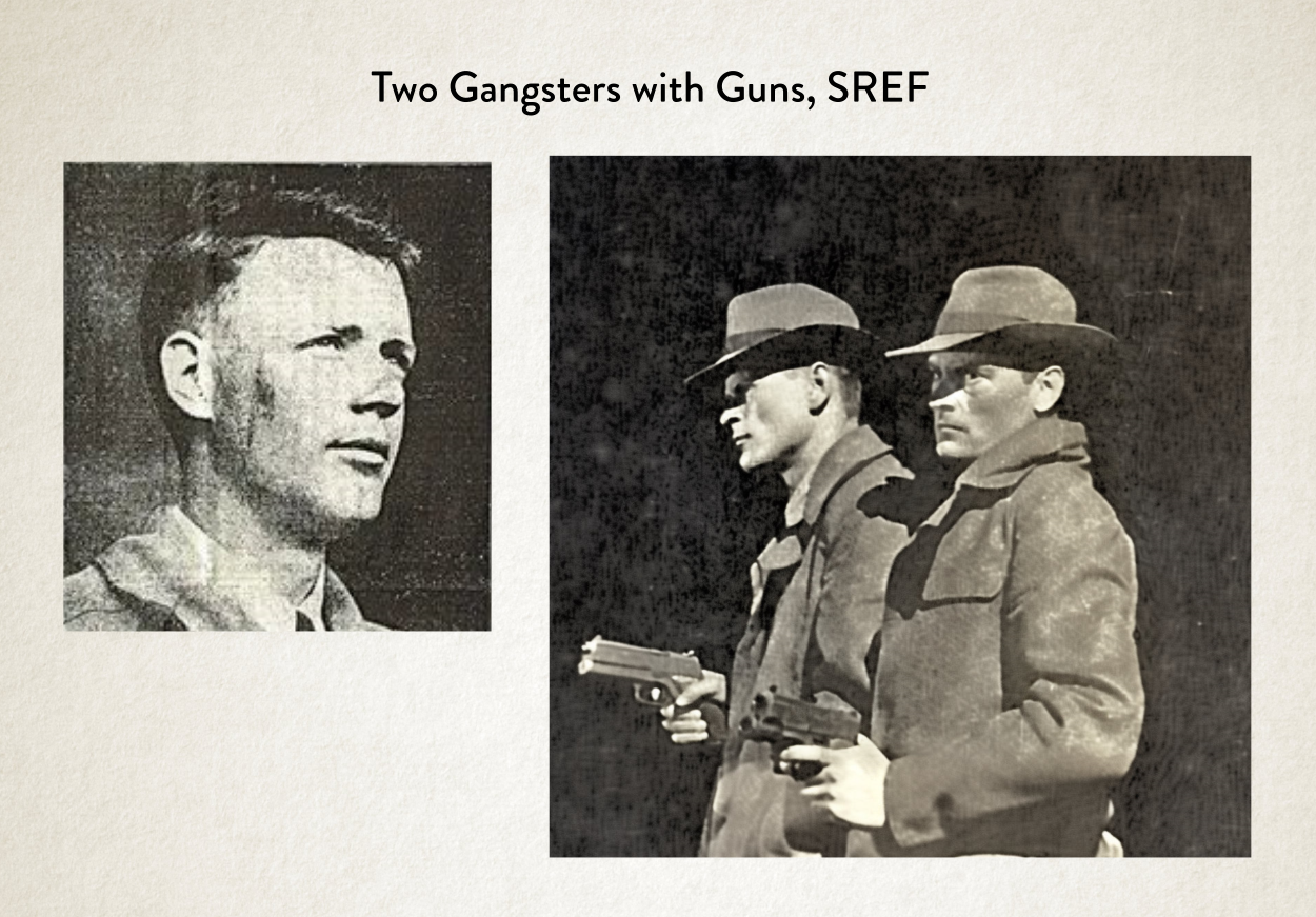
Imagine we have a book about a 50s newspaper journalist that’s investigating a case involving two gangster brothers. We could find an old photo from a newspaper and try to go with that aesthetic.

Or maybe we want to get a vintage look from a really old romance novel with that lovely muted palette. I didn’t really ask for David Hasselhoff on the cover, but fair play. I was a big fan of Knight Rider as a kid.

Or maybe we just want a really strong fun colour palette and even an angle from something we’ve found but with a completely different subject.
So it’s a wonderful tool for thinking about how we can get source ideas to inform the aesthetics of an image for a book cover.
Important Reason #5: Aesthetic Uniqueness
A few years ago, when I was limited to stock images there was a rash of book covers that use exactly the same image in different ways. It was unavoidable. Completely. Simply because there were only so many really good images to go around. And the best images got used all the time.

It made me super duper happy when AI came along, simply because I started making images that were completely unique that no one else was seeing. Because all the images were made from scratch, by my own hand.
Authors were no longer going to get the same image that someone else could come along and use for their book cover. It was great.
Side note: In fact, I seem to be getting more and more authors coming to me, which have got covers from three or four years ago, when we used stock images, saying to me that another author (or readers) have said they’ve used the same image. Well, yep, it’s a stock image. And I think authors and readers feel that way, because there is a lot more AI, utterly unique stuff out there.
So AI has made my work unique and specific to that very book, and that book alone. I love this fact because it’s an advantage to the author. It matches the uniqueness of their book!
But what Sref means is, not only that the image can be unique, but all my aesthetics can also be unique now. I’m no longer reliant on some sort of style prompt such as ‘Illustration in Watercolour & Ink Lines’ ‘Highly-detailed cartoon illustration’ or ‘Simple vector in the style of a corporate logo’ or what-have-you. Which made unique images but with somewhat similar aesthetics but now I can also change up the aesthetics as well.
Unique aesthetics for the win!
Important Reason #5: An Aesthetic Singularity
Something that gets talked about a lot when it comes to AI, especially AGI (Artificial General Intelligence), is something called The Singularity. That’s basically the wonderful or the super-scary point, depending on your viewpoint, when AI surpasses human intelligence. In terms of General Artificial Intelligence, it’s the point when the AI is smarter than any human so it starts creating, coding, training itself to be even more smarter, and smarter, and smarter, and so on.
Sref is a game changer, completely, but is it the graphical equivalent of the Singularity? Nope. Definitely not.
But the feeling I get from it is that from an aesthetic point of view. Yes, it is. We’re getting styles from MidJourney that no human could think of, and definitely couldn’t execute.
It has this wonderful feeling of treading into the aesthetical unknown. Like we’ve passed a point where things are going to get rather wonky and wonderful. I’m already seeing other AI art’s work which are things I couldn’t not imagine and I’ve never seen.
Another thing that happened on Friday night, when I was showing my friend Sref, I was showing him what other people in the MidJourney Community were doing with it, to get this same point across.
How we’re now in that wonky and wonderful post-human aesthetic world.
The original isn’t one of my pictures. It’s someone else. But we then went ahead and used that image to make — you guessed it — a Sad Elvis.
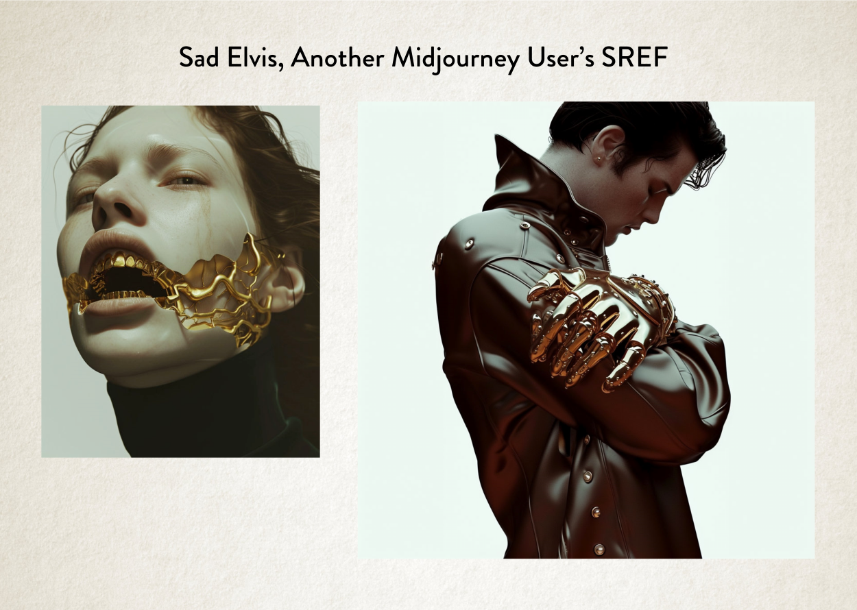
To me this is next level stuff. This is the point where things really start to get interesting when it comes to aesthetic exploration. It’s beyond what we as humans could think to execute.
Here’s another thing I made from a remix of a remix of a style from two images for a commission I did last Friday, using Sref.
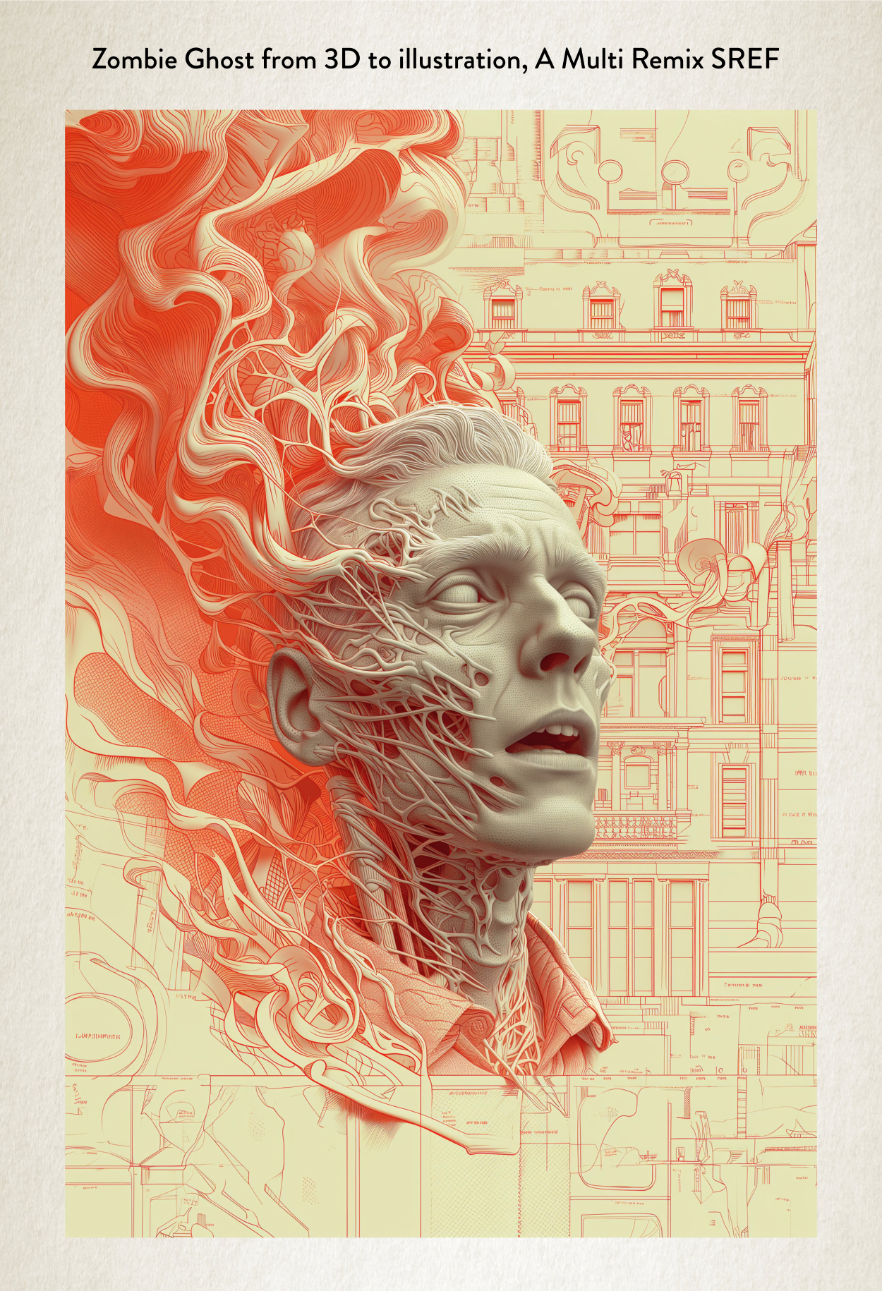
Again beyond what I could even imagine in my head. And that’s the point, if you can’t imagine the aesthetic in your head but the AI is creating it then we’re in new creative territory. We’ve crossed some Rubicon, for sure.
Something that gets levelled against AI image generation by those that don’t understand it is that everything it makes is soulless. It’s a phrase that gets regurgitated all the time. It hasn’t been made by humans so it’s therefore soulless.
There is an obvious flaw in that argument, due to the fact that it’s me playing with the AI, it is a human making it. It’s all my artistic journey. But what those people really fail to understand is that humans connect with the tone of everything. Those feelings come for the most part from the aesthetic presentation, as well as the subject.
Yes, a lot of the earlier AI stuff was very samey. All had that same aesthetic. Some of the non-MidJourney generators (Dall-e I’m looking at you) still suffer from this problem.
What these people were saying was: this image has an AI aesthetic so I don’t like it.
The line is still being touted out without much meaning behind it any more.
But things have passed that point now. Sref is an even further journey into that unknown, using human play and discovery. Little artistic journeys. If I wasn’t busy as a book cover designer, it’s actually what I’d be doing. Playing all day with Sref.
And there is an irony at work with that future Elvis image, which is perfect one for me.
It’s cold, sad and sterile all at the same time. It’s almost the perfect representation of lonely and cool in equal measure. As if the image is the soulless future the anti-AI brigade are scared of. But at the same time, it’s emotive. The tone is great! I love the dichotomy of the image, it stirs something in me intellectually and creatively. Which is what good art is about. Right? But it was made with AI.
But it did take me and my friend about about 50 or 60 generations to settle on this final picture. I didn’t magically get that Elvis on the first try. It was our journey together.
So that’s what my next blog post is about, how the process actually works with my authors if they commission me. Because it’s worth chatting about.
So I better finish this post here and get on with finishing that one. Which I actually started before this one but then started writing this one instead, so I could play with and talk about Sref. I was that excited.
So, catch you next time when I talk about my process using MidJourney.
Kindness and smiles,
James
PS If you feel I’ve used the word ‘aesthetics’ a bit too much in this post, then spare a thought for me. I’ve had to type it all these times. It’s a horrid word to type.
PPS The next thing that’s coming down the line with MidJourney is called Cref. It’s at the top of their development list. If ‘S’ stands for ‘Style’ what do you think ‘C’ stands for? Yep that’s right: Character. Could be interesting for people wanting the same character on multiple book covers. It’s definitely interesting. No doubt I’ll talk about that when we get to that point.


richardsexton57
/ February 5, 2024Blog entries like this make me long to understand Things Artistic. (Or musical, but that’s another story). I see how certain characteristics of the original image remain while others are changed – removed or enhanced or blurred or… My problem is that the new image evokes a particular emotion or feeling, but I don’t know why. How does that happen?
Many years ago (the early to mid-eighties, actually) when I wind-surfed a lot, I would watch videos of well-known hot-shots like Robby Naish performing wind-surfing stunts and feats of endurance. One special video sticks in my mind: three men crossing a bay somewhere in America. They were all sitting back in their harnesses, trimming their sails, moving their feet to steer the boards around and over the waves. It was a feat of endurance, and quite dangerous, since gear breakage wasn’t unknown. They’d be lost in such open water. But the speeds they were achieving as they danced over the swells was entrancing. The video was set to a musical soundtrack of ‘Technopolis’ by the Yellow Magic Orchestra.
If you have eclectic musical tastes, James, you might want to find them on Youtube.
Can’t wait to see what your software suggests for all my books!
lisabetsarai
/ February 6, 2024All I can say is … wow! Amazing post, fantastic examples, and some serious insight into the nature and capabilities of AI. Thanks!