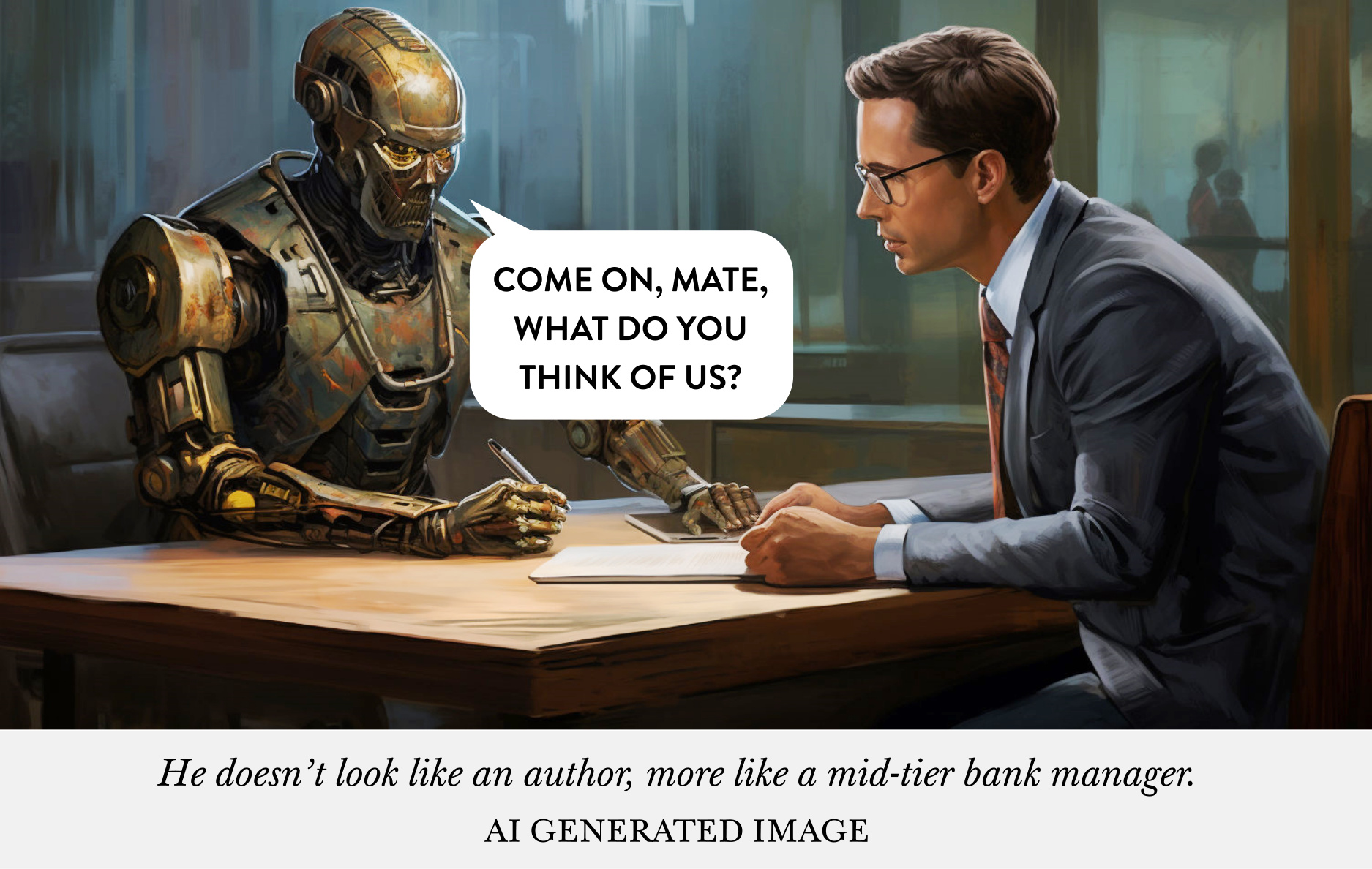
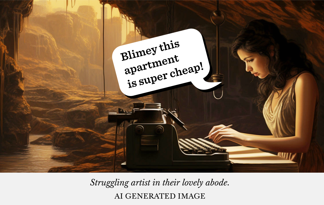
When authors come to me for a book cover commission they generally come at me from two very different directions.
Either they’ve seen my work and say to themselves: I’ll have some of that, let this kid go wild and create something amazing for my book, I’m sure he’ll do good work whatever it is.
Or maybe they will say: I have a vision in my head, I want James to execute it for me.
And although I must prefer the former let-me-have-at-it approach, because they’ll generally get better results with it, I don’t mind executing the former, this Author’s Vision.
But …
And here’s comes the ‘but’, we’re not going to get exactly the image they have in their head. And this blog might help them understand why not. And how we need to approach their book cover, their vision.
So this blog post is for them! But even if that’s not you — you might even be somewhat in between both of these sorts of people — this blog should help you understand AI image generation a bit better.
If you don’t want to read this whole blog, and it’s bit of a long one, and just want a TL;DR:
But if you want to know the reasons behind it all, and understand AI, stick with this blog and I’ll show you the man-behind-the-curtain, i.e. my life, trying to make your great book cover.
This blog post should dispel a lot of the myths I think authors have built up in their head about how easy and low-effort AI is. And in dispelling these myths, and actually understanding how I do what I do, it should make my life easier.
Because I think there is a lot of confusion at the moment.
So let’s start off with a topic which most authors probably think they have a good grasp of ‘Description in Fiction’. But before we do that, there’s quite a bit to cover, so grab yourself a lovely Earl Grey tea and a croissant, get comfy, and let’s have a look at it all.
Visual Imagination Greatest Joke
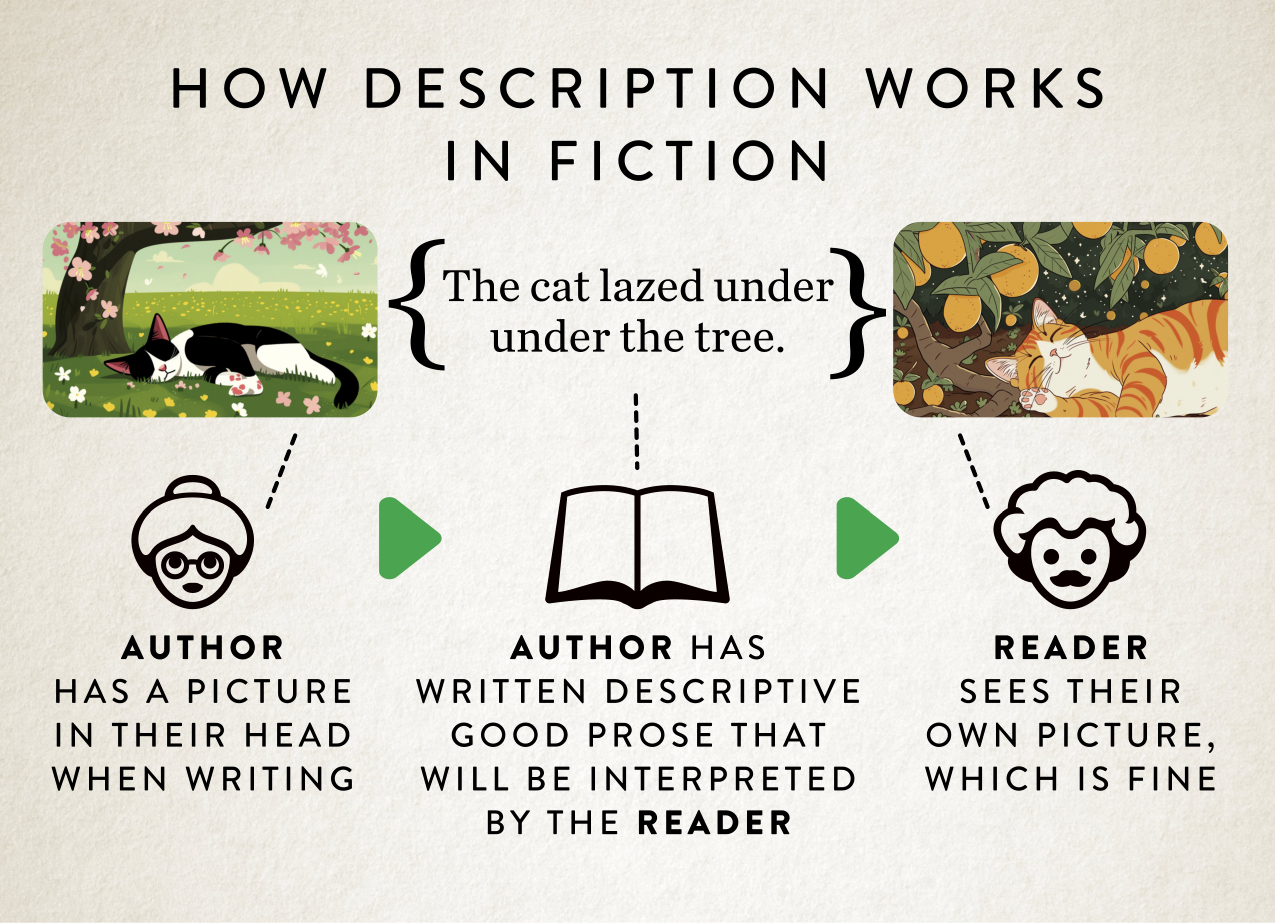
Before we talk about the problem that AI runs into, let’s have a little chat about how description in fiction actually works. Because I think this explains one really big problem with AI in a very perfectly succinct way.
All authors have an implicit feeling with how visual imagination works. When they’re writing something they’ll have a vision in their head of the scene, what the characters look like, maybe what’s happening in the background. Authors will see it in their mind’s eye and then their job is to effectively write that description down in words, so that readers will see exactly the same thing in their heads. Right?
Wrong.
Here’s the catch: readers won’t see exactly the same thing! Ever! They build their own picture in their own mind’s eye from the author’s words.
It’s literally how fiction functions. Good fiction gives you enough description and story to build the picture, whilst making sure the narrative moves forward.
So how could you get a reader to see what you see, as the author?
One solution would be to rely on that old adage: a picture tells a thousand words, right?
So what will you do as the author? Are you going to write a thousand words for each scene? For each character? So the reader sees exactly the same thing as you.
No, that would just mean the prose would become clunky and full of description and the story would move along at a glacial speed.
So what authors actually do is economise on description and give in to the fact that what they see in their own mind’s and the reader’s mind’s eye are never going to be the same thing, but close enough so we can carry the story forward at a nice pace.
In short, as authors we give ‘enough’ detail, not ‘excruciating’ detail.
This is important to remember when it comes to AI, because what MidJourney likes is that ‘enough’ detail, and doesn’t play well with ‘excruciating’ detail. Just like our readers.
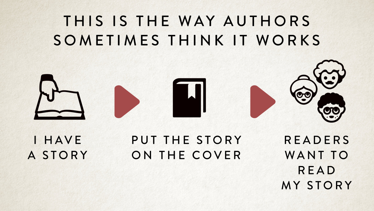
What authors need to remember is this what’s happens:
And this is perfectly fine. In fact it has to be this way.
So why explain this?
When an author comes to be with their Author Vision for a book cover, what they’re doing is holding onto that first image. And I get caught in a hellscape of trying to match it. Our image on the left.
But if you’re following me so far, I’m sure you can see the glaring obvious problem here.
Just like a reader, with their own visual imagination, of the words that have been offered by the author to explain something visually, I’m in the same boat as a designer.
And here’s where it gets even more farcical.
There’s a third person in this process. And that’s MidJourney. So you have three different people being told words, and making pictures in their head from those words.
So authors tell me words to tell MidJorney, to make those images, like it is some sort of game of telephone. It’s a bit frustrating to say the least.
But I can see the cogs in your mind turn, as an author.
Wouldn’t it be much easier if we cut out James. Let me talk directly to MidJourney. Oh, and I know I’ll just give it loads of description! All that excruciating detail. That’d work. Right?
Nope.
Firstly, you might have heard of something called ‘prompt craft’ when it comes to generating images. It’s basically the way you talk to the AI so you can get the right thing out of the system in the way you want. And to put it into context, I’ve committed an hour every morning before I start work proper, every single day, over the last couple of years, to actually learning and understanding prompt craft. So good luck with that.
There’s two sorts of people in this world. Those that have played with AI image generation and seen how unruly it is, and how difficult it is to get it to behave, to get what you want.
And those yet to try AI image generation.
So that’s problem number one. It’s going to be a frustrating experience for you.
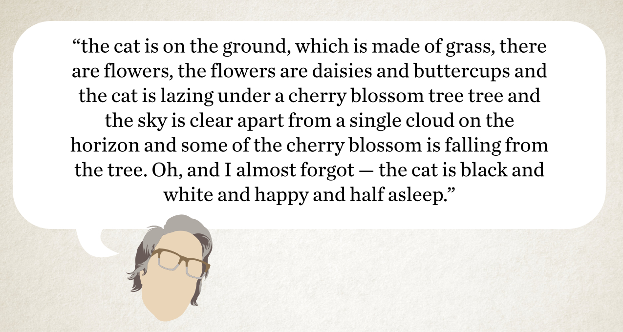
In fact, those two images of the ‘cat lazing under the tree’ were actually me asking MidJourney to literally draw a picture of a ‘cat lazing under a tree’. It interpreted my words in two different ways because I didn’t specify more than that.
And your second thought about it might be: I know what I’ll do I’ll just give it lots and lots of description then! Job done!
Something like:
Okay, let’s try that exact description with MidJourney and see what happens to try and get closer to the author’s mind’s eye image.
Here are the first four outputs from the description.
Welcome to my world! And the world of AI image generation.
If you want a feeling for the frustration you’re going to get being me then go have a play with one of the free image generation tools: ChatGPT, Co-pilot or Gemini. And you’ll soon understand.
So let’s have a chat about why this is happening and how we can fix it.
Chucking Water
Even if an author gives me loads of excruciating detail, like in that cat example, why isn’t MidJourney giving us images that are 100% perfect and match what we’ve asked for?
The simple answer is: technically, I have no idea!
All I’ve got is a feeling. A feeling I can best describe in terms of an analogy, one I like to call ‘The Random Chucking of the Water’.
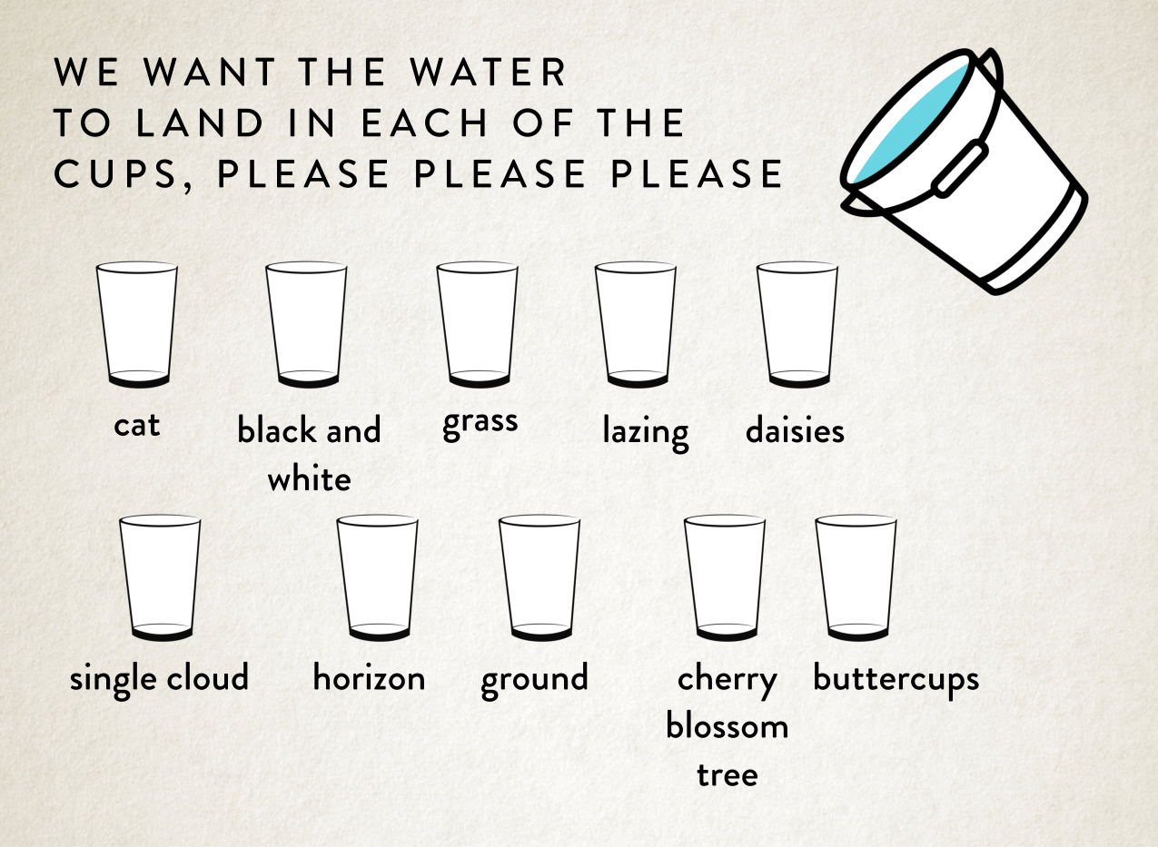
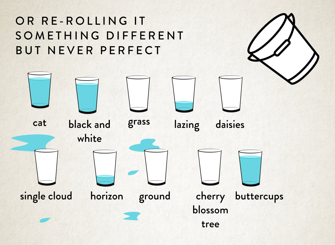
The best way to visualise it for me — and explain it to you — is to think of it like each individual element we ask it for in that long description as a cup we want the water to fall in, everytime we re-roll a prompt to generate an image. And we’re chucking a big bucket of water at those containers. To see what sticks.
So our prompt my look something like this:
And then when we run the prompt, chuck the water, and hope it lands in the right descriptive places.
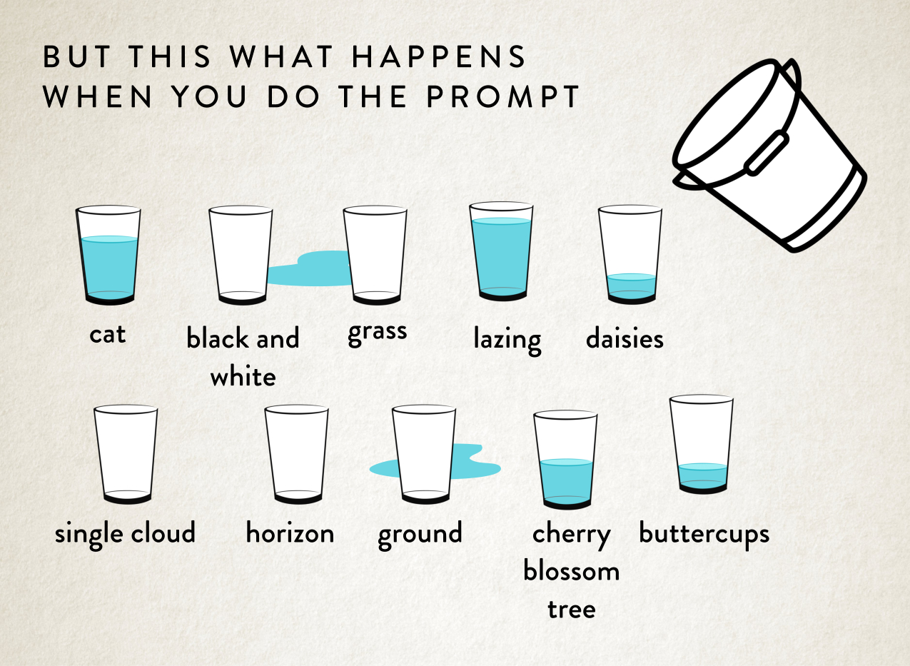
Let’s place some bets on whether that will work or not.
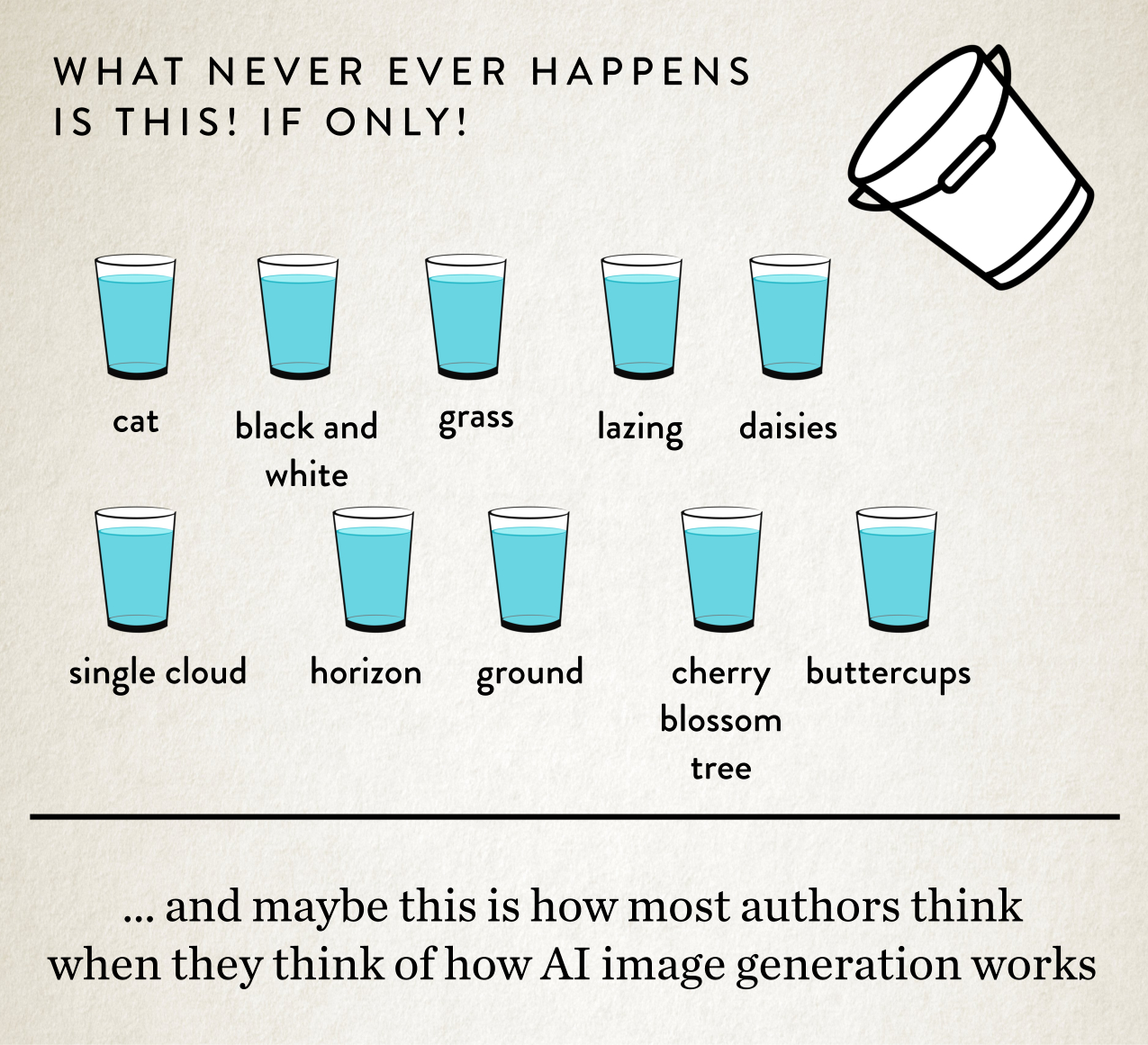
Yeah, generally this is what happens:
What we’re ideally looking for is this!
And that’s why the chucking water analogy works so well. Because you could try a million times and it’s not going to land in all the glasses equally as you want. It just won’t happen. Re-rolling prompts is more like some daft messy task on Taskmaster, where the studio audience is laughing at you. Rather than a precise art. By the way, all the Taskmaster Episodes are online here, and they’re very funny.
So it’s never going to produce a perfect image, hitting all of your descriptive elements and getting them all right.
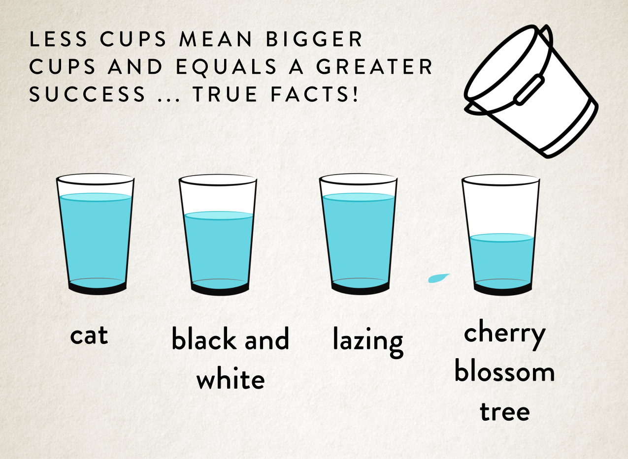
But another reason why I really like the glass and bucket metaphor is because imagine we actually cut down the amount of descriptive elements, what would that look like?
I’ll take some bets again on how you think that is going to turn out.
Of course. It definitely works a lot better! The water hits the right glass a lot more of the time!
But what this means is that authors who want an image to be more correct, need to let go of their Author’s Vision, because sorry, it just isn’t going to happen. There are limitations to what AI can and can’t do. The number of descriptors it’s going to hit correctly.
There simply needs to be compromises and authors need to trust me that I have their best interests at heart and I’m trying my hardest to get things right for them. Making the best images to make book covers from.
There needs to be a meeting in the middle.
But how do we achieve that?
Prioritise! Prioritise! Prioritise!
Firstly, we’ve learnt from our ‘Chucking Water’ analogy MidJourney is better when it has less cups to aim at. So much better. So firstly, we need to prioritise.
We need to trim the fat from the vision you have in your head. Make your idea a bit more amorphous to actually hit our really important points.
Ironically, this is what makes a better book cover anyway, hitting the three or four really important tonal, premise or plot points. Rather than an overly complex, detailed visual mess. Think more iconic album cover, rather than a movie still.
And is it really that important that the cat is black and white? That the tree is a cherry tree? Will it make any difference to a potential reader’s experience stumbling on your book cover if these things aren’t 100% accurate?
I would say ‘no’. If you asked me I’d take eye-catching over correct detail every time.
And maybe I’ve already taken up two of the descriptive elements I’m using in my prompt to make sure your cover is tonally correct and eye-catching. So that’s two less you’ve got to play with!
As we’ve learnt, if we try to give MidJourney our 300 word detailed description to explain your perfect image we’re definitely going to get the water splashing everywhere. So I would say the limit for any image is probably five or six descriptive elements. In order! And as I said, I probably want to take two of those, as the designer, to get tone and the medium right.
So that’s four things you can probably tell about your image.
Simply let go of the details in your head. It’s easy. What are your top five things? The age, the race, the hair colour, what they’re doing, what they’re wearing and … nope, that’s it. We’ve already gone over those four water containers to get consistent results.
Crazy, I know.
So you need to think of your most important story specific elements that you want on the book cover, and when I generate images just pick the coolest, eye-catching image. Because you’re not going to get everything you want. It’s the nature of the beast.
I’ll repeat it again: Forget about details. We’re after great emotive, eye-catching images that tell a story. Not the details. We can’t do detail.
Unfortunately, MidJourney isn’t very good at being detail-oriented.
So for me as a book cover designer, if we’re going down an AI route with a commission I like to know what’s important to you, in order! It’s helpful.
Details might be important to you, but they’re just not that important to MidJourney. It might improve with version seven or eight, but I wouldn’t hold my breath because from version five to six it was meant to improve and it didn’t.
Save your details for the inside of a book. You know, your writing.
And I know I’m banging one about ‘details’ here and you’re going to say to me: but everything is important! All my details. The vision in my head.
And I’m going to say: but that’s not the way it works, Veruca Salt. You can’t have an Oompa Loompa.
And cutting down your priorities gives better results, it’s the only way we can cut down all the randomness MidJourney generates. And give us strong usable images.
And you could say to me: but keep generating until all the water lands in my seventeen different glasses, it should eventually! Keep doing it! Keep doing it, NOW!
Sorry, not going to happen because time is very much limited, and I’m not just just talking about my precious designing time, we need to talk about …
Working on GPU Time
There’s a fantastic joke by Simon Munnery:
“They did give infinite typewriters to infinite monkeys. It’s called the internet.”
Okay, the original saying is something like: infinite typewriters plus infinite monkeys would equal the complete works of Shakespare.
My point being, given an infinite number of generations on MidJourney we could come up with the image that is in an author’s mind’s eye. Simple.
Well, apart from the fact that I don’t have an infinite amount of time to work on infinite images. I have a dinner date at 8pm today for starters.
And then comes the heavier catch.
I don’t have infinite GPU time.
With MidJourney I get 30 GPU hours a month to play with, basically the service generating the images is some cloud computing set-up, doing all the fancy stuff behind the scenes, and then giving me what it’s generated.
Basically around 150-200 images equals about 1 hour of GPU time.
Which sounds like a lot of images to pick from but there is a vast amount of redundancy!
Generally over the last couple of years what I’ve found is that if I have a project where an author has commissioned me, say for a single cover, I will generate about 300 images and about 25-30 images will be good enough to show the author to choose from.
There is a whopping 90-95% which is simply just trash. Unpresentable.
Images where the water has gone everywhere, and I know it’s not what an author has asked for. Or doesn’t look right in terms of tone. Or bad composition. Or has funny limbs. Or the colours are yucky. Or MidJourney interpreted my words in a rather amusing way. On and on.
So for each set of images I need to produce for a cover, I’m usually using up 1-2 hours of my GPU time. As well as the time of perfecting my prompt to get great images, with usually about 3-4 hours of human time too!
It would be great if I had infinite GPU time but that’s actually not possible. So unfortunately it can’t work any other way!
It would be utterly wonderful if an AI could read an author’s mind, do exactly what you tell it.
And I think sometimes authors think if they just give me more words and if I work hard enough it’ll happen.
It. Will. Not.
Plus I’m running out of GPU time — and patience.
So the watchword here I think is: compromise. Because as we learnt earlier communicating an Author’s Vision is ineffective with mere language.
There is a more powerful tool at an author’s disposal for getting great images with MidJourney, when I’m doing a commission for them, if they’re willing to open their mind.
But let’s start off with something simple before we get to them …
MidJourney Tools
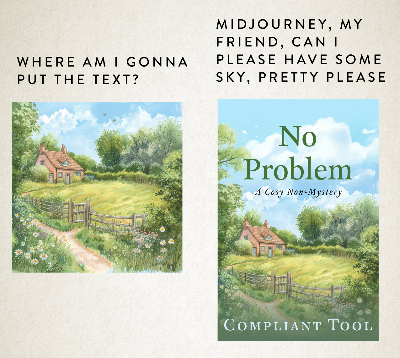
Once we’ve decided on an image out of those 20-30 images I present to an author. Then we do have the possibility for MidJourney to edit that image within certain limitations.
The big one, for me, and it’s super practical, is probably panning. Without panning I wouldn’t have any space for your lovely title.
Here’s an example:
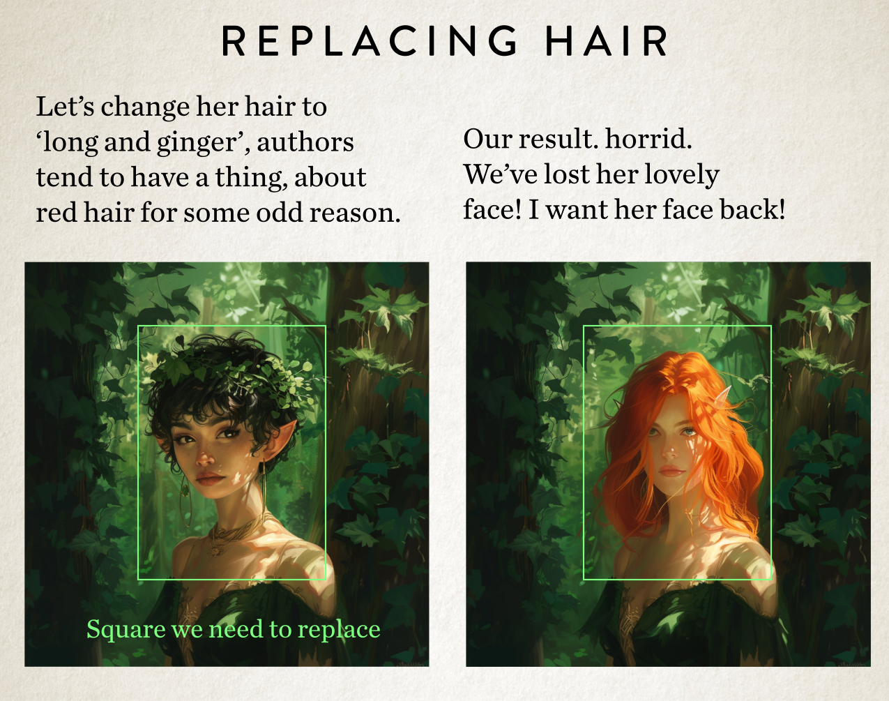
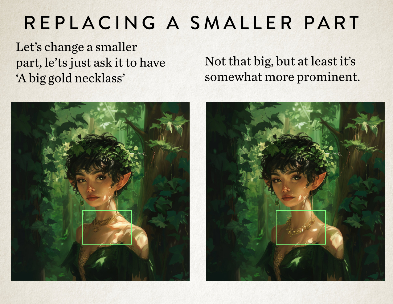
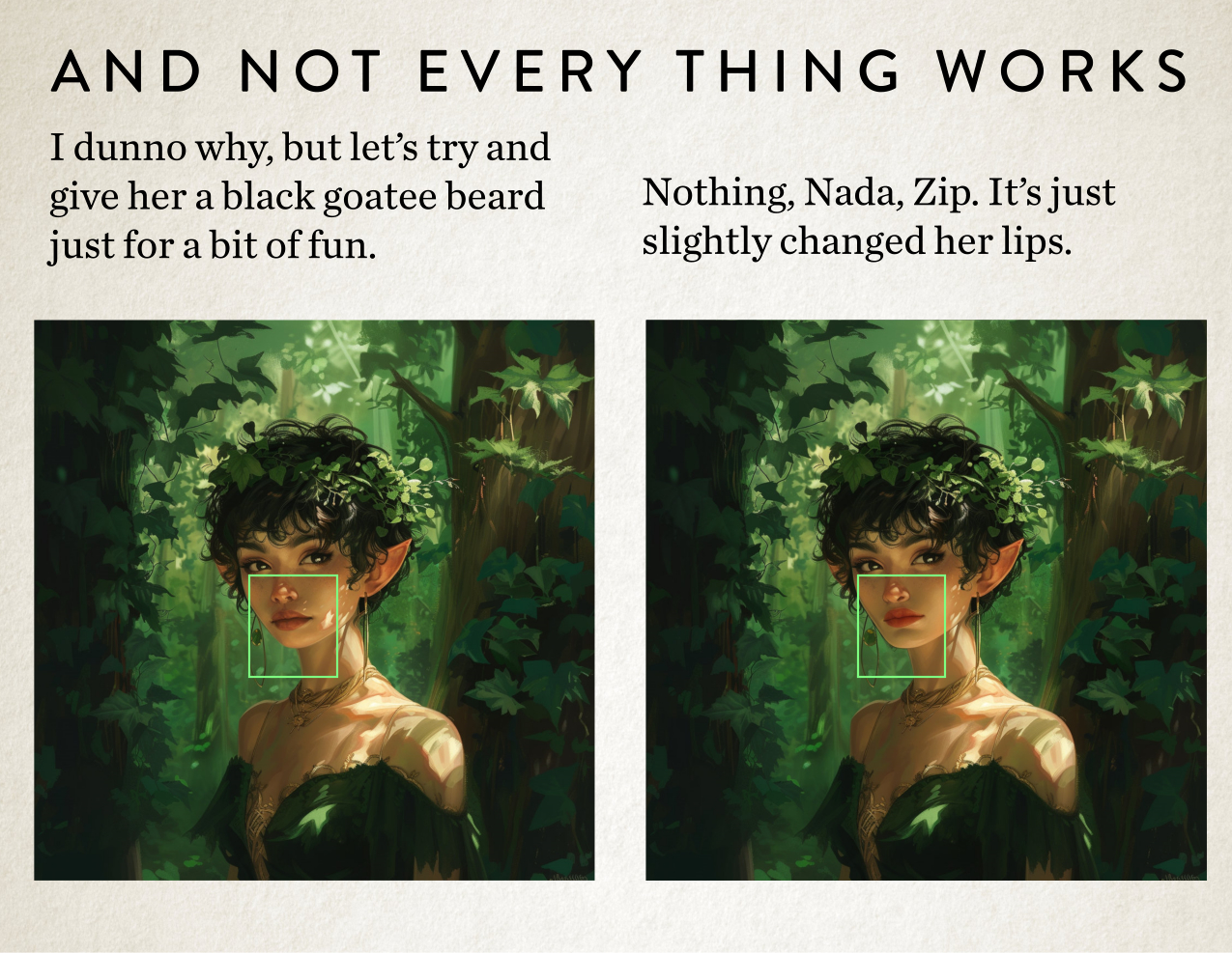
Also, and here’s another big one, is we can actually reroll parts of the image.
“Great, that means I can change a hairstyle to whatever I want, right? Change clothes. We’ll do all that later, then?”
Nope. Not so fast.
Because we can only replace rectangles of that image. So if that rectangle goes over something you do and don’t want to change, it will change both things. Also it’s not always perfect. We get messy results. Because we’re back to that 90% redundancy of duff rerolls.
Here’s an example of what I mean of your hair style idea.
[PIC]
Pretty bad right? How about if we just change some smaller elements. Let’s try a couple of experiments.
So there are some edits possible but only if an author can think in terms of squares and be prepared for me to turn around and say, “that didn’t even work.”
But my more powerful solution at our disposal, but less MidJourney related …
Give Thanks for the Happy Accident
I’m going to ask you, as an author, if we only have 4 or 5 descriptive elements to go on, which would you prefer to see: Ten images that are very similar which match your vision or ten images that are completely different in styles?
For me, I’m very much in the latter camp. Simple because choice is good. And it’s what MidJourney is really good at. Trying out lots of different crazy ideas.
Having a set vision in our head limits us to all the possibilities out there in the universe. And me, I’m a happy traveller with a vague destination in mind and try not to hamper myself with too many expectations.
In this way visual creation is very different to telling a story. With writing you’re always going somewhere, a story is linear, but with the visual arts you get to play and explore until you stumble on something truly fantastic.
It’s the only way happy accidents occur.
In fact, MidJourney works best when you push it to the edges. It even has its own parameter which I’m a master at, which is called ‘Chaos’. What a great name!
And given enough chaos and seemingly disparate concepts it comes up with all manner of fun things! And do you know what a good premise for a book is about, yep, you guessed it disparate concepts. It’s literally the best tool for making ace images for a book cover.
And the more you create an environment for me to play in, the more interesting images come out of the whole process. Allowing me to explore rather than sticking to a set vision. Like playing with Sref, which we talked about in my last post.
But the catch is, to go down that avenue you need to let go of the image you might have in your head and …
Be More Vibes-based Author and Less Details-oriented
I know this is hard for some authors that commissions me, but it’s a powerful way to get a powerful cover. And it’s how MidJourney actually works best. How I work best. Yep, my happy place.
But if we are trying to follow your vision, which I don’t mind doing either, you just need to remember you can half your cakes and eat it, but only half the cake!
So to Recap
When undertaking a commission with me where you have something very specific in mind, then you need to think what are your priorities for that image. Because MidJourney can’t do it all. If only. And hope that this post has helped explain why it can’t do it all. How it all actually works.
So I need something like:
It need to be in a soft illustrated style like X cover
She’s ditzy looking because it’s a plot point
She’s walking in the Dartmoor National Forest
She’s wearing bright yellow waterproofs
She has a Jack Russel dog with her
After about point five, MidJourney is going to start to get very confused.
So you’ll need to forget about all those other facts you might want:
She has a bob haircut with bangs …
It’s mousey in colour …
The dog has a spot over his left eye …
She’s carrying a nobbled branch as a walking stick …
It’s about 6pm in the evening …
On the 19th of November …
And there is a slight South-westerly breeze …
and you can see a village in the background …
On and on …
But if you promise to let go of detail, I’ll promise to create you the best image I possibly can, to design you a great book cover.
And with that I’m signing off writing this blog, and signing-on to getting on with some of these commissions I have stacked up already.
The title of this blog post sounds rather boring and technical but it is anything but. Over the last week there has been a seismic change with the tool I use to generate images, that I use to design book covers. And it would be remiss of me not to talk to you authors about it.
So here goes.
But there is a little bit of groundwork to get through before we talk about how powerful Sref is. My favourite new little toy in MidJourney.
We’re definitely travelling very much into the future with this one. So maybe get yourself a futuristic beverage, get comfy, because we’re about to travel into the future of aesthetics.
Aesthetics: The Medium is the Message
When it comes to book cover design, a lot of the time the medium is the message. But what do I mean by that?
Let’s break down what a book cover actually consists of.
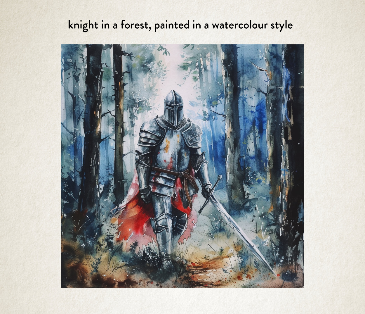
It’s very easy to think in terms of the subject on a book cover, for example it’s really easy to say something like ‘there’s a knight standing in a forest’ on the book cover, but there is a lot more that’s going on with an image.
Things we can break down.
Things that convey tone.
Things that will always speak to a potential reader, other information that we need to consider, when designing a book cover.
So I would split off the information into probably two very simple categories. Something like this:
So you can think of these things as the stuff on the cover (the subject) and the way you present the stuff (the aesthetics).
But one thing that I say in that essay (near the end) is you can easily achieve this ‘intrigue’ by being playful with the aesthetics. You don’t want to confuse potential readers by sending out the wrong signals about your book, but you do have wiggle room to be different.
What do I mean by that? Let me explain.
You can go and look through any category on Amazon books and find the sort of cover presented in the same aesthetic over and over again in each category with the same sort of aesthetic.
You know the drill; all horror covers will be moody or grungy or blurry, all thriller books will feel muted and desolate, all rom coms will be presented as twee and cute simple vector graphics. Etc. Etc.
They are aesthetic tropes that work. And they work because they convey a message about the book. And the thing I hear and read a lot in ‘The Cult of Self-publishing’ is stick to the tropes, don’t confuse the reader. You will sell more books. And to that, I say poppycock.
There is a tension at play here, one that doesn’t get considered when people talk in this way, a tension with my job as a book cover designer. And that’s actually getting your book noticed.
As a book cover designer, that’s what my job is! It’s my primary directive.
Think about it, if everyone uses exactly the same aesthetic tropes how are you going to get noticed? It’s just going to be a set of images that all look the same. As if everyone’s turning up to the party in the same dress.
And that’s where playing with these aesthetics comes in.
Creating something that’s ever so slightly different. Something that gives potential readers that little brain fizz of The New!
If a book cover looks a little different, then potential readers are going to think, this book is a little bit different from the standard fare. Do you want that subtle psychological advantage or not? I thought so.
Everyone likes to think that their book is a little different from everyone else’s, right?
That is the message we’re trying to get across and we can only do that with the aesthetics, if your book is about a forest knight and you want a forest knight on your cover.
So that being said, this little blog post is about my new tool I have at my disposal to achieve that. An aesthetic toy.
But before that let’s talk about how MidJourney actually works. I might be ‘teaching your grandma to suck eggs’ here but it’s worth covering.
What’s Prompting
We will get onto Sref, but let’s first talk about how prompting works.
If you’ve not been hiding under a rock for the last year or so you’ll probably know about AI Image Generation and it works with something we call ‘prompting’.
Prompting works with natural language, or sort of, because it’s an art until itself. So you basically just tell MidJourney what you want and it creates an image for you.
So to take it back to the original thing I mentioned, what you generally do is as it for those two things: the subject, what you want it to draw, and the aesthetic, how you want it to draw the thing.
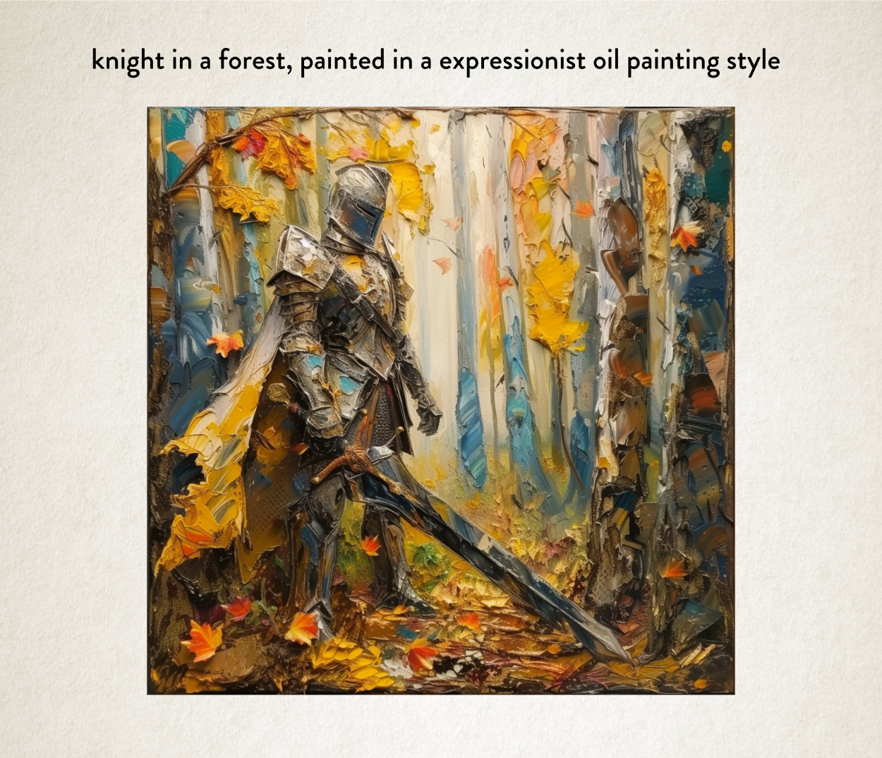
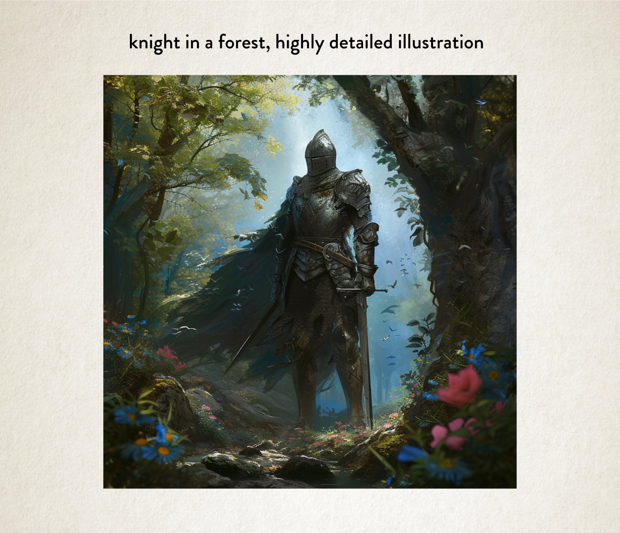
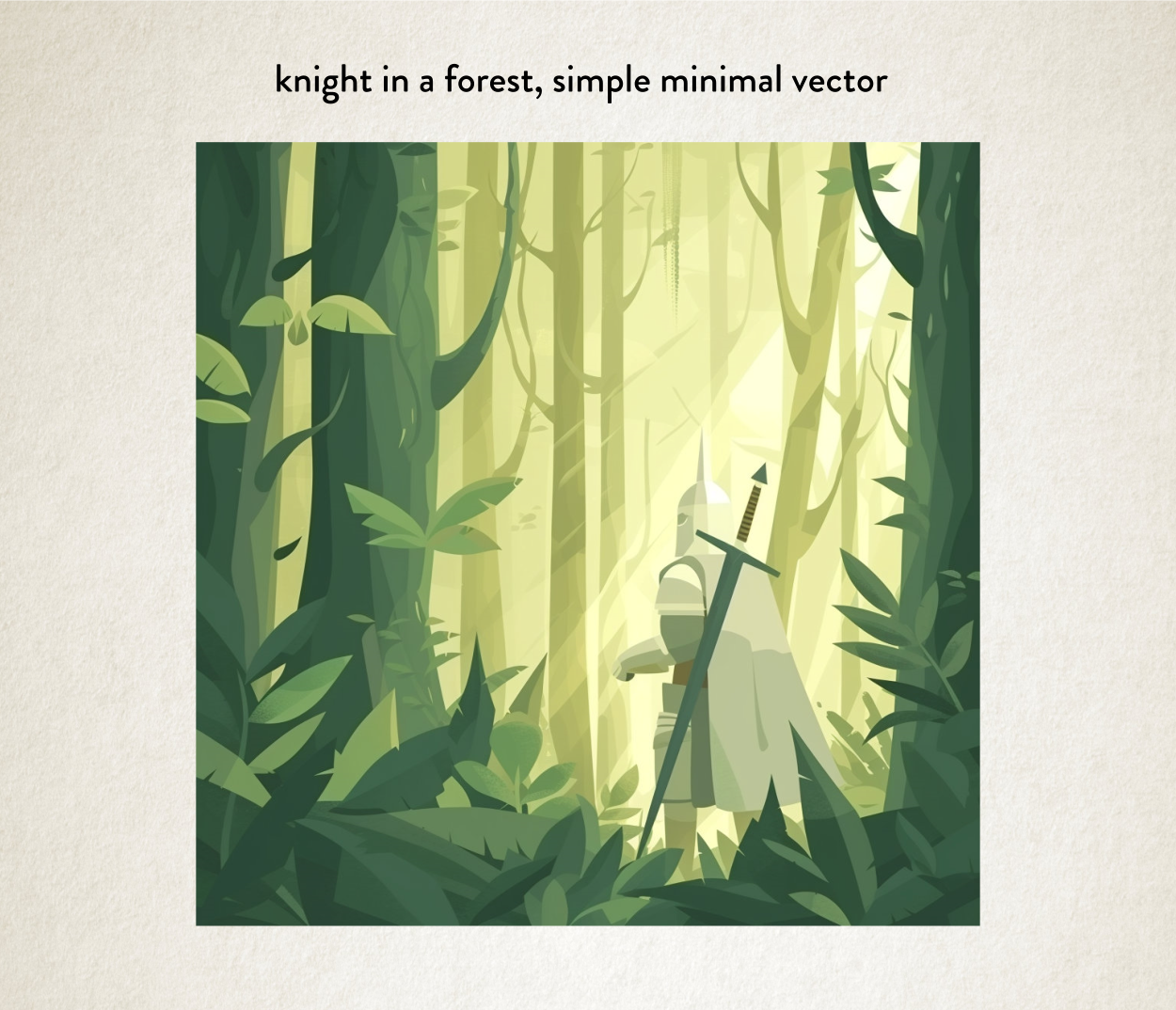
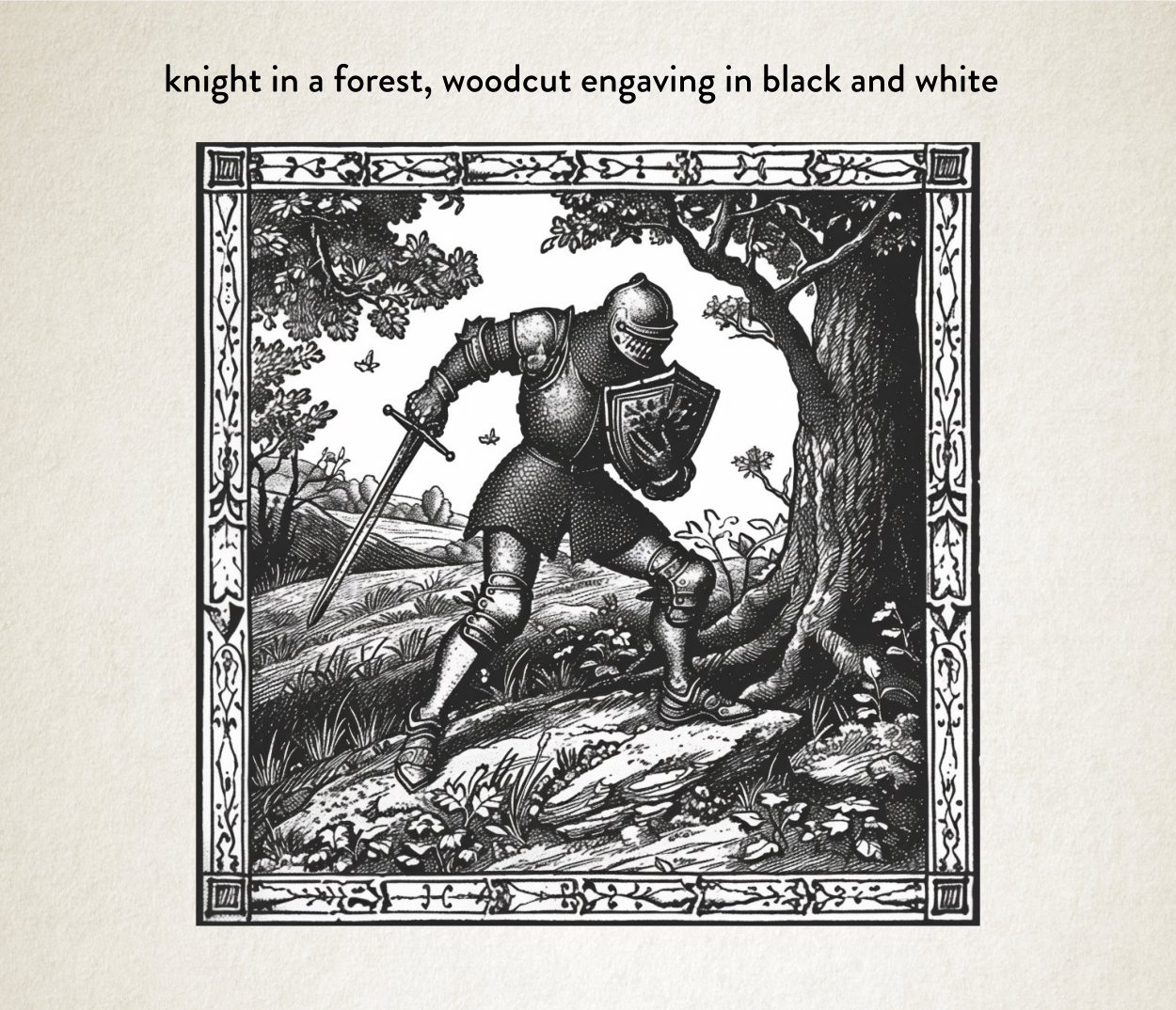
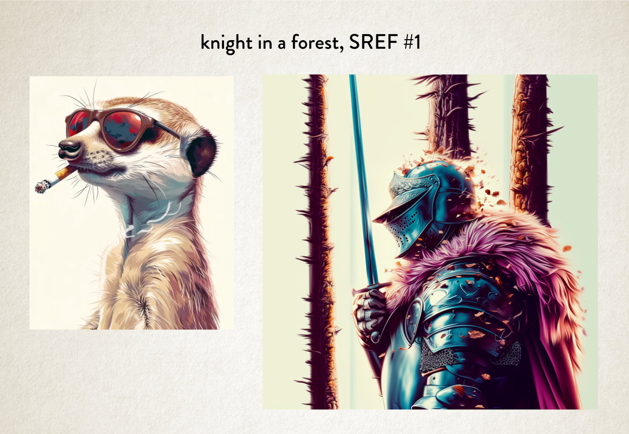
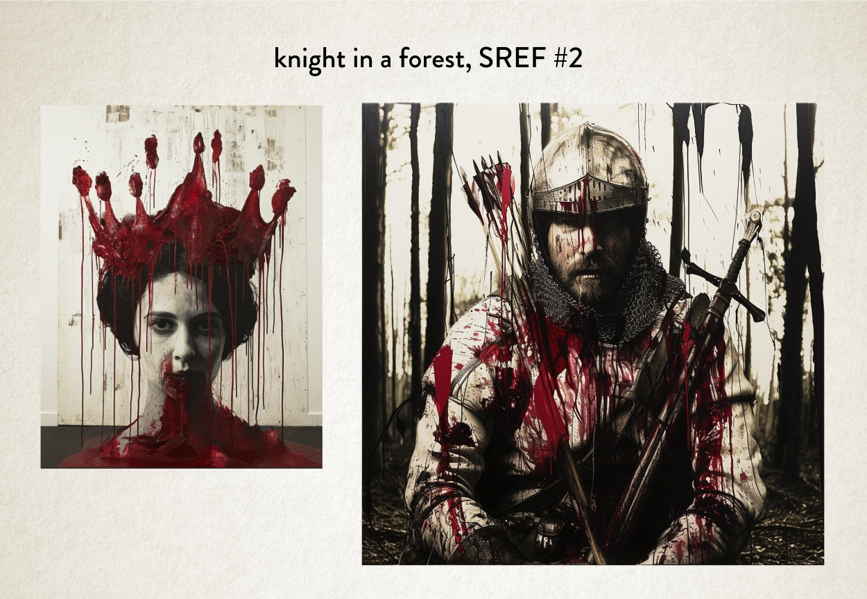
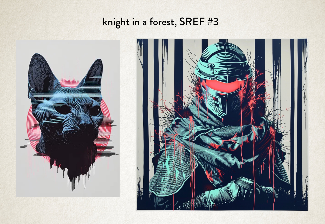
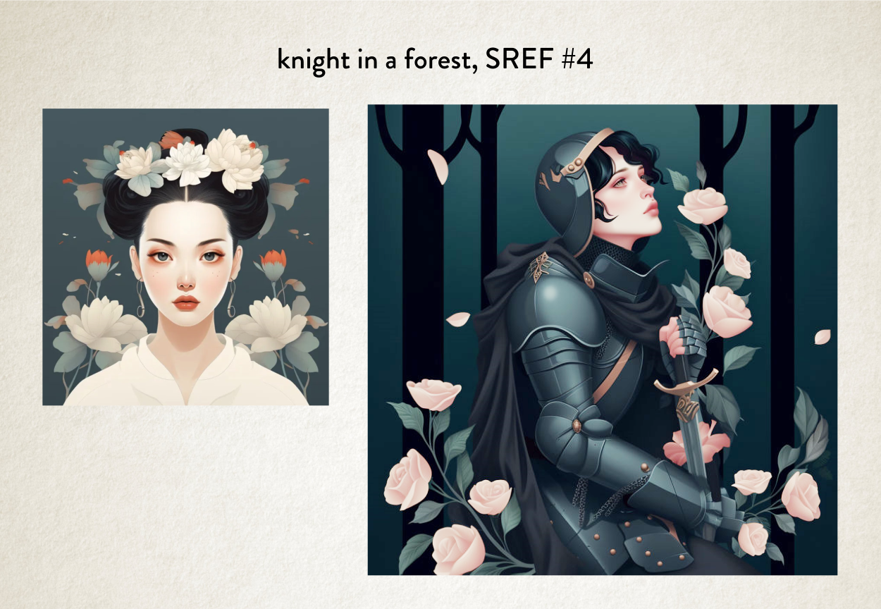
So let’s take ‘the knight in a forest’ and do a few very simple prompts just so I can show you how the prompting works.
Quality prompting, to make something interesting, is a bit more complex that just those simple terms. But you can see from these images that we can get very different images from the same subject.
These different aesthetics say very different things to a potential reader about what this sort of story they are in store for. The aesthetic informs the reader.
So, for example, the minimal vector image might say: this book is more for children. The woodcut engraving version might say to potential readers, this book is more historically accurate because you’ve chosen a more historically accurate way of presenting the image.
All aesthetics have a message they convey. They set a tone and expectation.
In fact, in terms of design, aesthetics the best tool at our disposal to stand out. And we can play around with the prompting to our heart’s content to get the messaging right and keep the book cover eye-catching.
In fact, half of my job these days is simply about learning how I mix prompts together and come up with the right amazing tone for you authors.
The other half of my job is learning new prompting tricks from others, by playing around myself, and then remembering to note down what the prompt things were. I’m 50 and my memory wasn’t what it used to be.
But my job has just got a lot more interesting with ‘Sref’.
So let’s have a chat about it.
Introducing Sref
Sref, or Style Referencing, is something that came out for MidJourney about a week ago, at time of writing (start of Feb 2024). And it’s been so fun, I’ve just had to sit down and write a blog post about it. Simply because it is the perfect tool for achieving exactly what we need to achieve this ‘ever so slightly different’ aesthetic we need to catch potential reader’s eyes. Our sweet spot.
What that is, is a way of taking a style reference from a picture and using that to make a new picture. Almost like the AI is learning styles on the fly and applying them to your subject.
So where I’d normally put the aesthetic part of the prompt, such as watercolour, I can simply use an image as a reference instead. Or even both! Some style prompting and a style image reference.
But let me show you what I mean, because it’s easier that way.
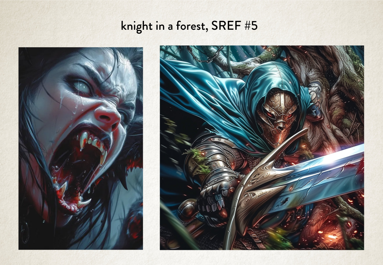
So let’s take our knight in a forest and do a few generations using different images as reference and see what we get.
Admittedly some of these would work better than others for a book cover, but you start to see the power of what MidJourney can now do with Sref.
It seems to be able to take the colour palette and the structure of the way something is presented, and the style it’s drawn in, angles of composition, and make brand new images using that complete aesthetic. Which is a game changer (more of that soon).
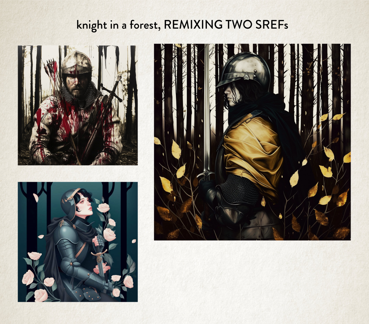
But not only can we take a reference image, we can also take more than one image and use both aesthetics to make a third.
So let’s take two of the images we’ve already made as style references, and make a third new image. See what happens.
So let’s try that, shall we.
Pretty stunning results, with aesthetics I’ve never seen before! Brand spanking new aesthetic pulled from the ether.
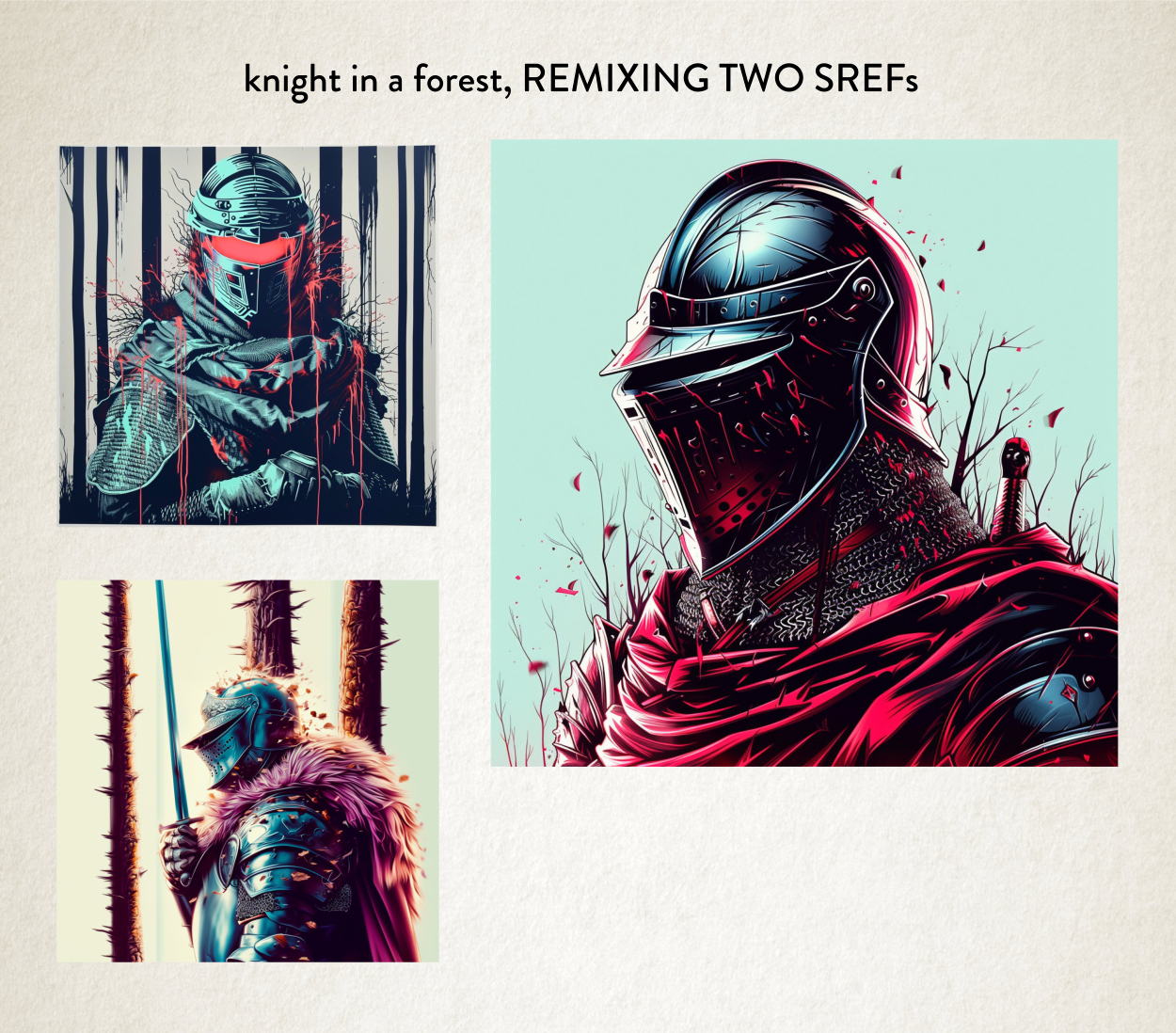
And any of these aesthetics I could keep and then use them later for something completely unrelated or even remix them yet again with some other aesthetics. On and on.
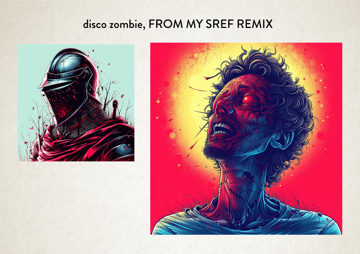
Let’s take our remix and make something new with it.
Pretty interesting. It’s a mix of a mix with a new subject.
But why is this so important, why am I telling you all this? Why is it so seismic? Well there’s a good few reasons, so let’s go through them.
Important Reason #1: I Like The New
I have some friends that sort of like the same sort of music. Which is fine. But that’s not my path. It’s sort of the reason why I hate trap music, it’s sonically too samey. ‘Sonically’ being the audio equivalent of visual’s ‘aesthetic’. Trap is always that same heavy 808 kit and the same crispy 32 bar snares. Always. Zzzzz.
So I always go hunting for new tunes, new sonics, this is my jam at the moment, just for example. Nutty stuff. Great video. Maybe because it appeals to the sonic mixing of an African sound and a Berlin sound.
It’s also why I like going to fancy restaurants with odd flavour pairings.
What makes me happy is The New.
And this doesn’t just extend to my down-time. In my job, what keeps me interested in doing book cover design work is The New.
So at the moment I’m as giddy as a Kid at Christmas with a new Lego set. Yep, as a kid I was given Lego every single Christmas! Loved that stuff. Because I could make stuff from it. I never followed the instructions.
Important Reason #2: The Creative Journey
I think anyone who is honest with themselves creatively has learnt to let go of their ego and just let the process take over at certain points in your journey when making anything. Sometimes the art just takes over at some point and the destination you had in mind actually changes.
Something new is discovered along the way. Things change and you accept the change. And then you end up with your glorious result.
This letting go makes good art.
Imagination is always just a guide and not the be all and end all.
Trusting yourself to go with the flow and be in the moment.
And this Sref stuff is the perfect example of this 50% my idea and 50% letting the process take over.
Previously when you needed to use words it seemed a way more rigid way of working. Like: this prompt didn’t work, I have a vision, how do I make it work. Right, change some words. That’s closer. Frustrating.
With this new way of working, I get to let go a lot more and get my hands dirty and make a mess and just see what comes out of the other end. And everyone loves the mess of finger painting. It’s pure joy!
Important Reason #3: Peak Sweet Spot
You’ll see with some of our previous examples of aesthetic applied using Sref to our ‘Knight in a forest’, they probably wouldn’t cut the mustard for a book cover. Maybe the green background one for a female night with more romantic overtones, or the bloodier one for a more gruesome fantasy novel. But that’s not to say we couldn’t take style references to make something just a bit different.
And that’s what I always try to do. Make something different.
At the time of writing I’ve just had only two or three working days playing with Sref, but what’s become abundantly clear is its power and I need to start building and collecting my own images together as aesthetic reference to remix to my heart’s content.
So don’t worry. I’ll be making work that hits that perfect sweet spot between trope and far too zany. Collecting the perfect new aesthetics for each genre and remixing them to my heart’s content.
Important Reason #4: Peak Correctness
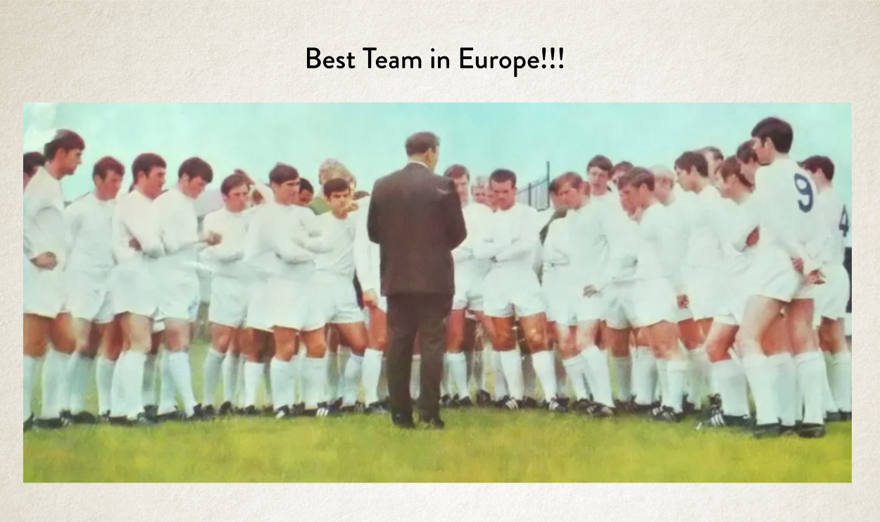
And he is where it gets even more interesting. On Friday night me and my good friend Mike were watching Leeds United play — something we do on the regular over facetime. We won, by the way.
But afterwards I wanted to show him the power of Sref; I love the fact that he takes interest in my work.
So we started with this picture here. Yep, vintage Leeds United team photo.
It’s an awful picture in terms of quality, but it completely says 1970s, it has that perfect blur and colouration. It’s so time-specific.
So, I asked him what he wanted to make from that photo. Suffice it to say we’d had a few beers watching the match, it was Friday night after all. These were our examples. Quite daft, I know.
But amazingly aesthetically-correct results based on the original reference. It sort of blew our tiny beer-addled minds.
So I now hope that example has got your brain cogs whirring, of how I can make anything aesthetically-correct! All by just using the correct reference, some prompt-craft and a little bit of imagination.
So just off the top of my head, here are some random examples.
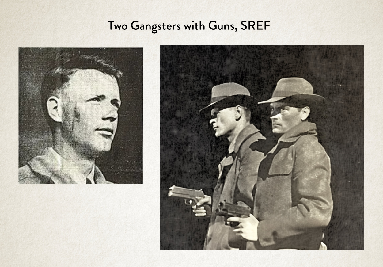
Imagine we have a book about a 50s newspaper journalist that’s investigating a case involving two gangster brothers. We could find an old photo from a newspaper and try to go with that aesthetic.
Or maybe we want to get a vintage look from a really old romance novel with that lovely muted palette. I didn’t really ask for David Hasselhoff on the cover, but fair play. I was a big fan of Knight Rider as a kid.
Or maybe we just want a really strong fun colour palette and even an angle from something we’ve found but with a completely different subject.
So it’s a wonderful tool for thinking about how we can get source ideas to inform the aesthetics of an image for a book cover.
Important Reason #5: Aesthetic Uniqueness
A few years ago, when I was limited to stock images there was a rash of book covers that use exactly the same image in different ways. It was unavoidable. Completely. Simply because there were only so many really good images to go around. And the best images got used all the time.
It made me super duper happy when AI came along, simply because I started making images that were completely unique that no one else was seeing. Because all the images were made from scratch, by my own hand.
Authors were no longer going to get the same image that someone else could come along and use for their book cover. It was great.
Side note: In fact, I seem to be getting more and more authors coming to me, which have got covers from three or four years ago, when we used stock images, saying to me that another author (or readers) have said they’ve used the same image. Well, yep, it’s a stock image. And I think authors and readers feel that way, because there is a lot more AI, utterly unique stuff out there.
So AI has made my work unique and specific to that very book, and that book alone. I love this fact because it’s an advantage to the author. It matches the uniqueness of their book!
But what Sref means is, not only that the image can be unique, but all my aesthetics can also be unique now. I’m no longer reliant on some sort of style prompt such as ‘Illustration in Watercolour & Ink Lines’ ‘Highly-detailed cartoon illustration’ or ‘Simple vector in the style of a corporate logo’ or what-have-you. Which made unique images but with somewhat similar aesthetics but now I can also change up the aesthetics as well.
Unique aesthetics for the win!
Important Reason #5: An Aesthetic Singularity
Something that gets talked about a lot when it comes to AI, especially AGI (Artificial General Intelligence), is something called The Singularity. That’s basically the wonderful or the super-scary point, depending on your viewpoint, when AI surpasses human intelligence. In terms of General Artificial Intelligence, it’s the point when the AI is smarter than any human so it starts creating, coding, training itself to be even more smarter, and smarter, and smarter, and so on.
Sref is a game changer, completely, but is it the graphical equivalent of the Singularity? Nope. Definitely not.
But the feeling I get from it is that from an aesthetic point of view. Yes, it is. We’re getting styles from MidJourney that no human could think of, and definitely couldn’t execute.
It has this wonderful feeling of treading into the aesthetical unknown. Like we’ve passed a point where things are going to get rather wonky and wonderful. I’m already seeing other AI art’s work which are things I couldn’t not imagine and I’ve never seen.
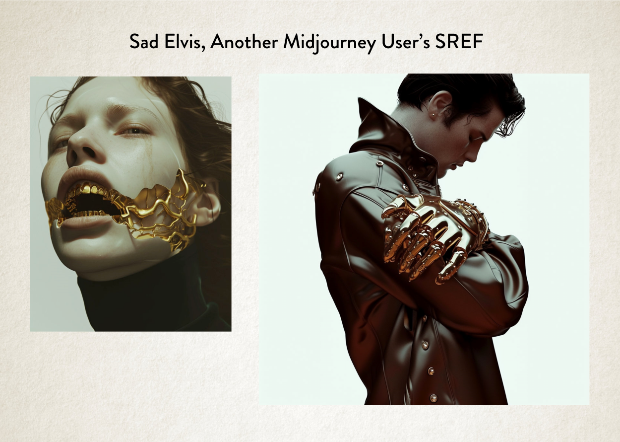
Another thing that happened on Friday night, when I was showing my friend Sref, I was showing him what other people in the MidJourney Community were doing with it, to get this same point across.
How we’re now in that wonky and wonderful post-human aesthetic world.
The original isn’t one of my pictures. It’s someone else. But we then went ahead and used that image to make — you guessed it — a Sad Elvis.
To me this is next level stuff. This is the point where things really start to get interesting when it comes to aesthetic exploration. It’s beyond what we as humans could think to execute.
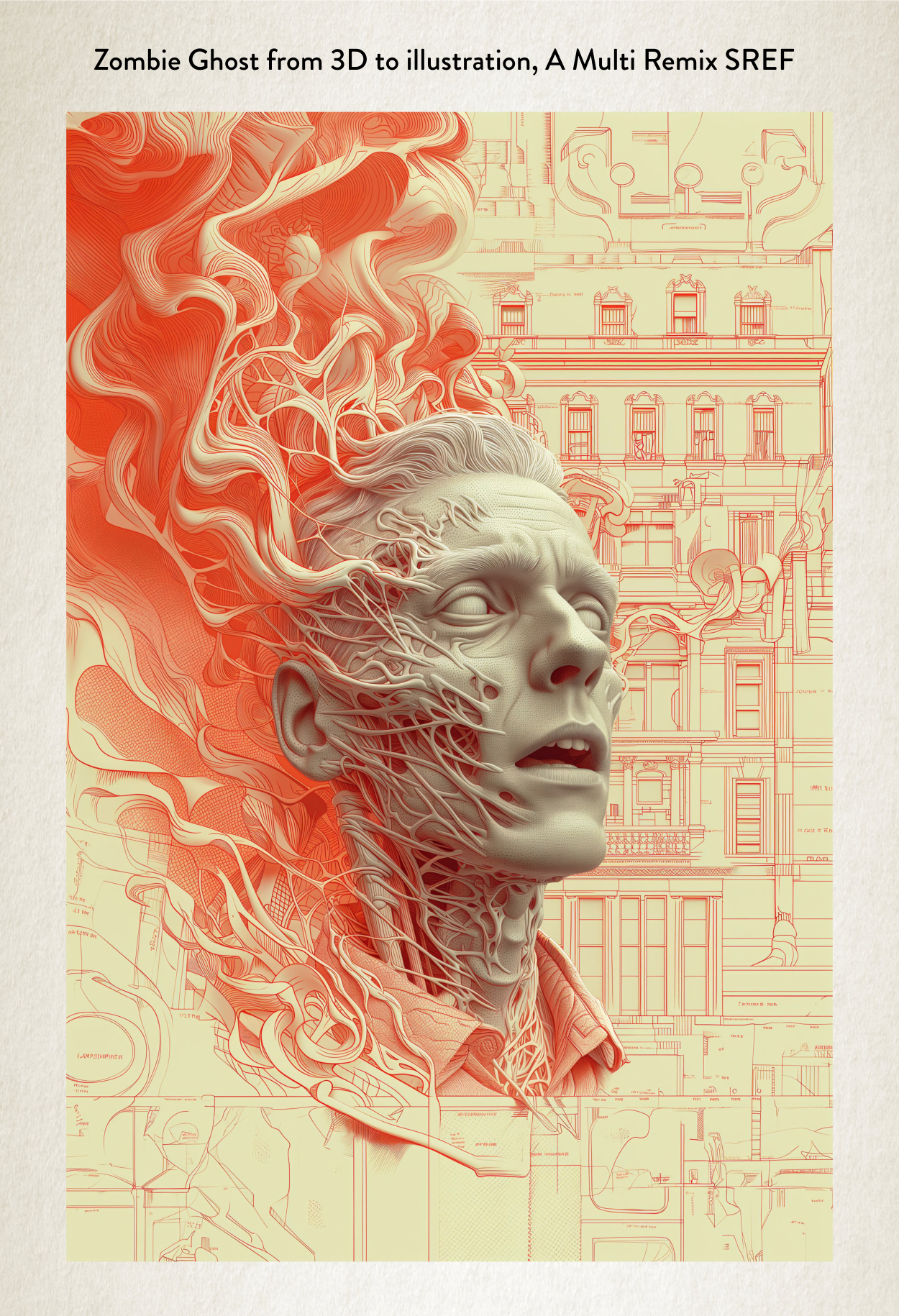
Here’s another thing I made from a remix of a remix of a style from two images for a commission I did last Friday, using Sref.
Again beyond what I could even imagine in my head. And that’s the point, if you can’t imagine the aesthetic in your head but the AI is creating it then we’re in new creative territory. We’ve crossed some Rubicon, for sure.
Something that gets levelled against AI image generation by those that don’t understand it is that everything it makes is soulless. It’s a phrase that gets regurgitated all the time. It hasn’t been made by humans so it’s therefore soulless.
There is an obvious flaw in that argument, due to the fact that it’s me playing with the AI, it is a human making it. It’s all my artistic journey. But what those people really fail to understand is that humans connect with the tone of everything. Those feelings come for the most part from the aesthetic presentation, as well as the subject.
Yes, a lot of the earlier AI stuff was very samey. All had that same aesthetic. Some of the non-MidJourney generators (Dall-e I’m looking at you) still suffer from this problem.
What these people were saying was: this image has an AI aesthetic so I don’t like it.
The line is still being touted out without much meaning behind it any more.
But things have passed that point now. Sref is an even further journey into that unknown, using human play and discovery. Little artistic journeys. If I wasn’t busy as a book cover designer, it’s actually what I’d be doing. Playing all day with Sref.
And there is an irony at work with that future Elvis image, which is perfect one for me.
It’s cold, sad and sterile all at the same time. It’s almost the perfect representation of lonely and cool in equal measure. As if the image is the soulless future the anti-AI brigade are scared of. But at the same time, it’s emotive. The tone is great! I love the dichotomy of the image, it stirs something in me intellectually and creatively. Which is what good art is about. Right? But it was made with AI.
But it did take me and my friend about about 50 or 60 generations to settle on this final picture. I didn’t magically get that Elvis on the first try. It was our journey together.
So that’s what my next blog post is about, how the process actually works with my authors if they commission me. Because it’s worth chatting about.
So I better finish this post here and get on with finishing that one. Which I actually started before this one but then started writing this one instead, so I could play with and talk about Sref. I was that excited.
So, catch you next time when I talk about my process using MidJourney.
Kindness and smiles,
James
PS If you feel I’ve used the word ‘aesthetics’ a bit too much in this post, then spare a thought for me. I’ve had to type it all these times. It’s a horrid word to type.
PPS The next thing that’s coming down the line with MidJourney is called Cref. It’s at the top of their development list. If ‘S’ stands for ‘Style’ what do you think ‘C’ stands for? Yep that’s right: Character. Could be interesting for people wanting the same character on multiple book covers. It’s definitely interesting. No doubt I’ll talk about that when we get to that point.
So over the last week I put out a survey to all my authors on my mailing list and most of the answers have come in now and I thought I’d share this information with the wider community, because it definitely makes for some interesting reading.
Some of the results surprised me, some didn’t at all, given my feeling for the whole topic. Some of the results might even surprise you. But definitely some of the assumptions about AI I found wildly off-base.
So I’m going to share my thoughts along with all this data. My interpretations of it and what I feel authors are getting wrong and right about it.
But please don’t shoot the messenger, eh? And by all means argue with my interpretations in comments.
And just for clarity, my newsletter went out to a few thousand people and I had a few hundred people respond to the survey which I think is a good enough sample size to get some good opinions. But I have to also say that any time I’ve mentioned AI on a newsletter I’ve had ten to fifteen people unsubscribe, so I don’t know how many of the truly anti-AI people I’ve cleared out.
So grab yourself the biggest pizza you can find and get ready to find out what all your fellow authors think about AI.
How much do you know about AI?
A moderate amount – 43.2%
A little bit – 26.1%
A lot – 21.6%
I’m obsessed – 5.7%
Nothing – 3.4%
This one really did make my eye’s pop out of my head like I was in some sort of cartoon. If you add the ‘moderate amount’ to the ‘A lot’ figures we’re talking about almost two thirds of the authors thinking they think they’ve got a good grasp on this topic. Wow!
To put it into context, I’ve been trying to devour as much information as I can on this subject, time permitting, and if you asked me the same question I would definitely say ‘A little bit’ without fail.
It’s a subject that’s fast moving, ever changing and it’s super hard to keep up with it. Even with what are this week’s new developments. Actually on this point, one thing I like doing is following @rowancheung on twitter because he does a neat little weekly round up of that week’s developments. And then if something piques my interest I investigate more. He’s worth a follow, for sure.
I’ve also got a couple of friends that I take for lunch as well that are actually experts in this field and try to pick their brains about the subject, and ask questions which usually result in disdainful pitying looks.
I feel daft, but I’m learning. I think you have to allow yourself to feel daft to learn.
I guess people like to say they know more than they actually do. I’ve always been in ‘the wise man is the man that knows what he does not know’ camp.
Does that make me wise? Yes it does.
Just not about AI.
Anyway let’s crack on …
How do you generally feel about AI?
I think it’s someone good – 45.5%
I somewhat think it’s a negative thing – 28.4%
It’s amazing, I love it – 13.6%
I’m utterly neutral – 11.4%
I loath it with every fibre of my being – 1.1%
This also surprised me. Only thirty percent of you really don’t like it. Fair enough. And then the other seventy percent don’t mind or like it. To be honest I thought that this would be more fifty-fifty. Or even have these numbers flipped. 70% hate, 30% fine.
For all the noise out there on social media and in self publishing blogs about the subject I thought that would have translated into more hate. I guess angry people scream the loudest, and everyone else just quietly gets on with it.
How do you feel about how informative I’ve been with all this AI stuff coming through? And be honest, I try not to get offended.
You’ve been brilliantly open and informative about it – 78.4%
You’ve given some information, three stars, try harder – 18.1%
I think you’ve been somewhat confusing or disingenuous – 3.4%
Thanks. And I will try harder. I mean this survey and my thoughts is a good start, right? RIGHT? But yeah, moving forward I might start talking about other AI writing related topics as well, not just what affects me with the book covers.
How fearful as a writer are you about AI replacing you?
Just a bit, it’s going to be a bumpy ride, but it’ll be fine – 38.6%
Not at all, I can’t see it replacing my unique voice – 30.7%
Somewhat, I think Amazon will be flooded with content – 28.4%
Very scared, I think I’m going to be completely screwed – 2.3%
Firstly, I love these answers, because they’re very positive and I would say they’re probably about right. It’s going to be somewhat of a bumpy ride. Lots of missteps will happen.
I think there will be a certain flooding of content on Amazon but they seem like they’re already on top of that. So personally I wouldn’t worry too unduly about that. I mean it’s a crowded market place even if people are just writing all those books without AI. I’m sure you all know that.
But what I’m going to say is that people connect with people. It’s always been that way and always will be that way. If you have a book that connects with people, it always rises. I’ve seen that time and time again with the books that I’ve done book covers for.
And further to that, actually the authors that I’ve seen that happen with are generally more personable with me, so I assume they are with their readers / fans.
It’s always been about human connection, always will be.
Write books that connect. And make sure you connect with your readers. Oh, and connect with your book cover designer.
Or anyone else that can help you, for that matter.
People.
How do you see AI lasting?
It’s here to stay, so I better get used to it – 79.5%
No idea, I can’t guess – 13.6%
There’s some hype but it’s probably a fad – 6.8%
It seems wrong so will probably be outlawed – 0%
It’s a flash in the pan because it’s no good – 0%
Not much to say about this apart from the fact that it’s nice to know that most of my authors are rather pragmatic and secondly, what? I couldn’t tempt any of you with ‘flash in the pan’ and ‘it will be outlawed’. Not a single author thought either of these things would happen! This is rather telling.
You might have heard of some famous books being used to train AI models but do you think any of your own data is being used to train AI models (such as photos you take, books you upload, social media posts, and other general data you leave behind on the internet)?
They probably are, yes and it makes me angry they’re using my data without my permission – 28.4%
Maybe they’re not, but I’m unsure – 20.5%
They probably are, yes, I don’t care – 21.6%
I don’t think they’re using my data to train AI – 20.5%
No idea, don’t care, if they’re using my data to train AI – 9.1%
This, to me, is probably the most interesting question of all out of all the questions I asked. And you’re not going to like my thoughts on this subject. But I’m going to be honest with you all.
The only people that answered correctly or truthfully were those that said. “They probably are, yes, I don’t care.” or “No idea, don’t care”.
Let me explain why.
Firstly, a lot of people left comments on the section at the end of the survey expressing notions of AI models being trained on data where people haven’t consented and that it was a violation. My thoughts on these answers tie into that.
Do you know yourself what you have consented to already? Do you actually read the terms of service on all the things you use online? I mean really dig down into what you’re consenting to that corporation doing with your data. I would say 99.99% of people just simply click on ‘agree’.
And the bitter truth is ‘consent’ is exactly what you’re doing when you click ‘fine, I agree’.
As creative you might post your works of art on KDP, DeviantArt, Spotify, or wherever, but also you’re generally consenting for them to use that data in whatever way they want to use it. It’s the price of putting your creations out there. Data is just too valuable to them for them not to have access to it. Or to sell on.
I think a lot of this gets mixed up in notions of copyright and privacy. But from a real legal standpoint, consenting to place your data on their websites does mean you’re giving up certain rights. It’s what the social media websites have been doing for years with your posts about what you had for your dinner or photos of your cat doing a funny pose. Using your data to train AI models.
My rule has always been: if you don’t want to give them access to your data don’t put it online.
I’ve judiciously avoided putting photos of myself online, or letting people take photographs of me and tag me. I don’t put any social media stuff up there either. I simply don’t like the thought. I’ve always operated with the principle that your data will be used.
It’s sort of interesting with multimodal AI models that are coming along (multimodal means like text, audio, pictures, video, etc all at once). One thing I thought was this. What if there was an AI app on your phone where you held up your camera at someone and simply said to it: tell me about this person. And it summarised you, and everything you’ve left behind online. How would you feel about that?
Is that possible now with today’s AI technology? Of course, there will be somewhere working on that project.
I think a lot of the regulations that governments will be working on might be to do with things like this. Because that idea creeps me out. But at the same time most people have given over that level of data.
But at the same time, it would come up with a blank if you stuck that camera in my face and asked it about me. Because I’ve not given over enough data.
Yes there is a photo of me on my website but it’s out of date and doesn’t really look like me for a reason, even though it is me.
I can’t remember what the figure is but each individual in the western world generates GigaBytes of data every day, TeraBytes every year!
Do you think all these services are hosting and processing all that data for free? Nope, they’re doing that because it has value to them. And that value is not just for selling adverts, because they’ve always known that data was more valuable for machine learning (which is what AI used to be called). It’s always been the case. Google was working on these sorts of projects 15 or 20 years ago.
So with all that said let me ask you a hypothetical question: if you knew Amazon was handing over all your book data for training to AnthropicAI (which they invested billions in the other week), would you take your book off Amazon? Or would you accept that as a cost of doing business with them? Where else could you take it to sell?
Are they doing this? I have no idea and I’m not going to speculate.
But the question I always ask is: would it make business sense to do that? I always assume that corporations are acting with shareholder value in mind. Nothing more.
I say this because it’s sort of interesting to think in these terms.
I think that a lot of authors, because Amazon has been good for self-publishing, have positive feelings about that corporation. But I think they’re as bad as Spotify. And if you know the history of how Spotify came about and how they operate you’d know that’s bad!
Monopolies have you over a barrel when it comes to your data. That’s just a pragmatic fact.
Personally, I’d love for there to be some viable alternative to KDP for authors. Like there is with Spotify, which is Bandcamp, who properly compensates musicians and doesn’t use that data in nefarious ways.
I’m not hopeful. But we can dream.
Sorry for the negativity. The truth is sometimes a bitter pill. But yeah corporations are never ethical.
And now I think we need to move on from this one, because I could talk about this subject for hours.
Do you use AI tools to write?
I use light editing tools with minimal AI – 53.3%
I make sure I avoid all AI tools – 25.1%
I use editing tool, and prompt tools to come up with ideas for my books for characters and storylines (such as Chat-GPT) – 18.2%
If I could get AI to write my whole book I would – 3.4%
It’s interesting that around twenty percent are already embracing new AI tools that are available. I would have thought that this would be less.
But it’s interesting to also note that people understand that AI has been around for a lot longer than just the current hype. Because yes, things like, the Gmail and Google Docs ability to spot grammar mistakes is because of machine learning. In fact, a long long time ago, maybe 15 years ago Google decided to scan all the books on earth for this very reason. I remember authors kicking up a stink then thinking they were going to be a competitor to Amazon, when what they were doing was training AI models. All this stuff has been around for a lot longer than most people think.
Also ‘bravo’ for the three percent of people just wanting AI to write their books. But as we’ve already established, it’s probably not going to happen.
If you could write a whole high-quality book with AI by prompting it with your own imaginative ideas would you?
48.9% Definitely not
30.7% I’d be tempted to look at what it could do
19.3% Yes, but I’d have to stamp my own personality on it
1.1% Yes, that would be ace, I’d just count the cash
Also I really like the fact that so many of you would be tempted to have a look at what it could do. I think some of the 50% that said they wouldn’t be tempted are liars! Come on, you’d just have to have a sneak peek. Surely. Curiosity is at the heart of any creativity and imagination, surely. Or maybe that’s just me.
And I love the bear-faced laziness of one percent of you telling me they’d just sit back and count the cash. That made me smile. So thanks for that. Ha!
If you had to guess, hypothetically, how long do you think it will be before an AI could write a full novel to the same quality as you, given you could give it enough prompting?
22.7% No idea, can’t guess
20.5% Three to five years time
18.5% By next year
17.0% It’ll never be able to. Write as good as me? Pah!
15.9% In two to three years
5.7% Around ten years
Even with all my investigations into this subject I would have to say that I’m completely in the ‘No idea, can’t guess’ camp too. Really, no idea. But what I would say is that the ‘By next year’ people should have nothing to worry about at all. And the around ten years camp is probably closer to the truth. Maybe.
But having said that, I honestly think that people won’t connect as well to these full AI books that are written, simply because AI will never understand the nuance and subtlety of emotion like humans do.
But I think over the next few years you’ll see a lot more hybrid approaches with AI models like Sudowrite’s Story Engine. And that will only improve.
Which AI tools would you use to help you with your writing whether they exist now, or in the future? You can select more than one.
Because this was a checkbox answer then each answer stands in its own right, as a percentage of the total number of people that answered, I’m going to go through them individually with my thoughts.
79.5% Editing AI Tools
Only 20% of you didn’t want AI editing tools and this makes me happy because I honestly think this is where AI can actually be quite a powerful thing to augment the writing process. It’s something that could be used for you to improve your craft and to spot things that you might have missed.
65.9% Marketing / Advert AI Tools
But this answer sort of depressed me. Two thirds of you think that marketing is the key to success. I guess in a crowded market place you want to be seen. But really, you think this is more important than storylines? Or research? I dunno, maybe it’s just me. But what I’ve seen time and time again is that well-written books eventually get traction. No matter how much marketing you throw at something, if your craft isn’t good enough it’ll never work. I know because I write bad books. Ha! So I know from bitter experience.
40.9% Research Help AI Tools
This sort of tool is actually the thing that appeals to me most about AI, the ability to get answers to research questions distilled pretty quickly. It’s quite interesting, about 10 years ago I spent 18 months researching for a novel I wanted to write which was set in the holocaust. I read about 20-30 books and made extensive notes. It took me forever and I never even wrote the thing. But it would have been nice to have a tool to help me with that, whether I wrote the book or not.
38.7% Trailer Video AI Tools
Are trailer videos still a thing? Quite surprised by this answer. I think, in all honesty, I asked this question because I wanted to know if they were still a thing. They are!
33.8% Audiobook Narrator AI Tools
Boom there we go, another set of people handed their P45s (for you non-Brits, that’s the piece of paper you’re given when you’re fired). I guess anything that is a large expense for any author is going to be on the chopping block.
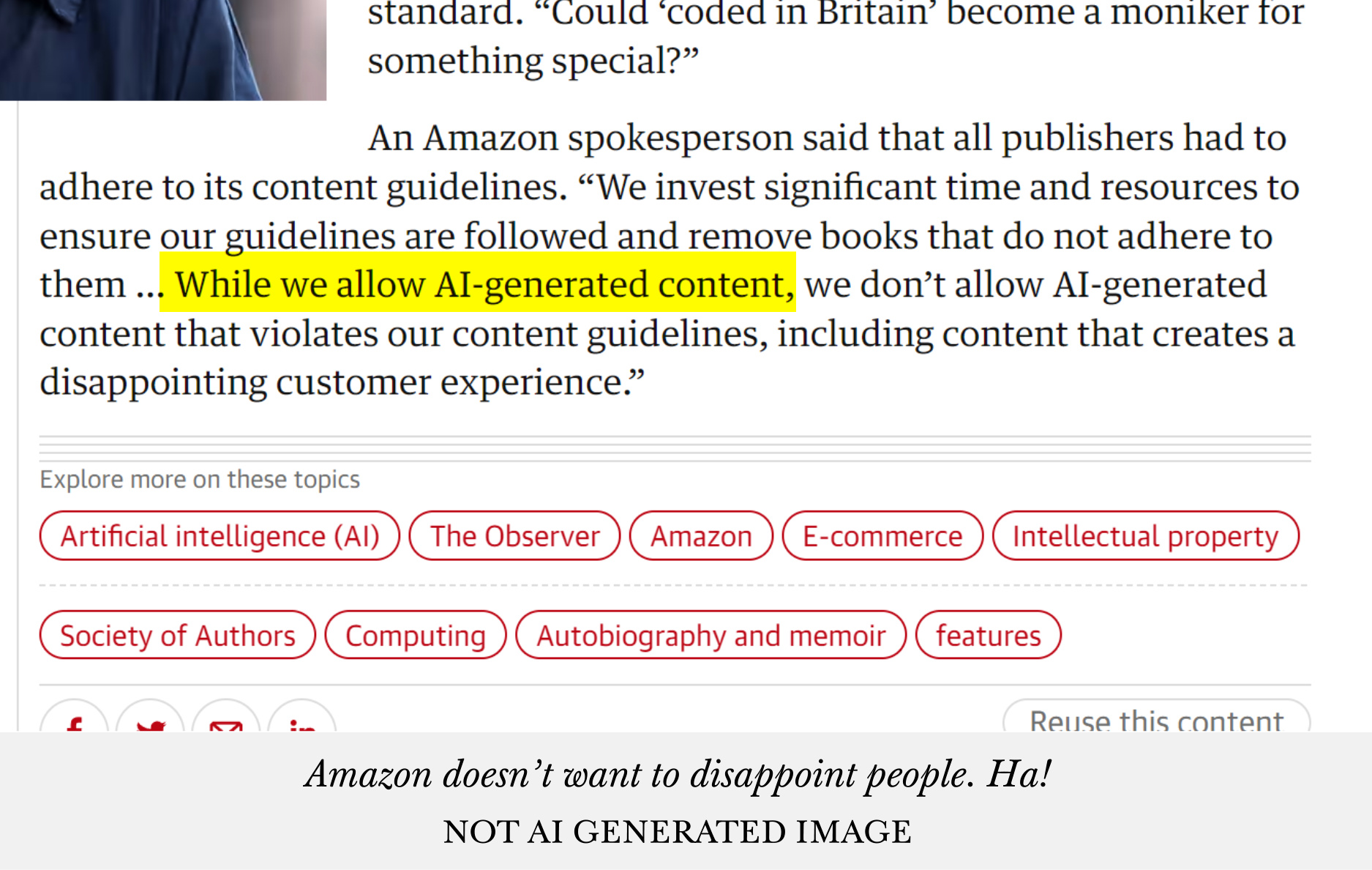
32.7% Book Cover AI Tools (i.e. putting me out of a job, ha!)
Traitors! A third of you are pure Judases. A pox on your name!
Okay, I jest, I’m pragmatic enough to know that I’m not going to last forever as a book cover designer with AI coming along to eat my job. It is what it is. You only have to look at what Amazon announced this week with AI generated product iamges to know where my job is eventually going to end up. I’m not a man that puts his head in the sand.
31.8% General Idea / Writing Prompt AI Tools
I remember right at the start of the Kindle revolution 11-12 years ago there was this massive spate of articles about ‘Writers Block’, it seemed like every single blog I went to, or every single forum post was about this subject. So I guess the whole thing hasn’t really gone away because there is still a third of you who would want tools to inspire with ideas. Fair play. Inspiration is always good.
24.8% Storyline AI Tools
Also this result makes me happy. Over the years when addressing you all, I’ve always used the expression ‘authors’ but it’s not really what I feel about writing at all. I always think the correct expression is ‘Story Teller’. But that’s a bit clunky to use. So the fact that 75% of you don’t need any help with the storyline is good news. Tell those stories.
22.7% Character Development AI Tools
Me, I like people, but I’m awful at writing about them. Developing them, fleshing them out. This tool would be bang at the top of my list after editing tools. I guess you’re all better than me at writing and I should stick to design. Thanks.
5.6% NONE
And this result somewhat surprised me. Because one third of you said that you felt negatively about AI but you’d still use it if there were tools that helped you. Only five percent are sticking to their guns. I guess that’s human nature though. I don’t like it, but if it’s helpful I’ll use it.
What’s your feeling for Book Covers that have source graphics which have been generated with AI?
If the book covers is good enough I’m not bothered 31.8%
At the moment I’ve avoiding them, let’s see what the future brings 26.1%
I’m neutral 21.6%
I love book covers made with AI because I’m getting something unique 12.5%
I hate hate them and avoid them like the plague 8.8%
This result didn’t really surprise me, because honestly, I had this vision in my head that people were fifty-fifty when it came to whether they liked AI on book covers. What did surprise me though was the fact that a quarter of you are worried about AI covers for some reason. As if at some point Amazon is going to say ‘no’. As you’ve seen earlier, Amazon themselves are now using AI image generation for product adverts. So I hope authors realise that actually what I’ve been saying all along about AI is coming to fruition and really, there won’t be any problems with AI being used on book covers. Because there won’t be.
If you do not want to use book covers that have had any AI work on them, why?
No, I’d use AI, I don’t care 50%
Because I think it’s cheating and unethical 19.3%
Because I think Amazon might ban my book 14.8%
Because I don’t think they look as good as stock image covers 10.2%
I worry other authors or readers might target me for that 5.7%
So yeah my fifty-fifty gut feeling was spot on again here. Gee, I’m good! I love it when I’m right.
But let’s go through the negative answers because it allows me to go through some of my thoughts on the subject.
The ‘ban my book’ brigade I can understand to a certain extent, because you’ve worked really hard on something for maybe years and then you put all the effort into marketing, get a stack of reviews, and suddenly your book is taken down. It would be super frustrating. I know what it’s like because I had a book up on Amazon that had 50ish reviews and it was handed over to my old publisher and when I tried to get it back I couldn’t and I lost all those reviews. I was livid.
But let me tell you in no uncertain terms: Amazon will not ban your book for AI.
Here’s my reasoning:
1. They’re asking you if you’ve used AI, don’t you think if they’d wanted to ban books like this they would have already come out and said it rather than just asking.
Amazon, like you, only cares about KDP not being flooded with low quality products. And my covers are not low quality, thank you very much.
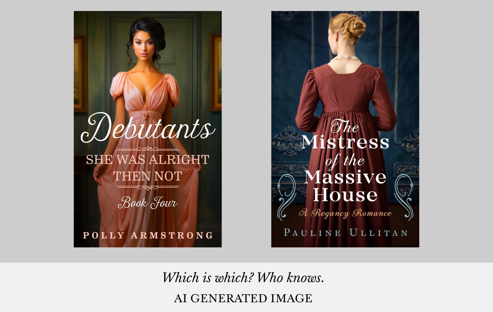
Next, the ‘not as good as stock image’ people. All I’m going to do is leave this here. Tell me which one is the AI cover and which one is the Stock Image one.
Of course, about a year ago AI images weren’t that great. In fact, I’ll let you into a secret, when I look back at some of my MidJourney v3 book covers that I made I cringe. And cringe hard! Even v4 covers are a bit ropey. The current versions I’m a lot more happy with. But maybe when v6 comes out, I’ll start cringing all over again at v5 images.
Next, yeah, I’ve seen a few posts about the ‘pitchfork brigade’ out there targeting authors for using AI. Twitter is really the worst for this sort of polemic horridness. I don’t know what makes people do this and I think it’s a bit short sighted and daft. Because such things might come back to bite them in the backside. People in glass houses and all that.
Because I imagine all these authors that have nothing better to do than to say ‘Down with AI’, and I’m going to target other authors, don’t know what they’ll end up hypocritically using that contains AI models that help them in their writing journey, in one year, in two years, in five years.
“Well I used this, but it’s not the same as those other authors that use AI to do X, Y or Z,” they’ll rationalise to themselves.
Or is it just book covers that count? Yeah, right.
And finally the twenty percent that said ‘it’s cheating and unethical’, firstly, the ethical dimension we’ve somewhat covered earlier to a certain extent with data and consent.
But as a book cover designer I’m really torn somewhat about this ethical dimension.
Let me explain some of my personal thinking on this subject.
Firstly, I just want to make the best book covers I can, so if AI allows me to make better covers for my authors, screw the ethics right? I’m doing better work. My larger ethical responsibility is to my authors. If you had a chance to save your own family or save a city of people you don’t know, who would you save? Your family, obviously. Ethics go out the window.
Second, I’m bored of Stock Images, I’ve seen them all before, a hundred times. Dull dull dull. I have the responsibility to myself that I’m having fun doing my job, and AI has been a godsend after ten years of making covers. A new challenge. A fun thing. A thing where I’ve actually been able to imagine cool looking images in my head and actually make them real! Where previously I was hamstrung by what was available with stock images. Selfish I know. James, enjoying himself. Heaven forefend.
So let’s think about who AI Image generation is harming? All those people that spent a lifetime learning a craft and now the AI can actually replicate somewhat they learnt. In some instances it surpasses it. They’re on the scrapheap and to think about what it’s like for those people. What they’re going through is horrid.
It’s something I’ve thought about, do you know why? Because that’s me too. It’s coming for book cover designers. I’m going to go through exactly the same thing. THE. SAME. THING. I’m under no illusions about that. So I can feel for them. But at the same time I’m gonna enjoy book cover designing whilst it lasts, because I do love my job.
And do you want to know how I feel about my demise? Nothing. Simply because it’s an inevitability. Getting angry or being sad about it isn’t going to help. I’m pragmatic. So I need to adapt or die. Things change. We’ll get onto this subject a little later.
And those that think I’m ‘cheating’ by using AI. We’ll chat about that too in a little while. If only.
Do you think readers care if a book cover is made with AI?
No because I don’t think they can tell these days 34.1%
No because they just care about the writing 33.0%
I don’t know but I don’t want to take the risk 13.6%
I don’t know and don’t want to think about it, whatever 10.2%
Yes, and they’ll avoid my book if they thing it’s made with AI 9.1%
This answer was interesting, because I think you’ve probably got it spot on. I think where AI image stuff is as of today, people can’t tell. Maybe 9 months ago. Yep.
Also, there are probably a hundred commissions out there which I’ve designed, over the last six to nine months, using AI for source material. And they’re wildly popular or at least have hundreds, if not thousands of positive reviews.
And I’ve not had one single author come back to me and say: this book cover, readers are accusing me of using AI. Not one.
Readers don’t care.
Well they do, they care that you’ve written something that connects with them, and they care that the book cover has caught their eye and imagination enough to investigate.
Which do you think it takes me longer to make? A book cover with A.I. or Stock Images?
Stock Images 19.3%
AI Images 14.8%
Same about of time 29.5%
No Idea 36.4%
Kudos to the third of you that said ‘no idea’. But I’ll tell you something, in all honesty I would say that AI covers take longer to make. Usually 2-3 times as long to make. Because you generate so much dross to get to something usable. And that’s not taking into account all the time I’ve spent playing and experimenting with MidJourney to really understand how it works.
The assumption is that AI is somewhat magical, super fast and comes up with that perfect idea that you have in your head every time. If only. Anyone that’s played around with AI image generation will know what I’m talking about.
So the answer is: more time but better results. And results is what I’m about.
If there was a cheap AI tool in the future that you could chat to about your book, or even feed your book into, and it could come up with your perfect idea for a cover would you use it? And don’t worry about offending me, I’m quite pragmatic about being replaced at some point. And this might be helpful for me to reframe my own work.
Maybe, or at least I would see what it could do 44.3%
No definitely not, because my idea for a book cover might not be the right idea to catch potential reader’s eyes. It’s an art in its own right. I’ll never leave you, James. EVER! 33.0%
Yes, but I’d want a second opinion in a consultancy capacity from someone else that knows what they’re talking about, i.e. you! 15.9%
Yes definitely, because it would make my life easier 6.8%
I love people’s honesty to this question. Only a third of you would stick by me for your book covers. To be honest with you all, this is what I would have guessed as well. If there was the perfect tool out there then I’m down to a third of my work which is probably not going to be financially viable for me. Better start thinking of some Plan B’s. Don’t worry, I am. Some second jobs, I’ll never stop designing for that third that still wants me.
How do you feel about my latest AI pre-made cover offerings?
They’ve been great, I’ve just not found ones that fit my book 75%
I would have loved more stock image pre-made covers 25%
Interesting, I would have thought it might have been more 50-50. But yeah that gives me something useful to go on in terms of doing more Stock Image pre-made book covers. 25 out of every 100. Cool. On it.
Hypothetically, if you were getting a commission from me would you want me to use AI?
Maybe, if we can’t find the right stock images 44.3%
Yes, definitely because I really want original work 31.8%
Definitely not, stock images only 23.9%
This is a brilliant answer. And it’s actually a truer answer than you probably guess, or at least from my experience. Which is, 80% of you do want AI on a commission.
For all the 50-50 of authors liking and hating AI, when it comes down to it, it’s needs must.
I actually chat to 3 or 4 other book cover designers behind the scenes. I’ve never seen them as competition and more like contemporaries. And it allows us to share our ideas and findings. A bit of support for one another.
And everyone has said the same thing as I’ve found, 80% of the time authors are happy to use AI when it comes to commissions.
So when you think about all those new books coming out with great covers, probably 80% of them have AI elements somewhere on there. And I bet you couldn’t pick those book covers out. Unless they’re really badly designed.
Behind the scenes AI has already taken over, helping us designers, probably without you knowing.
You pour your heart and soul into your books and likewise I pour my heart and soul into making book covers, but how do you honestly feel about me using AI?
Positively, because I trust you to make good work 36.4%
No Bothered 31.8%
Slightly negatively 27.3%
Very Negatively 4.5%
And still, there is a lot of negativity about AI. I don’t like the idea that people feel negatively about me. I guess you can’t please everyone, all the time. And honestly at the start of this post, I think I’ve cleared out a lot of the haters from my mailing list because I have been so informative about this topic. I guess I’ve picked my lane. Try to inform.
And finally just for a bit of fun. How long do you think AI takes over my job and GoOnWrite? Just as a guess. Just for laughs. Don’t worry.
Never, because I’ll always come to you for advice 39.8%
Two to three years 19.6%
Five to ten years 19.3%
Three to three years 18.2%
Within one year 3.2%
I love the fact that 40% of you want to stick with me. Makes me feel happy.
I guess it would be fun to know what my guess would be, right? How long it will take for something to make ace covers. Well, here goes, 3.2% of you are probably right. I would say at some point 2024 there will probably be pretty good AI tools for book covers. And that’s me on the scrap heap! Hey, don’t write off so fast, please.
I’m going to temper this fact with a few things that you might find interesting.
Firstly, when it comes to commissions roughly about 50% of the time authors come to me and have no idea what they want on the cover, they haven’t got the foggiest, and it’s up to me to come up with the concept. 25% of the time they have a bad idea and I have to persuade them that they’re barking up the wrong tree, and we explore some different concepts. And 25% of the time they have a good idea and we do it. So that’s a whopping 75% of the time I need to come up with the concepts. AI is never going to be able to do that, or at least nothing human and imaginative.
Secondly, when it comes to pre-made book covers, you’d be surprised the amount of the time and author will spot one and it’ll be the basis of a brand new writing project for them. Because the cover inspired them. I know this because they tell me all the time. And it makes me happy. Likewise, AI isn’t going to be able to be that kernel of imagination I provide. Or at least, I like to think so.
So I don’t think it’s all bad news for me. But there is a big uncertainty about it.
If I get replaced by the robots, what job should I do as a Plan B? Yet again it’s a bit of fun. Come on, they can’t all be serious questions.
Get back to your own writing 45.5%
Open a chicked wing kiosk in Barcelona 20.5%
Start a new tech start-up with friends 13.6%
Start a Youtube / Twitch channel talking about your life 6.8%
Got back to painting portraits on commission 2.3%
This was a bit of a joke question at the end, but like any good joke there is a modicum of truth in there. I’m very much getting the feeling that I have to come up with some sort of Plan B because I think my work will somewhat be halved in a few years time. So I might be doing two jobs.
Firstly, authors worry about AI taking over their writing, but then most of you want me to do more writing. That made me giggle. I don’t think that will keep the wolves from my door. I honestly think the ‘Chicken Wing’ business is more of a goer. If I was a millionaire man of leisure I’d definitely do the chicken wing business because I’ve scoped that one out. It seems profitable. And I’m amazing at making chicken wings and dips. It’s something I’ve perfected over a lifetime.
I think doing some sort of tech start-up with friends is the most likely course of action, but I think maybe it would be to do with AI and writing. And you’ve already given me the answers to what tools you want the most. Ha! Sneaky that. Because I actually love this field, it’s full of lovely people.
And a few other suggestions people gave me …
“Teaching others how to use AI in the best way; consulting on designs and probably still some creating on your own while stubborn people catch up.”
“Editing ai stock images. I mean are they really ever going to fix the tweaked hands and lazy eyes” – they have already done that!
“Sidewalk artist and busker”
And my two personal favourites …
“Join the US Space Force and become a Saucer pilot.”
“Call Centre – cleaning and servicing the AI-bots answering the calls.”
And maybe that’s all my future has in store, cleaning AI-bots for 14 hours a day, whilst dealing with a dwindling client-base, in the evenings. Ha!
But until that happens I’m going to keep on keeping up with all this AI stuff and keep informing you all of my thoughts and what’s happening.
Okay before I start you might not have run across this word ‘semiotics’ and I’m not trying to be big and clever by using clever words. In fact, quite the opposite, I’m here to explain exactly what it means and why it’s so important when it comes to deciding what you want to put on your book cover in terms of imagery and the title. Basically it’s just a ten dollar work for ‘connection’.
But let’s get to it and find out what is all about shall we.
Hopefully this will be a lot shorter than my last few essays, so get comfy, grab yourself a coffee, but maybe just a small one, you know like an espresso or the like.
What an Author Wants Isn’t Always Right, and Always for Semiotic Reasons
Over the last few years I’ve designed hundreds of commissions and something that pops up regularly is at the start of the process an author will tell me what they want on their book cover and about 50% of the time my honest response is:
I don’t get it.
Then that author will proceed to tell me all the completely convoluted reasoning for the idea they have for their cover. They will go into complex and lengthy intricate detail about how X is like Y and then Z happens. And A. And B. And C. And I just sit there somewhat dumbfounded because they’ve misinterpreted what I meant.
I can see the image in my head, they explained well enough but I don’t get it. It doesn’t grab me, I’m left feeling confused and cold.
And that’s exactly what any potential reader will feel too, because they’re coming at it cold, too. Just like me.
A book cover designer should be that first line of defence when it comes to stopping these confusion inducing ideas. It’s what I do.
I don’t blame authors for coming up with these dissociative concepts for a book cover. They’ve spent months working hard on their book, they’ve been subsumed by it, and their great story. They’re inside looking out.
But what they fail to recognise is the fact that potential readers haven’t read their story. Yet! In short, the author’s idea does match the story but it’s very much putting the cart before the horse. Yes, that book cover will match the story.
But if the story is going to stand any chance of being read it needs to connect to potential readers first and it does that through the book cover.
I get asked to do this back-to-front way of thinking a lot.
And my response is: let’s look at this properly. Let’s have a look at how we can make those connections.
Sometimes it’s my job to persuade them that they have a bad idea, because there is no connection. It connects with the story, but that doesn’t mean it will connect with potential readers. And what’s more important? Connecting with the story or potential readers? And a lot of the time authors need to understand that you forgo connecting with the story, to connect with readers. Suck them in. That’s what a book cover is for. Although a book cover can’t be some sort of bait-and-switch, it needs to reflect the story, the genre, the mood. But reader connection is the most important part.
How do we do that?
Well, in steps semiotics to save the day, by adding some connective tissue between the story and potential readers connecting with the book.
That’s how winners are made!
One Hundred People Were Surveyed
Semiotics is basically a fancy word for the connections people make with certain words, images and symbols. And these associations are super important, because it’s literally the only way we’re guaranteed to make some connection with potential readers.
But I hear you tell me: it’s all so subjective, people have different life experiences, everyone will have different associations with different concepts and imagery.
This is true. I agree. I won’t argue with that point. So we need to hedge our bets.
But how do we do that? The best way to think about semiotics is to imagine that game show which in the US is called Family Feud and in the UK Family Fortunes. If you’ve seen neither, there’s loads of clips on YouTube.
But let me explain what it is.
It’s a game show where basically the questions always have the same sort of format. One hundred people were surveyed, top 6 answers on the board, name something you associate with X.
So as an example ‘100 people were surveyed, names the top 6 things people associate with witches’?
And then the families need to guess the answers to win.
So for our ‘witches’ questions the final board might break down something like this with the hundred people:
1 Witches Hat 33
2 Cauldrons 24
3 Black Cats 19
4 Spells 14
5 Broomsticks 6
6 Salem 4
That’s what the study of semiotics is, the understanding of the connections people make. How it breaks down across the board. The statistics of it.
And that’s how everyone needs to start thinking about their book covers. If you surveyed 100 people what would they think of your concepts? What connection they would make.
Making the Wrong Connection
A good way to explain this is probably to provide you with a bad example of how a semiotic connection can be a failure because it’s not been thought out properly.
A few months ago I had an author that had a book that was to do with a happy ending and they wanted a rainbow on the cover because there was maybe a rainbow in the story, I can’t remember. And I asked the author if it turned out that the main male character turned out to be gay and that was the happy ending and the author said ‘no’.
That was simply because as I came cold to the concept of a rainbow, I’m going to make my own connection. And I didn’t think that book was going to be about pots of gold, Noah’s ark, or any of the other things I’d associate with rainbows. I’d done the calculation in my head of romance + rainbow = maybe some sort of gay story.
It’s a blunt response, of course.
But that’s all we have to go on, when we send something out into the world. That connection people are going to make.
We could get into the neurological science of these cues we all have, but suffice it to say, brains are efficient machines, they make the quickest most efficient connections between concepts and the more we make those connections the stronger those concepts become stronger in our heads. It’s just how our noggins work! My word, I love these sort of nonfiction books. So I’ll shut up about it before I go on a real tangent.
Making the Obvious Connection
If you read my last essay about what makes a book cover intriguing then you’ll also realise that we can’t make things too obvious. You can’t just use the shortcut, i.e. your top answer, because people are not intrigued by that. It doesn’t offer enough fizz to your brain.
Imagine if every single romance cover just had a heart on it and was called ‘Falling in Love’ then Amazon would really be a dull place, or at least in the romance category.
I guess there is probably a good hunting or fishing analogy in here somewhere. If you’re trying to hook readers and you serve up the same bait all the time they probably get wise to that. You need to be a bit cleverer with your offering.
So there is a balancing act to be undertaken to make sure that your title and cover stand out somewhat, whilst still making good connections.
We have options.
Firstly, and thankfully, most author’s books aren’t just ‘they fall in love’, there will always be elements we can add to the cover to make it interesting, start making new connections with both things. And then we can balance the recipe of those connections to make them not too obtuse or too obvious.
Secondly, I’m a sucker for the third, or fourth, or fifth post popular answer on Family Feud style 100 people were surveyed-board.
And finally, if you’re designing your cover yourself, or you’re getting me to design that cover, the best thing to do is let go of that vision you had in your head, that scene from your book, or your whacky convoluted concept and start thinking in terms of how ‘out of 100 people surveyed, potential readers are connect to that image’.
It should look something like this:
Yep that’s right, not more than 2 or 3 concepts on there. Any more and the cover starts to get overly complex for the split second a potential reader will look at it. Seems simple right? Yeah, extracting the right ones and thinking how they’re going to work together is basically my job and half the fun of it cover design. It’s an art.
I’ve always tried to follow this way of thinking when designing my commissions or my pre-made covers, because what I understand without connection in the split second when I look at book covers, when browsing, I’m going to be left cold, confused and I move onto the next book.
No connection. No sale.
In Conclusion: My Advice to any Author
When you think about your ideas for a book cover I would sit down and play a little round of Family Feud / Family Fortune with each of the concepts you want on there.
Forget about your story, clear your mind and list the top five answers that people would associate with that image concept you have. If you’re coming up with a blank or if those associations have nothing to do with your story then you’re on the wrong track. You need to come up with a better book cover idea.
Because without thinking about how the wider world thinks and connects with concepts then you’re not going to sell as many books. No matter how wonderful your story is.
Thinking about it in this way is vital.
Book covers are the thing you do once you come out of your writing cave. Once you’ve left the story behind and you want other people to come into the world you’ve created. And you need to create the right signage outside of the place that is your story that potential readers connect with.
And that’s it. That’s what my job is. Working out those connections by talking with commissioning clients. It’s second nature to me.
But if you’re designing covers yourself, coming up with titles, it’s always smart to work out how those semiotic connections are going to play out.
And now you know how.
And that’s it. A short one today. That’s it from me.
At first glance, the concept of ‘intriguing’ seems somewhat of an ineffable, unquantifiable trait. Intriguing makes someone stop and want to investigate further and hopefully subsequently enjoy that experience.
But is it really that ethereal and out of our grasp or can we actually define it?
And when I say ‘we’, I obviously mean ‘me’.
This is going to be the fun task of this essay. So buckle up, we’re about to go on an interesting journey into the world of everything!
Intriguing is a concept I’ve always thought about in my artistic and creative life, whether designing book covers, making music, coming up with recipes, or even writing and selling my own books.
Also as an idiot consumer of entertainment I’ve always asked myself: why is my interest piqued by certain things, and not others? Why do some things work and others not? Why do some TV programs grab me and others I turn off after ten minutes, with an utterance of “boring, boring, boring!”
It’s a fantastic philosophical question. I could even go as far as saying: it’s an intriguing question. But I won’t.
I’ve also found it’s a subject that seems to pop up again and again in the books I read. Whether it’s pop culture, art history, art theory, psychology, philosophy, or even history and science. I guess because it’s always been rattling around in my head. A question I’ve wanted answered.
But it’s probably taken me most of my adult life to truly understand what’s going on, to be able to quantify it and come up with my own theory. But more importantly to simplify into a usable form. Something I want to share with you.
And maybe, just maybe, if I can define it for you then maybe you can use it in your life to harness its power.
It should allow you to get some more eyeballs on your book, by making people stop to look at your book cover, or even write better marketing copy, or maybe even write better books. And you can even use it to make more friends, by making yourself more intriguing. Okay, the last one might be a bit of a bold claim. But we’ll see.
There is a lot of groundwork to lay down so get yourself a nice big healthy smoothie and get comfy.
We’re going to go on a wondrous journey through a good number of opposites, but as we were talking about people, let’s start off with that.
Banal Vs Over Complex
Everyone knows boring people. Maybe you’re a boring person. I know I can be. Sometimes I’m talking about a subject and people just have that far away look in their eyes. But why do people bore us? Others not?
I remember when I was about 10 or 11 as a kid, there was an in-joke between me and my group of friends. One of us, I can’t remember who, had overheard a conversation in the P.E. block changing rooms, which went something like this:
So my group of friends would go around saying the most banal of things to one another. Pause. And then hilarity. The childish ‘Yeah, same here’ joke.
This went on for weeks. It still makes me laugh to this day when I think about it. But why was the banality so funny? It seems rather childish. But there is a truth at the heart of that in-joke, as there are with all jokes.
What we already know is utterly pointless. It’s funny that it is so pointless.
But why is it pointless to know: that someone doesn’t smoke, is having their dinner that night, or is quite predictably wearing their school uniform at school?
In short, banal useless information doesn’t really benefit us. We already know it. The sky is blue. People like sunshine. The sort of thing that politicians serve up to us, the masses. Better jobs. More prosperity! Free ice creams for everyone. Who’s not going to want that?
At the other end of the scale there is another type of information that people love to serve up and we just love to ignore too. It’s another way people bore us. It’s those that insist on telling us overly complex information that has no use.
You all know the sort.
Someone will tell you in excruciating detail the specifications of their new 850cc motorbike, their camping-slash-hiking trip to the Mesa Verde national park, the electrical circuit layout of the 320A Airbus aeroplane. When you’ve never ridden a motorbike in your life, you’ll never visit Utah or will have to fix the electrics at 30,000 feet.
It’s just a mass of overly complex facts that have no relevance to your life. In short, deathly boring. Not banal but just as useless because you’ll never actually use it. You tune it out.
And if we wanted to we could put these things on a scale it would look something like this. And because it’s a scale there has to be a sweet spot, right? Let’s bang that on there too.
But let’s not get ahead of ourselves here with that very good looking sweet spot. We’ll be returning to this scale throughout this essay.
But to summarise that’s why some people bore us: we already know the information or it goes over our heads. Either way we lack interest because our brains are not intrigued.
But why is this so?
The answer is pretty simple, it’s because that’s the way our brains have developed down the ages.
There is a Darwinist Imperative for this lack of interest. It’s how we survived as a species. Our brains are programmed for survival and survival is only based on useful information. If we expend energy on things we already know then we might miss out on new information that gives us an advantage for that lovely lovely survival.
We ignore the banal or overly complex.
Our caveman brains try to filter out the information we already know. That’s the feeling of boredom we have. It’s our brains saying, screw this for a game of soldiers. No use. I’m losing time on this rather than learning information that will help me put food in my belly or give me shelter from the elements.
Let me give you an example.
A group of cavemen (or cavewomen) are sitting around the fire (that’s just been invented) and one person is talking about how you properly skin an animal so that the toxic part of the animal’s lower intestines don’t contaminate the meat but you already know this. Everyone knows this. But at the same time a second person in the group is talking about a new rich hunting ground they’ve found. Because the first person is taking your attention then you’ll miss out that valuable hunting information.
And food!
Tuning out what we already know helps us glean new information, that puts us at an advantage.
Likewise, if someone is chuntering on about advanced spear techniques with hunting, and you’re the person that just lights the fire every night, because that’s your task in the tribe, your brain is saying to you: yeah, but this is not relevant to me. Too complex.
So next time you’re bored of a conversational topic, or part way through a film, you now know why your brain is losing interest. It’s looking for the next piece of useful information that will help you survive. Or at least the caveman part of your brain.
Our brains are trained to be intrigued by things that could give us an advantage and in turn we can use this fact, exploit it, to our advantage to intrigue others.
But how does that help me create something that’s intriguing, I hear you ask. Hold on there, not so fast, there’s quite a bit of extra work to do. A few more foundations to lay. But this is a good start and a good thing to remember, as we move forward.
So let’s leave the cavemen and cavewomen behind and zoom through the annals of history right up to the period of late-19th century / early-20th century and look at what was going on there. It was a very fertile period of change.
Seismic in fact.
Experience Vs Experimental (A Little Art History, Again)
Right up until around the middle of the 19th century western art was based on one pretty basic idea. Art was there to represent the elevated ideals of human experience, things such as faith, beauty, power, community, love. The more elevated the better it was as a piece of art.
In fact, Sigmund Freud (of mother-loving-dream-diagnosis fame) proposed his own take on art in an essay. He was an experience-loving chap so as you would expect his definition was pretty straightforward:
Heightened reality, plus a person’s experience equals art.
It’s how a lot of non-creative people think about art: I like pretty pictures. Pretty being the elevated part, and the picture part says “I have experienced this object before, so it’s a thing.” What they are saying is a very Freudian view of art. And most artists agreed with Freud for thousands and thousands of years. So he reckoned he was right. Smart people always do.
As an aside, Sigmund thought art pretty useless if the truth be told. It was of no value. It didn’t really elevate the ego. It was just a pretty bauble to look at. A waste of time. Sad bloke.
Then Modernism came along in Freud’s lifetime and blew his theory’s right out of the water.
So he simply changed tack and said that all art had become the artist’s neurosis laid bare. He said modern version of art now provided an ineffective escape to that elevated state, and that the only way to make great art was with the traditional recipe. Convenient that, eh?
So, what was this Modernism and why was it so important? And don’t worry we’ll come back to Freud. And why all this is important.
Modernism happened when some artists got together and said: screw this, why does art have to reflect how we see the world? Why does it have to be that elevated version of the human experience? Why do we have to paint in the colours we see (Cezanne)? Why can’t we write a piece of music which contains notes out of key (Debussy)? What actually constitutes art (Duchamp)? Or why do elements need to even be connected, life itself is all just nonsense, why not reflect that (The Dadaist)? To name but a few concepts.
It seems rather quaint thinking about it, sitting here in the 21st century, but they just started creating whatever they wanted. A boundary had been crossed and the ‘heightened experience’ way of making art went out of the window. Even if it made no sense in terms of what art was meant to be according to Sigmund Freud.
And the public at large was absolutely livid. “What is this guff,” they said with one accord, “it doesn’t make any sense.”
Because it wasn’t in the traditional mode of making art. It was literally a scandal that artists were no longer making that lovely heightened version of the human experience. “We like those pretty pictures,” said the general public.
And the artists, being the rebellious sorts that they were, just pushed it further and further. Becoming more and more discordant with their artworks, thinking that the further they pushed it, the more they’d find the magic, secret, special, Szechuan sauce we call ‘art’.
This went on for decades.
They did not find the secret sauce. Because they were looking in the wrong place, as we’ll find out.
But if we look back now at some of the artwork that was produced at the time, such as Monet’s Water Lilies, Debussy’s Clair de Lune, A Sunday Afternoon on the Island of La Grande Jatte by Seurat, the works of Picasso, etc. It just sort of seems, well, it’s just art. We see it as art. But it wasn’t at the time. And I’m about to explain why.
It was a period of great change, where a lot of the work produced you could call very ‘experimental’. And people didn’t like it because they didn’t know it. It was not part of their past experience. It left them cold.
More than a hundred years later, people still say the same thing, “Modern art is rubbish.” In most probability it leaves them feeling stupid and uncomfortable.
But if art is your jam, you don’t always feel this way.
Let’s talk about my favourite subject — ME! — to illustrate the point.
I come from a fairly working class background. I didn’t really visit galleries as a kid, even though I was really into drawing. But as I’ve experienced and read about art down the years — and as I know more I am more au fait with the field — I appreciate it more. It moves from the experimental side of my brain into my realm of experience. Thank you cultured ex-girlfriends, and my curious mind.
When you start going to galleries, you gain experience with the art works. And the more galleries you go to, the more art you experience and suddenly you find yourself enjoying it more and interpreting it in your own way, based on that experience.
It slowly ceases to feel experimental. It’s what you know.
It shifts along the scale towards the experienced. And you get to where I am today with what I know about art and you start saying things like: I don’t like that, very derivative of …
Or something equally poncy and you’d think me pretentious. But I’m not saying it to sound smart. I’m saying it because I’ve experienced that sort of artwork before and what I’m looking at does very much look like copying (i.e. derivative).
Meaning it has slipped into the too experienced area. It’s no longer in the sweet spot for my brain. There’s not enough ‘new’ there for me to enjoy it.
Oh, a ‘sweet spot’ you say? I’ve heard that before.
So let’s do another scale then. This one we’ll call ‘Experience – Experimental’.
But where does this experience actually come from? Surely we all live different lives and experience different things? Everyone’s experience is different, right?
Well we could have a chat about semiotics here, but I’m saving that for a later essay, because that’s a whole different, interesting and important subject I want to delve into.
But for now let’s see if we can’t chat about some universal experiences we all encounter, no matter who we are, where we live, what we’ve been through.
Harmonic Vs Discordant
There is some order to the universe. But not in some hippy way; if you ask it, it generally doesn’t answer. Well it will, but only with hard science and cold maths. Rather than, you know, your heart’s desires.
But some of this stuff is quite magical, at least to me.
So let’s talk about harmony.
Colours sit on the electromagnetic spectrum at certain frequencies. Red, for example, sits at 430 terahertz, while blue’s frequency is closer to 750 terahertz. So far, so what.
Here’s where it gets interesting though. For me as a designer there are just some colours that go together well. These colours you’d call harmonic colours. They work together because there is actually a mathematical equation that strangely works on the ratios between the distance of where the colours sit on the electromagnetic spectrum.
All visual harmony can actually be represented mathematically. Although I won’t bore you with the equations to those ratios — go look it up if you don’t believe me.
It’s why ‘red and green should never be seen’, it doesn’t fit that equation of harmonic ratios. Most people have just an innate connection with things that work well. Some better than others, admittedly. But this is because harmony is an innate human trait, because of the maths.
Another place where you might have heard the word ‘harmony’ is as a musical term. And just like those ratios for the distance between colours of light that work well together, we have exactly the same thing for notes on the musical scale.
So as an examples, the most basic chord in the key of C major is C, G and E, and the distance between them is pretty much:
C= 256 Hz
E= 330 Hz
G= 393 Hz
We could get into the maths of it, but let’s not though, eh?
But there is a mathematical ratio that works for all triads (three notes played together). Basically the distance between the notes that make them sound nice together. Pleasing to the ear. In exactly the same way as some colour combinations are pleasing to the eye. I mean literally the same ratio distances.
We could even get into the timing of the way beats happen, because it’s governed by these mathematical equations. If you really want to go down the rabbit hole on this concept there’s a fantastically interesting video from a few years ago about it here: https://www.youtube.com/watch?v=JiNKlhspdKg.
In short, we find something pleasing because of these ratios and equations.
Not to get too hippy about it, but the universe really does tell us what goes together really well.
And you’re going to scream at me: I want things that work together. I love harmony.
And I’m going to say to you, no you don’t.
You’re wrong! Sorry.
Let me explain why in the form of a question.
If we have the cheat code to harmony why don’t we all just use it all the time? It is after all the thing that pleases us.
The answer is, we do!
All the blinking time!
Constantly.
So much so that it actually becomes pure banality (remember that?). It’s something you’ve heard a thousand times before. And you turn off. Not another cheat code song. The caveman parts of our brain kick in and say, not this again.
So visual artists, musicians, even chefs need to come up with new combinations to keep your ears, eyes, and taste buds interested. To keep us interested. But at the same time they can’t stray too far away from what’s mathematically correct.
Let’s return to those crazy Modernist artists for a while.
At the other end of the harmonic spectrum we have the discordant. Like a toddler smashing their tiny ham-shaped fists on a piano thinking they’re Nils Frahm and it just sounds like a mess. It’s horrid. It’s because none of the notes work together. This we call ‘discordant’.
And those crazy modernists said to themselves, why not explore this discordant area, see what we find there. And what they found there was a lot of fertile ground. Things that didn’t go together, they found, made them think in strange ways. And they liked that.
A good example of something discordant actually working are the films and television of David Lynch. None of it makes sense or fits together well. It’s not for everyone. But some people like the strange feeling it gives them because it is so zany. Enough I guess that he gets to make them.
But this exploration into the discordant gave rise to the artists and musicians saying: people will leave my concert if it’s completely discordant, but maybe I just sprinkle a little bit of oddness on my cornflakes then that would serve as a counterpoint to all the trite harmony people have heard a thousand times before, that might work. Maybe we’ll mine the discordant for ideas and bring a little back into the harmonious realm.
And that’s actually what they did. And it worked. It’s basically why people call the art period we’re in now: post-modern. We did the modernist exploration and we’re back now with our discordant goodies to use.
Even in the modern pop music you’ll find topping the streaming charts you’ll hear small discordant concepts dropped in here and there, to keep the listeners ears playing attention. It’s something that the Beatles understood more than half a century ago. It’s one reason, even though I despise pop music, I can’t get enough of Toxic by Britney Spears (true fact).
And here’s the point, you can’t have something that is completely in tune with the harmony because we’ve heard it all before, we turn off. And we can’t serve up something that is utterly discordant that people don’t understand.
We need a third way, a sweet spot if you will.
Does this sound familiar?
Yes it does. Yet again, this sits on a spectrum.
I’m starting to see a pattern, are you?
So are these things completely unrelated?
Not on your nelly.
Pulling it All Together
These spectrums we’ve looked at thus far I feel explain why we grow bored of the known and are fearful of the unknown. There is something intrinsically scary about what we do not know, like the sabre tooth tiger for the caveman, I don’t want to hear about that area of land to the north where someone spotted one. Don’t relate that story to me. I’m just never going there.
Or to put in another way, our modern brains feel that: this piece of information makes me feel stupid. Best avoided then I won’t feel bad about not knowing. What you don’t know won’t kill you, if you will.
At the other end of the scale, you have the interminably dull, you’ve heard it a thousand times before, the ‘grey goo’ as good friend Lars calls it. He’s a DJ and has to trawl through all the grey goo music to find the gems to get the dancefloor moving.
But why does it have to be one thing or the other?
A good life is lived in wonderful shades of grey. It’s not black and white. It’s in the exploration of that spectrum. No one wants to feel 100% comfortable or 100% uncomfortable all the time.
And here is where it gets interesting. Very interesting.
Let’s put all these things on a scale. All these opposites.
So remember back when we were talking about Sigmund Freud and his rather slapdash approach to trying to define art. Well a little later, in the 1960s, another Teutonic chap came along called Theodor Adorno. Another proper philosophical thinker. And his last work was called Aesthetic Theory.
It’s a book I’ve tried to get through a few times. But it is heavy philosophy with a capital H, E, A and a V and the Y. But the basis of this post is pretty much something that he was saying. Art is nothing to do with experience or neurosis as Freud posited, it is the dance in the sweet zone on what I’m going to call my Unified Spectrum of Interest.
That’s what gives something the moniker of art. This sweet spot is the enjoyable area. Because it is hitting the required ‘not too scary’, or ‘not scary enough’ sweet spot. It’s the area where the art works because it opens your brain up to different ideas, emotions and possibilities.
All good art dances along that line without straying too far into either forbidden zone.
It stays in that ‘intriguing’ sweet spot. It may for a short period of time take you into the direction of what you already know or don’t know. But it never tarries too long in either place. It moves back and forth between these two poles.
It’s forever moving along the line from what’s comfortable and uncomfortable, what’s banal and what’s over complex, what’s harmonious and what’s discordant, what’s experience and what’s experimental.
To Theodor this is what good art is.
For what Theodor said about art, I say exactly the same thing for ‘intrigue’. They’re inseparable concepts. And this is important to remember when approaching any creative activity. How to pique people’s interest, keep them hooked.
But this seems all very abstract in nature, right?
Okay. Let’s give you some real world examples to explain what I mean and you’ll start to see the power of this concept.
Example #1: The Murder Mystery Novel
In my working week I make a heck of a lot of these book covers. It’s a super popular genre. And these sorts of books are wildly popular simply because they’re basically taking this concept and presenting it in a pure narrative-form.
These types of stories are constantly moving along the line with dropping information for the reader to do their own detective work. Between what’s known, and what’s unknown, what’s banal, and what’s not. What is comfortable and what’s uncomfortable. What makes sense (harmonious) and what doesn’t make sense yet (the discordant). They are literally doing that perfect dance in the sweet spot to generate intrigue in the reader’s mind as the story moves along.
Well, that is, until a story is neatly wrapped up at the end.
It is a genre that is wholly based on this concept. And without dancing on that line they simply wouldn’t work. Anyone that is a master of their craft in this genre is already a master of this concept, whether they know it or not.
Think of a murder mystery without the discordant red herrings, or the banal characters that turn out to be the murderer, the little clues that move from the unknown, into the known, when we work out who the killer is. Without this dance along the line it just wouldn’t work.
Example #2: Star Wars Cinematic Universe
If you don’t like Star Wars, then don’t worry. I don’t either. But it serves as a perfect, albeit more complex, example of what I’m talking about.
Sometimes I watch the films and TV shows if I’m a little hungover, mainly to see what’s going on with CGI these days. It’s quite fun. But it’s all a bit childish for my tastes really. But this is a fantastic example of what I mean. So let’s have a chat about that.
Sorry, if it’s not your bag.
I’m rather obsessed with the Star Wars Cinematic Universe on a conceptual-level simply because it is such a good example of what I mean. It really solidified my thoughts on this subject.
Here we go …
So we have the first three films: Star Wars, Empire Strikes Back, and Return of the Jedi. These stand alone on their own and were wildly popular at the time. They must have hit some sweet spot with the movie going populous at large.
Then the next three films came along in the 90s: The Phantom Menace, Attack of the Clones, Revenge of the Sith. They were generally panned at the time, when they came out. It’s as if George Lucas thought that all the fans had now grown up and were interested in all the political intrigue, council meetings, and some sort of more grown up love tale. But this meant that they ended up being too far away from the ‘experienced’. So they probably end up here on the scale:
The for the final three films that JJ Abrahams or whoever directed and wrote those films went back to the tried and tested formula of the original films and they made The Force Awakens, The Last Jedi, The Rise of Skywalker.
And it’s not controversial to say that they were roundly panned. It is generally agreed amongst the die-hard fans they were just horrid rehashes of the first three films for a new generation of kids. Or that was probably the idea.
But because they were too close to the fans’ experience they drifted into the banal zone. They’d basically overshot in completely the wrong direction this time. Oops. So something like this:
What has happened in the meantime though, is that Disney bought the IP and has been churning out stand alone films and television programs. And some of these have been successful with the fans. Mainly because they’ve hit that sweet spot of being completely new (unknown) and yet familiar (known).
Just off the top of my head, and I’ve not watched them all, but they interestingly sit on the scale, to varying degrees of success. This is where I’d roughly place some of them:
In exactly the same way as me becoming more experienced with galleries, we need to remember that the ‘Experienced’ always informs everything that comes after it. So that sweet spot is based on all the Star Wars Cinematic Universe material that has come before it. It’s a constantly changing and evolving set of experiences for the fans. So that needs to be borne in mind when something new comes out.
To my mind I find it quite shocking, in a way, that some of these Star Wars products failed. It’s as if the producers and writers of these things were just employing a hit-and-hope strategy and no one asked them where their project they were working on sat on my Unified Spectrum of Interest scale.
If the Hollywood Producers had just sat down, one afternoon, and hashed out where these projects sit on the scale compared to the original films I feel they might not have had as many duds. They were probably too busy getting their cute dogs manicured whilst drinking posh coffees. Actually that’s unfair. I have no idea what Hollywood execs do with their afternoons.
Example #3: Gossip / Soap Opera / Politics in the News
All three of these things are pretty interchangeable to my mind. I mean really. They pique interest with intrigue because they all have the same quality of having ‘known’ characters we feel comfortable with (i.e. friends, soap characters, politicians).
But the thing that makes these three things so powerful is the fact they share the same trait of constantly having new ‘unknown’ storylines popping up on an unstoppable regular basis. Also, don’t they always have that small sprinkling of the discordant strangeness that keeps us coming back for more? That ‘you’ll never believe what happened’ quality.
Of course you can believe what happened because they are rooted in our knowledge of that person, but with just enough of the unknown, in that sweet spot that keeps us hooked and coming back for more.
It might sound like I’m being dismissive about all three. But I enjoy them all immensely, like anyone else. But I’m under no illusions of why this is the case. We are being manipulated in this sweet spot by the sheer scandal of it all.
It’s pure intrigue all the time, 24/7.
As a little side note, as this is entirely true, somewhere in my hazy past I lived in Belgium for a year. I moved there to live with a woman I was in love with. At the time Belgium did not have a government in power (or actually, for about 5 years), I had no friends there other than my girlfriend, and I wasn’t watching soaps. I look back to that year and think to myself, it was rather dull. Well, apart from the beer and the love making. Oh, and spending a night in the police cells for crossing the road, but that’s a whole different story. Intrigued?
Example #4: It’s How Fiction Actually Works
If you stop to think about it, it’s how fiction or nonfiction actually operates in our brains when reading. In a story the author is actually performing a delicate dance of the known and the unknown to drive the story forward. Slowly moving from what we know, or have just learnt, onto something we don’t already know about the characters or their story. It’s that tension between those things that gently drives a narrative forward.
If a story becomes too repetitive and we already know that aspect of that protagonist, and we’re just shown the same aspect but in a different scenario we turn-off. We like to learn new things about the protagonist. Likewise if the protagonist does something too unexpected and discordant it breaks the spell of the suspension of disbelief in our mind’s eye. A good story will always build the character and story by dragging the reader from unknown into the known. That’s what gives a story its momentum.
Great writers are a master at this sweet spot balancing act.
Example #5: Okay, One More and then I’m Pun
Love them or groan at them, a pun is a perfect example of this concept. They tickle our brains in a really odd little way. What they’re doing is actually hitting our brains in that sweet spot. It’s something that we immediately know and most of us understand, whether that be a common saying, an existing title or what have you. And then we’re introducing an unknown element into the mix. Boom. It takes it into that sweet spot on the Unified Spectrum of Interest.
For the most part, all jokes work in exactly the same way if you start to pull them apart and understand their structure. They all share this sweet spot of thinking you know where you are going, and then at some point we sprinkle a little discordant or unknown magic in there.
So I think we’ve established the veracity quite clearly here when I’m talking about with my Unified Spectrum of Interest scale.
But you want to know how it can be helpful to you as a writer, right? And not just to be able to write terribly punning titles. So let’s see how we can apply this theory in the real world.
Finally — Let’s Talk About Self Publishing
It’s been a long ride thus far. But finally we’re arrived at a point armed with our scale we can use as a tool to apply to all manner of things. But before I get onto my specialist subject of book covers, I feel it’s probably a smart and fun thing to talk about things I see in self publishing all the time in relation to this scale, and how it can help you.
Because after all: I do write; I always deal with lots of books on a constant basis; have to work with marketing copy; people come to me with their premises when they commission me to do work. So I’ve probably seen more books than I can shake a stick at over the last good few years. So I am somewhat well-placed to talk about it. Although you’re more than welcome to disagree with me.
So how can we apply what we’ve learnt to self publishing.
Well maybe it’s a good place to start is to talk about the two mistakes I see all the time, with book covers and with marketing copy. They’re always too far outside of this sweet spot. I would say with 80% of the books I see this is what happens:
It would be churlish for me to not take some time to explain to you how these can be improved. Along with the other marketing bits and pieces you might do as an author. We’ll get onto how we can fix these. Suffice it to say, book cover ideas tend to be a tad banal and the marketing copy tends to be a bit obtuse. We know we have to hit that sweet spot right. But how do we do that? Well let’s give it a go and see if we can’t generate some of our wonderful intrigue.
Perfect Taglines
Years ago I read a few books about taglines. Because I thought it was an interesting subject. Most of these books were truly awful. But one really stuck with me. An author had written a book, because they had changed their tagline, and it had suddenly become somewhat of a bestseller. So he decided to share his wisdom in the form of a guide for taglines.
In the book he proceeded to spend page after page scrambling around trying to understand why his new tagline was so powerful. He couldn’t quite grasp it. The book blathered on forever skirting around the real reason. It was all psychology 101, primitive thinking, etc. There was even something about the high jumper who started jumping in a different way. I dunno. Baffling stuff that didn’t make any sense to me, because he just didn’t see the wood for the trees.
His new top seller tagline was something simple, like:
“What if the serial killer turned out to be your husband.”
But why was this tagline so intriguing to potential readers?
Well, he never quite got it.
I do.
And having read thus far through this article I’m sure you can tell me, too.
Yep, it hits that sweet spot between known (what a husband generally is) unknown (what a serial killer does), banal (home life if you’ve been married a while), the complex (how serial killers do stuff), harmony (marriage), discordant (murder). I mean it’s pretty much perfect in its construction when you think about it. It’s sweet-spot-heaven. It’s a balancing act between both poles.
I would obviously put this down to being a perfect premise (but that’s a whole different subject I’ll cover in a later essay, at a later date) rather than tagline, but we can still use our Unified Spectrum of Interest to come up with something that fulfils the same sort of brief.
A tagline needs to offer both that balance between the two poles, hitting that sweet spot, to create intrigue and tension.
And tension is not one of my pet hates: faux-jeopardy. I despise faux-jeopardy. I can feel the bile rising just mentioning it.
We all know the formula, “Janice is returning to her hometown after a messy divorce, will she ever find love?”
It’s that question that’s meant to create the tension. The only problem with the question is that it doesn’t create tension because potential readers already have experience with those sorts of books. So the answer is always: yes. I’ve never seen a book where the answer is: no. Which I find infinitely amusing. So it’s pretend jeopardy, it’s not real. That faux-jeopardy is meant to drag the book into the sweet spot, it does not.
One reason why this is the case may be because all lazy authors use the same formula. It’s overused. Which drags the tagline into the realm of the banal, the known, the experienced. But it’s mainly because it doesn’t actually create tension because there is no ‘unknown’ in there.
So with a tagline, to hit a sweet spot, we need to make sure that tension is real. It needs both ends of the spectrum represented in the right balance to work. To pique interest.
Even something as simple as “Janice is returning to her hometown after a messy divorce and no one likes her,” is a hundred times better because in a potential reader’s mind, they have no idea why people don’t like her. But they wanna know, it’s too much of a gossipy unknown to pass by.
I mean it’s really that simple.
We know and have harmony with what our own home town is like to us, so we have a ‘known’ in there to anchor readers, and then we’re giving them an ‘unknown’, and it there is also that discordant feeling of people not liking us. It makes us fizz.
That’s where the tension operates, in space between the known and unknown.
That, in short, creates intrigue. As long as you’re making sure you have both things in there, as a sprinkling of something unknown that a potential reader wants to know, as well as something that they also can anchor themselves to, then you’re creating something in that sweet spot.
Stupidly simple, eh?
Better Marketing Copy
As I said earlier, I tend to run into most sets of marketing copy being too far on the overly-complex, unknown, discordant, uncomfortable end scale. And as such rather uninviting. But why is this? And how can we improve that?
I would say, most authors are great at writing and telling stories but when it comes to telling someone something that will invite readers into the story they fail. Maybe it’s because they seem to think that the marketing copy should be some sort of backstory to the protagonist, so we can fall in love with them, like they have when writing their novel.
Or they think marketing copy should be a cut down version of the story.
So they simply do this: it’s this person, here’s their details, and the circumstance, this is what’s happened to them, what they have to do in this story, and buy my book to see what happens to the protagonist.
But let’s look at this another way.
Imagine you’re in a bar (or on a plane) and there is a person sitting next to you and they want to tee-up a great anecdote. What they’ll do is sell that anecdote to you. They might find on opening in the conversation to say something like:
“Sounds like have a great relationship with your family, but yeah I have this one aunt, she’s a crazy one, there was this one time she was at a wedding dressed in a clown outfit, man, it was one of the saddest yet most beautiful thing I’ve seen my life, wanna hear the story?”
Who’s not going to be all-in on such a premise? What happened? It’s just far too intriguing to turn down. Tell me, tell me, tell me.
And this is because it’s pulling you in both directions without you even knowing it. Hitting the sweet spot.
So for fun, let’s break it down:
Crazy Aunt: this grounds you in the known, we all generally know who’s the crazy aunt or crazy uncle is in our family. By the way, it’s me in my family with my nieces and nephews.
Weddings: Also a rather banal concept, something we either really like or think they’re trite. But most people know how they feel about weddings.
Clown Outfit: Banal too, but you’re adding this into the mix at a wedding. No one has ever seen someone dressed at a wedding. What would happen? Why was she dressed as a clown at a wedding? How would everyone react to a clown at a wedding? It doesn’t make sense. We need to know, because it’s an ‘unknown’ mixed with a ‘known’.
Saddest: This is also interesting because both of those emotions are ‘known’ to us. We’ve felt sad, we’ve had empathy when we see sad things. We generally don’t want to feel sad. It’s not really cool. It’s sad to see homeless people without a roof over their head. Kids with cancer. Sad is not good. But we know it. And it wouldn’t work …
Beautiful: … but then you add ‘beautiful’ to the mix. This is very much an ‘unknown’. Things that move us in a beautiful way can be sublime (like music) when we’re feeling a certain way, or the kindness people show or other sentimentalities we call beautiful, but it’s not just one single emotion. It’s somewhat undefinable. But when coupled with the ‘known’ sadness, now our interest is piqued. ‘Sad’ plus ‘beautiful’ is exactly like ‘clown’ plus ‘wedding’.
It’s the crazy mix of all those things in succinct succession that gets us interested, all those elements that make us feel we want to know more.
But that’s not what most authors do when they write marketing copy, and I’ve read thousands of these down the years.
This is the formula they follow:
“A story of an aunt. She was a small town gal from the wild planes of Ohio and had lived all her life in that same small town of whatever, until she went off to college in Chicago and met the love of her life, whilst she was studying for her law degree to help the underprivileged. It was when she’d just come back from Mexico that she realised Richard, who was now a hot shot copyright lawyer for the Music Industry, was getting married to the new woman in his life … etc … etc …”
On and on with all this superfluous backstory, world building, and details, until that faux-jeopardy line of …
“Will she be able to win him back by dressing as a clown?”
Imagine I’m back at the bar, on that plane, and someone started to talk to me in this manner, with lots of detail about someone that I didn’t know, and the love of her life, who I also don’t know. It would have me thinking: what’s my second favourite bar in this neighbourhood or where are the parachutes?
And this is what most authors are doing.
They’re not creating intrigue because they don’t think about what a potential reader coming cold to the situation knows and doesn’t know, so why not just tell them everything. I’m educating you about my story. I’m going to preach to you.
Sorry, no thanks.
What’s better would be something like this:
“She’s that crazy aunt. The years haven’t been that kind, fun or funny. That is until she goes to his wedding dressed as a clown. It’s the saddest and most beautiful story you’ll read all year.”
It suffices because you’re hitting enough known and unknown to create the intrigue. Potential readers are not stupid. They know you’ll fill them in with the expanded world-building details inside the book!
So four or five sentences max, interest piqued, intrigue created. Job done.
Marketing copy is the person at the bar teeing up the story with a great Tweet-length intro to a really good anecdote. That’s what marketing copy should be and you can use the Unified Spectrum of Interest to make sure you’re hitting all your bases. And you will notice that the sweet spot is not in the middle, it’s more to the ‘experienced’ end of the scale. That’s a massive clue! So you need to anchor your copy in things that people know. What do all people? Use them: feelings, human connections, activities.
I have four or five clients I work for (out of thousands) that actually understand that potential readers don’t want all the guff of back story, and don’t have time to read two hundred and fifty words. Suffice it to say, this small handful of clients all sell really well.
There is a whole book somewhere that I started writing last year about this subject. So I could go further into this topic but now who’s being verbose now?
So let’s get on with it.
Titles with Power
We’ve covered puns already, and to me this is pretty interesting. It seems a rather formulaic thing to do, but unlike the aforementioned faux-jeopardy this does seem to sit quite neatly on the sweat-spot scale, it is after all a pun.
Or does it?
Maybe it’s something that authors have utilised so much that potential readers are now blind to it, because it now sits on the banal over-experienced end of the spectrum. I guess this is open to opinion. And I’m sure you have one.
So let me tell you my experience, because I’ve seen them all.
I tend to find when I’ve given titles for book covers most of the time I’m pretty unmoved. Although I don’t think that there is anything wrong with a utilitarian title. They’re serviceable. But I feel that authors are somewhat missing a trick. A chance for intrigue.
And unlike taglines, or marketing copy, it’s rather impossible to create tension in three to five words, it’s harder to achieve this intrigue, because you don’t have space for those vying elements.
So I would say we need to use our intrigue scale in a very different way. A more poetic way, but none-the-less in the same way, to get it in that sweet spot.
So let’s explore how we do that.
There is one of my expressions that I tend to use a lot, one that all my friends use as well, which is ‘it all a bit poetry for poets’. It’s when you go somewhere or see something and the only people interested in it are the people making or doing that thing. Karaoke is a really good example. Maybe reading and writing are too?
But as a writer myself, I am actually not that dismissive about poetry, in actuality. It’s just a thing I said to my friends to not come across as a dandy fop. I am a dandy fop. Or wish I was.
And I feel poetry can teach us a lot and should not be avoided. If you don’t read poetry then I suggest you go find someone that tickles your fancy, it’s not all daffodils and clouds. Some modern writers use the form really well.
Above are a few books of poetry that I remember reading and if you knew me, you would not think, yep poetry guy. Also another place I used to go to every morning with my coffee was Poemhunter.com to read the poem of the day. It would set me up for the day.
Because what poetry is really great for is teaching us the feeling a sentence can give us when coupled with an economy of words. And that’s what a good title is all about. It’s the tension between the ‘unknown’ nature of a well constructed sentence and the ‘known’ nature of the semiotic connection we make with words. That’s what hits our sweet spot. The tension between the banality words and complexity of how we order them.
Let me give you an example.
A decade ago I was designing a book cover for an author and he wanted to call his book ‘The Drunken Artist’. So far, so utilitarian. What was the book about? Yep, you guessed it: a boozy painter. This was back at the very start of my book cover designing adventure, so I had time to spend chatting about titles with him (don’t ask me now, far too busy with the designing, sorry).
We spent a while chatting and came up with: Painting with Wine.
Not amazing admittedly but better. Much better.
Because in reality you don’t paint with wine, have you ever seen anyone paint with wine: nope. It doesn’t make sense. You use paint to paint. It has an unknown poetic quality to it. It gives you just a little of the discordant sprinkling in with the semiotic connections you make with both ‘painting’ and ‘wine’. This mixing of two knowns creates a new unknown, which places it in the sweet spot.
I’m sure I could go into detail of other ways to target the sweet spot with titles. But it is something you can use yourself to create intriguing titles, as long as you remember you need to create that tension.
And playing with the words for their interconnected feeling is half the fun of being a writer. So that play should be something in our toolbox when coming to discovering tension with titles.
And I don’t like to say, and don’t tell anyone I said it, and I’ll never say it again but: reading poetry really helps. It gets your brain working with words in a different way.
We’ll keep that our little secret, eh?
Mailing Lists / Social Media Engagement
This is another topic I want to cover in a whole other essay, to really sink my teeth into it, because I find it incredibly interesting. So watch out for that. But in the meantime, if it’s something you do with your reader fan club, then hitting the sweet spot is also vital.
So you might have discovered this post because you, yourself, are on my mailing list. In my fan club. And as such, you’ve probably thought to yourself: oh, James’ mailing lists are usually pretty nice, he seems like an okay chap. You probably think the newsletters are natural and off the cuff. In a sense they are, yes.
But at the same time, I’m going to let you see the man behind the curtain.
When I first started writing newsletters all those years ago I did spend a terrific amount of time considering the tone I was going to use. Without even knowing about it at the time what I came up with was somewhat in this sweet spot.
I said to myself if I keep it all salesman-like ‘I’ve got book cover designs to sell’ it would become stale very fast (banal). If I chatted too much about myself it would put people off (for I am ‘unknown’ and ‘complex’). Maybe throw a bit of both in there. And without knowing about it I was actually doing the thing that keeps people intrigued in GoOnWrite.
You know what to expect from me, but also at the time, I tend to drop the odd leftfield tidbit into the newsletter. You never quite know what you’re going to get without it being unfamiliar.
If you have your own mailing list and you’re not getting great engagement it might be because you’re offering too much information that’s at the wrong end of the scale. You might be offering information that readers already know, expect, have already experienced (the banal). A writer just talking about their books or writing, for example. Or you might be offering too much information that way out there, readers have no connection with, too discordant.
You need to mix it up a bit.
This is what a quick google search revealed of what should be typical:
My stats hover around 40% openers and 15% click throughs. So I must be doing something right, hitting the sweet spot.
And Finally, Book Covers
Oh, I have led you a lovely merry dance thus far. We’ve covered a whole lot of ground. It’s like one of those hikes my dad will take me on when I go back to the North East of England. But here we are at the top of the mountain. That being my so-called specialist subject and actually the title of this article.
So what makes a book cover intriguing?
I guess we all pretty much can answer that now, pretty succinctly.
It’s a book cover that hits our sweet spot on the Unified Spectrum of Interest. Something that creates tension between the experienced and experimental, known and unknown, banal and over complex. Harmony with a bit of the discordant thrown in.
Job done.
All good and well but how can we practically achieve that visually?
With words this seems a little easier, right?
Well it’s a good job that I’ve been designing book covers for over ten years of my life on a daily basis. Because I’ve got a few tricks up my sleeve, things I’ve learned and I’ll share a few of them with you.
It’s probably best to explain what is the banal, the experienced, the know, the comfy first.
There is an expression that designers will use when it comes to stock images they’ll say, “it looks a bit too stocky that one”. But what they’re really saying is that it’s too banal.
Here’s an example:
It’s staged and it’s horrid, it’s all the tropes you’d expect from a business meeting image. In short, it is banal and we switch off, no matter how much it’s trying to communicate our business’s core message: which is obviously ‘business’. That is a stocky type of stock image. It’s the visual equivalent of our ‘grey goo’.
So what’s the equivalent in terms of a book cover? Well if we use our Unified Spectrum of Interest it would be something that is banal, experienced, comfortable, harmonic, and known. Basically a book cover that potential readers have seen a thousand times before for a genre.
But some of you, as writers, are screaming inside: I don’t want to turn up at the party looking completely out of place.
To which I would counter: but don’t you want to catch the eye of a prospective handsome man or lovely woman at said party? In this metaphor, we’re talking about ‘potential readers’.
I thought so.
You don’t have to look out of place but you’ve also got to have something about the outfit you’re selecting that’s will make you stand out.
And that’s where our sweet spot comes in.
But how do we achieve that tension between both things?
Well there are a good few techniques I’ve learnt over the years to subvert what is a cliche, and I am always playing and discovering new fun ones. But here we go with some of my ideas, with examples of what I mean.
1. Adding a Soupcon Madness to the Mundane
The simplest way of achieving intrigue is to take all this a bit literally. Take something that we are comfortable with visually within a genre and just add another element that we don’t expect. Our small sprinkling of the discordant with the harmony.
2. Using Colour Creatively
Colour is information. Colour tells us things, as does objects, typography and composition. But if we keep everything else standard but present the colour in an unfamiliar way we’ve created that tension we need. If all horror books are dark dark dark but we go light, it’s intriguing. Another way is to go to the more stark end of the scale. But if everyone else is using stark palettes in that genre then it becomes banal. So to use this concept we need to understand what is already ‘experienced’. But there are loads of colour palettes out there, and generally a single banal one that gets used all the time in a genre. Intrigue with a new palette. Easy-peasy.
3. The Medium as the Message
It’s quite easy as a design amateur to say there are only two ways you can present something, with a photo or with an illustration. Job done. As someone that’s spent the last thirty years designing, it’s a little more complex than that. There are hundreds of different ways of taking a photo, or illustrating. All these different mediums have their own message associated with them. They all say different things and speak to potential readers in differen ways.
For example, if you draw something in the kawaii k-pop or j-pop styles it says happy-happy-joy. If you draw something in the Frank Miller school of comic book illustration it says dark and brooding.
The message is always intrinsic in the style.
So we can always take a bog-standard banal element and present it in a non-standard medium to create that tension between subject and presentation. Something that creates intrigue.
For example, if all erotic fiction covers are male torsos photos shot in moody black and white why try a different medium for the photo, maybe of a male torso but in bright 50s technicolour. After all, your story is bright and fun. And you’re creating an unknown feeling in the average reader of erotica’s mind when they stumble across your book. Why is this cover not a modern looking black and white studio photo, they think. You’ve got them intrigued.
4. The Composition as the Message
For a designer it’s super easy to be drawn into a rather rote way of composing a book cover because after all you don’t have much space to play with and you have to fit at least the standard elements of title, picture and author name on there. And that in turn starts to feel all very much ‘known’.
It’s easy to go the banal route of designing in thirds, centre aligning, a simple visual index of title, picture, author name, or what-have-you. All lazy book cover designers do this all the time. I know I do when I’m feeling lazy designing pre-made covers.
But the other things I try to do as well is break my coding. Go outside the rules. Compose in odd ways. That oddness creates our sweet spot tension. It takes more time to experiment but that’s the fun part of designing. That: this shouldn’t work but I like it. Zoom in the crop too close. Have something hanging off the side of the page. Have the image off kilter. Stupidly small text. Stupidly large text. Split the image in two. Format one thing as another. There are hundreds of fun little experiments you can do which will create intrigue and visual tension, by making something very much known to feel like something unknown with exactly the same elements.
5. The Mood as the Message
Likewise, our mood-type tropes are really probably the strongest thing that comes to the fore when we talk about genre. Memoirs have that vintage hazy quality. Horror book covers are dark and brooding. Romance covers should be sweet, warm, inviting.
And all these ‘known’ moods or tones make sense. They tell our story. They set an expectation for potential readers. They’re a great shortcut.
Get the mood wrong on a book cover and it all falls to pieces.
So you would think that we don’t have much wriggle room with this to move it from a ‘harmonic’ expectation and move it to the right on our spectrum, into our sweet spot. And I’ve purposefully used the word ‘harmonic’ because if we go back to what we’ve learnt thus far, it’s not about throwing out the harmonic. It’s about sprinkling our harmony with a few ‘discordant’ elements to drag into our sweet spot.
Emotions in stories, or in life, are not blankly uniform. We have a few laughs in the hard times. In those terribly sad memoirs about awful childhoods there are always flecks of hope and joy. Or dark moments of adversity in a happy romance book. It’s what keeps us intrigued within the narrative. Otherwise it would all be one long parade of mystery or happy-clappy love.
And this is something to remember when designing a book cover. Those little sparks of the opposite of the standard mood is what can elevate a cover into the realms of intrigue.
6. A Good Visual Metaphor
I remember when I first started designing book covers all those years ago it was all about Fifty Shades of Grey and Twilight. It’s fair to say I’m not a massive fan of either of those books, in fact I’ve not read them, surprise surprise, but I am a massive fan of their book covers. Either book could have quite easily gone for the easy option of sticking a half-dressed bloke and woman on there, or a sexy vampire. But they didn’t. Instead they had both had poetic visual metaphors on their book covers instead. Bravo!
This creates tension and intrigue.
Fifty Shades: A tie (oh, I get it, the book is about tying people up, nice visual pun) but the photo is shot in those sexy platinum grey tones we all associate with wealth.
Twilight: The temptation of Eve. We all know that story. But I heard this book isn’t about Eve, it’s about vampires, right? And this creates tension and intrigue. Our protagonist is going to be tempted just like Eve? I wanna know how!
7. Mixing Two Knowns for an Unknown
Let’s do a little thought experiment here. Think of a sexy shirtless man with a cat on a book cover. Got the picture in your head? Good. Now how does that make you feel? What do you think the story is about? The sexy man part makes you think this sort might be somewhat romantic or erotic. But where does the cat come into it? The mind boggles. Hopefully not in a bad way. Maybe the man can turn into a cat? Maybe he uses the cat to entice the woman of his dreams. Maybe the cat controls our man telepathically with the right chat-up lines to get the woman.
See, our mind is racing. We have no idea. There is enough of a gap between the two ‘known’ elements to create an ‘unknown’ quality, and in turn creates intrigue.
There is an art to this though. Creating that correct distance. So for example if we had the sexy man holding an ice cream. We think, so what, he likes ice cream. Where’s the intrigue? But at the same time we can’t turn a cover into a Salvador Dali surrealist painting where we can’t make a connection of intrigue in the potential reader’s imagination.
It needs to be a distance where we write our own stories, we make our own semiotic connections. A good cover will do this. One of these covers below work, the other doesn’t (but I’d read the second because I’m psychopath).
8. Never Seen Before
For me this is the holy grail of book cover design.
Back when I was using more stock images to use for creating pre-made book covers, rather than playing with MidJourney, I used to spend hours and hours trawling for images. Too many to count, if I’m honest. If something suddenly caught my eye it was generally because I knew it could work for a book cover, i.e. it was something ‘known’ that would work for a genre, but it also had this quality of having never seen that sort of image before.
It would give me a little spark of joy. I’d think: cool, this is my jam!
I feel exactly the same way when I’m sitting here playing with a bog standard image and I get it to work in a new way. Or generating images using MidJourney and it comes up with something odd but not too far away from what people would want on their book cover. In that sweet spot. That ‘new’ intrigues me.
And that same sort of thing will happen to potential readers, when they spot your book cover that’s new enough to be outside what they’ve experienced but still inside their frame of reference.
New is good.
We all like ‘new’, right? New shoes or sneakers. The smell of a new carpet, new born babies.
So don’t be afraid of it, as long as potential readers can make a semiotic connection they’ll get a little rush of joy at the ‘new’ too.
I know what you’re going to say now: but I’ve been to your GoOnWrite website and a lot of the book covers I see there are more of the comfy banal stuff.
You’re right. There are two reasons for this.
Authors, I have found, are generally not as adventurous as I would like (hence all these words I’ve just written), and if I don’t have the banal on my website, then I don’t get sales and a man needs to keep a roof over his head.
Rightly or wrongly: banal sells, book cover-wise to authors. But probably less so to potential readers.
I look at some of these covers on my website and I’m actually sick to my stomach at how dull some of them are. But needs must.
And more importantly …
A lot of my more adventurous pre-made book covers actually sell well, so have already been sold, because the adventurous authors have been intrigued enough by looking at the cover, that they wanted to purchase that cover, and all probably without even thinking about it on anything other than a surface level. Like when I used to trawl ShutterStock and something caught my eye.
Intrigue sells! Who’d have thought it.
Something deep down inside of them has felt this all along and now they know why.
The ‘new’ gets snapped up fast.
Furthermore, when it comes to commissioning me from scratch you get the full intrigue package of me playing with ideas until we hit on that sweet spot and it’s been some of my best work down the years.
Here’s to many more, because I really enjoy my job!
In Conclusion (Yes, We’ve Got There)
Humans are spotting pattern machines, we turn off if we see the same thing over and over again. We become immune to the grey goo.
That’s not what creates the glorious intrigue in people’s minds. The thing that suckers them in and keeps them interested. We don’t have to be completely out there to be artists. I know I fit into this latter category for sure, with my own creativity, and need to keep reigning myself in from the ‘overly discordant’ zone.
We just need to keep in mind that something truly glorious sits on the scale and is generally just an ever so slight nudge to right of where we feel comfortable.
It’s quite simple really.
This small amount of bravery, this nudge to the right on the scale, is why we enjoy: falling in love; riding roller coasters; travelling to new places; and why we pick up books we’ve never read before.
It’s this mixture of the known with the slight addition of something completely unknown that creates pleasure.
So next time you sit down to work on something remember: will the people interacting with the thing I am making already know this, or do I need to add something unknown into the mix.
And if you promise me that, I’ll try to remember to do the same, and stop being so experimental with my works and pull it back in the realm of what people know.
Deal?
And Finally. I Promised, You Could Make More Friend
Okay. If you’ve read all the way down to this point I guess it’s only fair to share with you my thoughts on this subject.
From everything we’ve already covered you can probably work this out yourself: where your interest in new people should lie; or how you should present yourself to others to be intriguing, without coming across like some Dale-Carnegie-How-to-Win-Friend-and-Influence-People, insincere, try-hard creep!
We all know the sort.
Obviously this is going to be a little right on the Unified Interest Spectrum of how you currently probably present yourself when meeting new people.
But if you need it spelled out. Here we go.
Present yourself in a braver way. People are judgmental creatures. They already think they know who you are at first glance.
And what you do in turn is think to yourself: I don’t want to rock the boat with this new person so I’ll just present in a non-confrontational way.
What you’re doing is this:
You don’t need to be one of those wacky people we all knew in the first year of university.
Offering one small single piece of information that people wouldn’t think about you immediately changes their tack. Makes them think in a different way about you. You’ll intrigue them.
You just need to give a little more of yourself when you meet people for the first time. And a little more of the unexpected. Confound their judgments.
So more like this:
Secondly, ask braver questions. Slightly different questions.
I’ve lived in a number of big cosmopolitan cities over the years: London, Berlin, Barcelona. I’ve met all manner of people from all over the world in bars and pubs. It’s glorious. As a writer myself, other people’s personalities, lives and stories are my fuel. As such I’ve become adept at asking somewhat intriguing questions. You don’t have to go too far outside of the known to get something. Just that little nudge to the right.
An example.
Most people when meeting new people always end up asking those three utterly banal questions:
Where are you from?
What do you do?
How long have you been here?
Which I used to answer: my mum; drink; about an hour. Which I thought was rather facetiously delicious until I bored myself with my own drollness. And changed my tack.
I simply started asking them more intriguing questions. My favourite being:
What have you been up to today? Has it been going well?
It’s odd. It’s an off-kilter thing to ask a stranger you’ve just met. It’s not what they expect, but at the same time it seems like a perfectly normal question beyond that. It hits the sweet spot.
And believe me, people will always, but always, answer you. Telling you all about themselves and their life, starting with their day, that day. It’s a wonderful jumping off point for them. And people like that, they love banging on about themselves.
And with that it seems like I’ve been banging on for quite a while now. I think I’ve taken enough of your time already. So here’s where today’s ‘banging on’ finishes.
Even if you couldn’t get a word in edgeways at least you’ve made a new friend at the bar,
And that’s me,
James,
GoOnWrite.com
PS I promised this essay would be a little shorter than the last one. It wasn’t. I lied. The next one will be, though. Although I wouldn’t bet your house on it. Because you might end up with nowhere to live.
Over the last six months we’ve seen rapid advancement in AI Image Generation and there is a lot of chat and controversy around the subject. So understandably a lot of authors are somewhat worried whether it’s a good idea or not to use AI art for book covers or pictures in an illustrated book.
So I think it’s time to get my thoughts down and dispel some of the myths and tell you how it works and where you stand.
So here you’ll find the facts.
Controversy #1: It’s All a Bit Dodgy, Run by Dodgy Disruptor Companies
Of course a lot of these services, such as Dall-E, Stable Diffusion, MidJourney, no one has ever heard of before AI Image Generation. And yes, these are the first movers in the field. But there’s a number of well-known names already on this too.
ShutterStock, the place I’ve used for stock images for a good number of years, is getting in on the AI Image Generation act. They have a white-labelled version of Dall-E running on their website. Go look for yourself here.
Big companies like these aren’t getting involved without it being 100% legit. It’s just that some of the lesser-known companies are the first movers in the space.
But if you want a deeper understanding of the subject, the controversies surround it, then sit back, get yourself a nice cup of tea and let me try and guide you through it.
There are quite a few topics to cover. It might take a while but it will definitely leave you a little more informed on:
What your legal rights are, as an author.
How AI actually works.
Where the controversy lies.
What’s generally super interesting about it.
And finally, what the future holds.
Who I Am
If you don’t know who I am, I guess it’s worth pointing that out, to give you a little background. I’m James, the chap that runs the GoOnWrite.com book cover design service. I’ve been a freelance graphic designer since the nineties. In fact, this is an important point, because I was designing over the internet in pre-broadband days, when you had to dial-up via a landline to get the internet.
As in, I’ve always been ahead of the curve somewhat when it comes to technology. Because I love technology. I always have. In fact, another lifetime ago, I did a Computer Science degree at Brunel University. I dropped out in my final year back in ’94 to do more graphics stuff. I found drawing fun pictures more interesting than writing buggy code.
The point is that when some new technology comes along I’m a vociferous reader and thinker on the subject. Because I’m generally incredibly interested. And AI is no different. I’ve actually been reading on the subject for many years.
I knew it was in the post. But AI Image Generation took me by surprise last year.
But the fact that I’m a designer, and run a business, I have to be above board with everything. I can’t leave my backside out there flapping in the wind, so to speak. So this is something that I’ve thought about and looked at in thorough detail.
So let me try and explain how it works in the simplest way I can for you.
But before we get to the fun stuff about AI Image Generation, let’s get to one of controversies. One that just leaves me scratching my head. And that’s Copyright and Rights.
Controversy #1: You Can’t Copyright a Book Cover with AI Generated Images
The concept of copyright seems pretty straightforward to most authors. You can write a novel and copyright that novel, and own the copyright. Job done.
When it comes to book covers the situation isn’t as clear cut.
Let me explain why.
A novel is made of elements called ‘words’. And words are not copyrighted. No one owns them because no one created them. So far, so facetious.
But with a book cover design, this isn’t the case.
Traditionally, a book cover will be made of things other than words: so fonts, design elements, stock photography, or maybe stock illustrations. Someone else has created that stock or font set, and they wholly own the copyright to those things, and they give you rights to use them under certain terms with a licence. Those terms allow you to use them on a book cover, if you pay for the licence. Which is what a legit book cover designer does. What I do.
So does that mean that an author can now go away and copyright a book cover that I have designed for them?
In a word: no.
Any designer saying otherwise is talking out of their posterior.
Because for the most part, you can’t exert the fact to a copyright office that you are the originator of the work. The photographer of the stock image and the font designs have done the heavy lifting here. With a copyright you need to prove that the work is unique and original enough (and there are no clear rules on this). And I would say with a book cover, the moment you tell them you are using stock images, they’re going to laugh out of the copyright office. Not original enough. End of.
Let me give you a real-world example.
Imagine you make a book cover with a stock image and you could copyright it. Then another designer or author comes along and finds the same stock image and pays for a licence and uses it on their cover. So your two book covers look similar in some way. What’s going to happen now? Are you going to say they broke your copyright, take them to court? They’ll just show the courts that you’ve both used the same stock image. Case closed.
This idea of owning the copyright to a book cover is a popular misconception with self-published authors. A misconception that probably comes from the novel-made-of-words simplicity of being able to copyright a manuscript. A misconception, as a book cover designer, I need to correct on a regular basis.
But using licence material to make a cover gives you the Rights to use that cover on Amazon or wherever. This will become important in a second. There is a difference between Copyright and Rights.
So the question here is: if AI is creating brand new images that haven’t been seen anywhere else, why can’t I, or you as the designer, just copyright them? You created them right, they’re unique.
At the moment the copyright office in the USA has already said ‘nope’. Something has to be created by a Human to qualify as an original work. There is no stipulation for AI generated work there. Test cases have been brought and failed. Probably setting some precedence.
Here where the misunderstanding exists. Authors think they can copyright a book cover with stock images, and have heard you can’t copyright a book cover with AI images.
I’m afraid you can’t do either.
So you’re in the same boat either way. To me there is no controversy. You’re out of luck both ways.
But if you’ve been following thus far, the question you would probably ask is this. Does the service that generates the AI artwork give me the Rights to use that image in a commercial capacity, i.e. to sell a book, in the same way as a royalty free stock image site. And the answer to that question is: yes! Or at least the service I use. I’ve read their terms, and it definitely does.
So this idea of owning the copyright to the artwork, is somewhat of a mirage for authors.
“But I want to own my cover. I want. I want. I want.”
If you want to copyright a cover then get an artist to draw some image from scratch, or take a photograph for your cover, but to get professional work done you’re looking at hundreds, if not thousands of dollars.
The reality is for cost effective book covers, you’re using either AI generated images or stock images, under the Rights, provided by either service, whether it be stock images or AI generated.
What AI Definitely Isn’t: A Copy Machine
After reading a lot in the Self-publishing arena about the topic of AI Image Generation I see in some places there is a large misconception as to what it’s doing.
It’s quite easy to say to yourself, “oh, it’s taking all the images it’s stored and just cobbling them together to make a new image,” as if it’s some sort of clever collage machine.
That would obviously be stepping on someone’s copyright by doing that. It has to be doing that, right? I mean the images are too good to not be a copy of someone else’s work. A machine can’t make that.
WRONG.
But it’s such a great paradigm shift the immediate sensation is that it must be simply copying a human’s homework and. There just has to be some sort of plagiarism going on.
No AI stores images that are copyright. It learns from them.
But how can it have learnt to draw that well?
The above image shows you MidJourney’s improvement in 12 months. Yeah, it has learned to draw very well, very fast. Version five will hit at the start of 2023 and will be better and I think to myself how can it get better than version four!
But everything that it creates is completely from scratch from its learning. A good example to prove this point is to take an obtuse object and get it to design something that would have never been drawn in that style.
Here are few examples:
This is the lithographic engraved style which was the only way to do images in books in the 18th and 19th centuries. Also, making music, I’m a bit of a synth buff, and this is no synth that I know of. The AI knows that synths have dials, keys and knobs. It’s deciding to make its own unique synth.
Likewise, I don’t think Xbox’s existed in turn-of-the-century Paris. Maybe less Absinthe would have been quaffed.
I don’t think superheroes, let alone one called ‘Fish and Chip’ man were part of Picasso’s oeuvre.
All three examples sum up the reason why it would be somewhat impossible for the AI generation to just be copying images if it has to look in its database of all images that already exist.
Yes, it can paint in the style of what it’s learnt.
So how does it do that?
What AI Definitely Is: A Structure Analysing Machine then It Enjoys Lots of Arguments
We could get into the really nitty gritty of the technical ways of how AI learns and how it produces images. But some of that is even over my head.
But still, let me try to explain it in layman’s terms.
It looks at millions of images, and analyses the tags of those images. And looks for repeated patterns. So it can learn the structure of things. Shapes, colours, line widths, composition, on and on.
As an example, if you give it enough apple pictures to look at it’ll know that apples are round and generally red or green. So records that structure. And it stores that ‘round’ and the colours in a database. Then you ask it to draw you an apple, it’ll draw something that’s round and that colour.
Obviously, round and the colour is a simplistic way to look at it. The AI given enough images will understand other things about apples: stalks, where they’re usually found, that they’re not exactly round, that they can also be yellow or brown, what a half eaten apple looks like, etc. But you get the picture. So does the AI, given enough data.
The way the AI understands what you’re asking in it, and outputs good results from its ‘structure of things’ database, is achieved with something called a Diffusion Model. Basically you have two different AI’s arguing with each other backwards and forwards, until it has an answer for you in the form of a picture.
If you really want to get into the complexity of how this works you can read up about how diffusion models work you can read about things like Generative Adversarial Networks and Markov Chains. All subjects I got lost in because I’m a bit of a maths nut, and went down that rabbit hole. They explain what’s actually happening behind the magicians curtain. But yeah, rather full on, to say the least.
So in basic terms, the AI model has been trained to learn the structure of images. The things any human learns and knows. Cubism has lots of angles. Oil paintings have thick textured brush strokes. Rubens images are dark. A car has four wheels. The sky is blue. The grass is green. You see pumpkins on Halloween.
Literally anything you can think of that you would need to know to draw a picture, it’s been trained to know.
Controversy #2: How it Was Built (a Little Art History too)
So here’s where the controversy starts to hit. The image structure AI has been trained on millions, if not billions, of images from the internet, including a whole host of public domain and copyrighted works, from artists living and dead.
When you hear the expression ‘copyrighted works’ most people start to feel, oh, there must be something illegal going on. The gut reaction is to remember things like Napster, BitTorrent, if you’re old enough. Something doesn’t feel right.
But as we’ve established here, what it’s doing is learning structure from those work. What’s the difference between you or I learning from art that has gone before, copyrighted or not? As an eight year old I remember learning to draw doodling X-wings and Tie fighters (very much youthful copyright infringing material).
All artists and creatives learn from somewhere. When you first learnt to write, you might try to copy the style from your favourite author, until you find your own voice. Or as a comic book illustrator you might look at someone like Frank Miller and copy their style to improve your skills. It’s how we learn.
It’s also how the AI learns.
The problem here isn’t that a machine shouldn’t do what humans do, it’s the fact that the AI can do it on a vastly wider and faster scale.
Let’s take an example. One that I guess is quite dear to me and one that I’ve been thinking about, when I’ve been considering the subject of AI. Picasso and cubism.
Stay with me, it helps explain what’s happening.
The first painting in this style was Les Demoiselles d’Avignon by Picasso, which he completed in Paris but it’s actually from sketches that he made whilst he was studying art in Barcelona. And it’s a close subject to me because I walk down the former-red-light-district-street of Carrer d’Avignon quite regularly (it’s about 1 km from where I live currently). Anyway, here’s the picture.
So we can say Picasso invented the style of cubism. It was a radical shift in modernism or short-lived trend, depending on your point of view. But it definitely was the latter. Because there were a good number of imitators that came along.
In fact, in 2022, I was at the Sofia Reina Gallery in Madrid, which houses Guernica by Picasso — probably the most famous cubist painting. But that room was way too busy, like the Mona Lisa in the Louvre. So I mooched about and ended up spending time with this one instead.
It got me thinking about AI quite a bit. And it’s by another Catalan connected artist, it’s by a 22 year old Salvador Dali, yep that nutty chap. Hardly a style you associate with him. It’s like a young Dali is trying to be Picasso a good 15 years after The Young Women of d’Avigon. Catching the tail end of the cubism. See, I told you it was a trend.
So what’s this Spanish artist style-theft got to do with AI?
Well basically, we can probably draw a very clean line down through art history of styles being ripped off from one artist to the next, there is a clean lineage.
As Picasso said himself:
As in, it’s better to take the best ideas from other artists and not just copy their work verbatim. Ironic side note: the original quote was stolen from TS Eliot, but I digress.
The point is that we’re at a point in technological sense where the AI can take everything that has come before it and learn ALL the styles. It can, and has, be trained to be every artist, by analysing all the work of all the styles. That’s just facts.
Think of the AI generation as the perfect art student that has been told to learn paint in every style that art history offers. It would take a human thousands, ten of thousands of years. And it cracked its task in less than six months. Or at least it’s 95% of the way there. Don’t get me started on how it does hands (at the time of writing).
And this seems unfair, very unfair. And quite a scary thought if you think about it for a length of time, as I have.
How Can the AI Get Away with Copying Styles?
In a word: you can’t copyright a style.
This is where my little art history lesson comes in. Everyone copies from everyone else. Nothing is original, everything builds on what has come before it. The problem it seems to me is that AI has hyperturboed this development, and made it reality.
As the old adage goes: we stand on the shoulders of giants.
If you could copyright a style everything would have just stood still in art.
So there is no copyright on style. It’s just the way it is.
So are we in a post-copyright world because of AI?
No. You can still infringe certain copyrights with image generation. Whether it be a famous person’s likeness (e.g. Messi, the football kicky man), or a character (like Charlie Brown), or product design, or logos, or a final photo (like a stock image).
Put any of those things even on an AI generated book cover and you’ll still run into problems. But not the style they’re photographed in, drawn in, or what-have-you.
If that’s the case, why all the controversy? Given that you can’t copyright a style and the AI just understands the structure of a style.
Controversy #3: Ethical Qualms
This is where it gets murky from an ethical point of view. And let me introduce you to someone I’d never heard of before I started using AI as a tool, he’s called Greg Rutkowski.
We need to talk about Greg. He is a good example.
Greg is not a happy chappy. Greg is one of those artists that is alive to this day and is a jobbing artist. Greg’s paintings were on the internet. And these images were used to train the earlier AIs. So it then knew the structure of Greg’s style.
Then one AI user found Greg’s art and started using his name to make art because they liked his style. It made good fantasy art. So other people started using Greg’s name and his style became one of the most used prompts for a while.
He was getting Picasso’ed. People ripping off his original style. He wasn’t happy.
A few months ago he was probably one of the most vocal people out there shaking his fist at clouds. Maybe he thought he should be recompensed for the AI being trained on his images.
I feel sorry for Greg, I do.
But you didn’t see Picasso going down to Dali’s barrio and violently knocking on his door and asking for a fight or a big bag of deniros. Picasso was too busy moving onto the next thing.
If you ask me this is a complex issue. Here are my thoughts.
I like to think of myself as an ethical chap. So I would love for the fact that living artists, who are used in prompts to generate art, got some recompense for their style being used. Seems somewhat fair to me. Will this happen? Who knows. I remain hopeful. Yet, quite recently it’s already going in another direction. More of that later.
Secondly, and more importantly, for me I’ve never used a single artist name to generate artwork, it just seems so icky. It doesn’t feel right. I’m a bit of a Golden Rule chap. How would I feel if I was Greg? So I’ve never used Greg’s name. Or any other single living artist for that matter when generating images for book covers.
Plus as these things go: that sort of style became quickly overused.
One person uses Greg’s style to make a great image then everyone else just follows like sheep because they want to make great images too. And at one point there was a glut of Greg’s style (I know because I rate other people’s random images for free CPU time).
Following the crowd has never been my style. Also if I have this fantastical tool why would I want to make obvious book covers with obvious styles. I don’t. And haven’t. It’s so much more powerful than just doing Greg pictures.
But here is where it gets even more complicated.
Firstly, most of the people that are using Greg’s style, are they using it for commercial gain? Not necessarily. A lot of people use his fantasy style to make things for Dungeons and Dragons. Like character avatars. Should Greg get money when some dice-rolling 12-year-old is using his style for a bit of fun?
Secondly, does the AI actually make exact copies of Greg’s style when you use his name. Let’s do an experiment. Let’s take one of that original work image, shown earlier and try to replicate that using his name as a prompt:
To be honest with you, I actually don’t think it looks the same as his style and from an aesthetic point of view, I sort of prefer this AI image. It has more of a vibe to it. Sorry, Greg. The AI has already surpassed you, even if I use your name (which I would never usually do).
Thirdly, as I mentioned you can’t copyright your style. You’ll see from my example, is it really that close to Greg’s style, anyway? Some elements of structure might remain, like the shapes of a dragon. And I have a sneaking suspicion that Greg didn’t invent the shape of dragons, let alone copyright it, otherwise he’d be sitting pretty on all that Game of Thrones royalty money.
And at the time of writing this article it’s actually really hard to replicate his style. This might be something to do with the Spawning service (we’ll get onto that soon).
And finally, this is where it gets interesting. Remixing.
As we’ve established, down the annals of history, arts have borrowed or stolen from multiple other artists and developed their own unique style. Dali himself, as well as his foray into cubism, started knocking about with the Dadaist, and the Surrealist. All these inputs made Dali what you remember him to be: that melty clock bloke.
This is what AI is really good at. Here are some examples of the same image, where I’ve added a second artist. So a cocktail of Greg and another artist.
All of them become their own style. Nothing at all like Greg’s style. Or any of those other artist names I’ve used. It’s become its own thing.
It’s almost like, with AI, styles have become ingredients in a recipe. It’s a way of thinking that never existed before AI image generation.
But do I feel for Greg? Yes I do. Imagine spending 10-20 years of your life developing your own voice, and taking hours to paint a picture, and then AI comes along, learns your ingredient in months, improves on it, and then can be thrown into a recipe.
But that’s just where we’re at. There is no putting the genie back in the bottle.
It’s like the moment when all those car factory plant workers were laid off when robots came along. There isn’t a point where Ford or GM suddenly said yeah, this is awful for the workers, let’s get them back in. Those jobs just don’t exist any more. And civilization has moved on from that. It’s harsh. But that’s just what happens.
We’re in that radical technological shift moment in time.
Let me Introduce You to Spawning
And here’s the rub. I think I might have been lying to you.
I’m not entirely sure the newest version of the AI that I use even has Greg’s art even in it. I think it’s more of a generic red dragon.
Because things have already changed pretty fast to deal with this ethical issue.
So when some living artists kicked up a fuss, a service came along, called Spawning, advocating for artists, and created a database of those that wanted to opt out of the data that was used to train these AIs.
And every time they update any of these AI Image Generating services it needs to be retrained from scratch. And as they’ve gotten more proficient at training the AIs (as shown right at the start of this article), they need to rely less on living artists’ work.
So I suspect Greg’s style is on this block list now.
So everything has already quickly caught up with this annoyed artist question, ethical concern. But it doesn’t stop media outlets churning out contentious content to grab eyeballs. Controversy sells. Proper journalism is harder to do.
It sort of makes me sad. I would have preferred for Greg to get a bit of a kickback for his original training of the earlier AIs, even if I never used his style.
And now we’re going to stop talking about him.
I don’t even like his style, far too flowery for my tastes, a bit too Monet. Was Greg ever inspired by Claude Monet? Now that would be ironic.
Controversy #4: Signatures & Watermarks
Before we get past all the controversy, here’s another interesting aside to this ‘trained on artist copyrighted works’ which is rather messy, to say the least.
Greg and other artists, right down the ages, have typically relied on a rather old school way of protecting their works. They traditionally signed their works, or in a more modern way, watermarked their works.
So knowing what we know in the way AI learns the structure of images. What do you think happens when you ask the AI to draw a picture from such an artist? The AI has learnt that that part of the composition is part of that artist’s structure and replicates it. Because it’s daft.
Me, I’ve never had signatures pop up in my AI creations because I generally shy away from living artists. But everyone out there in copying internet land is using artist prompts where this has been learnt.
But this being some sort of proof that it’s cobbling together images from copyrighted work are just that: cobblers. It’s the AI simply trying to sign its own paintings, because that’s the structure it’s learnt.
And that’s it with the controversies.
I much prefer to talk about myself!
Where I’m At
As a cover designer, AI has been a godsend. I’ve loved playing with it. It’s incredibly useful as a tool. And I use the word ‘tool’ judiciously. Nothing replaces understanding, experience, imagination and hard work.
It’s easy to think of AI image generation as a magical thing, you just simply type something in there and it gives you the most amazing images that are perfect. If anything, to get good work out of it, it’s been a very steep learning curve for me. Getting what you want takes time to perfect the descriptions, nudge the argument between natural language and the structural nature of images this way and that.
Here are a few facts about me and AI.
Firstly, I’ve generated about 15,000 images and probably found about 1,000 of them actually useful.
Secondly, when I’ve used it for a standard commission with my clients I probably spend about twice as much time to generate the right image to use than it would have taken to find suitable stock images. But the results are definitely superior for certain genres of book when it comes to AI. And this is another point. Finding the right way to prompt it for each genre is a whole new set of skills I needed to learn.
But what it has been really good for is opening up my own brain and thinking in a brand new way about my own semiotic connections, expanding those. I’m sure my design brain is a little bigger after these six months.
But there is much more that’s great about it other than the expanded number of synapses in my stupid fat head.
What I Love About A.I. Generation for Book Covers
But for me this is where it gets interesting, for what AI Image Generation can actually achieve over stock images. There are loads of great advantages to using it to make book covers.
It’s a tool that goes beyond what humans can do if you open your imagination wider than what’s come before.
Uniqueness. People do want their book to turn up in a totally one-off design. AI Image Generation is really good at this. In fact, the fact it makes new images every time sometimes gives me too much choice! But allows authors to rest assured in the fact that someone won’t come along with the same stock image used on their cover.
Closer to the Author’s Ideas. When I’ve worked on commissions using it, I’ve been able to get closer to what authors want. “Yeah, my main character is a mixed-race, twelve-year-old angel in a magical dress made of crystals.” No problem. I can’t imagine the impossibility of achieving that with stock images. It’s now easier to match an author’s wonderful imagination.
I Can Give Authors the Original Images to Play With. In the past, when I’ve used stock images to make covers, I can provide a client with the final work, but not the stock image originally used, simply because that goes against the standard licensing terms. With AI generated images that’s now possible, legally. Which I’m pretty cool with, because I’m cool Fonzi. Although if you want me to make other bits and pieces of advertising to go with your cover, I can do that too, from my Design Extras page. You know, properly designed.
Representation. For me this has been a bugbear down the years. The limitations and biases of the originators of stock images always became my limitations to provide for authors. Me, I’m a ‘Bill and Teds’ person: be excellent to one another. I’m happy to work for any race, creed, able’ness, gender, sexuality and kink, as long as you’re being excellent too. AI opens up a lot of possibilities and this makes me really happy that I can provide for everyone. Whatever you want: female pirate captains, spies in wheelchairs, black spacecraft captains, bored purple aliens working in Walmart, Hasidic Kung Fu, or whatever crazy things you can imagine to write about! The AI doesn’t judge. Neither do I.
AI can easily work out and draw things that are too hard for Humans. You would have thought that anything that can be thought of in an artist’s mind can be visualised and drawn. But this is simply not true. Think of something like a fireball firing across a lake, whilst the water is being disturbed by an iridescent green glowing dragon that breaks the surface. Getting all those reflections, diffractions, and light sources would be virtually impossible. Or any other complex mathematical concepts. AI takes a lot of this stuff in its stride. To me, it’s the most interesting area of aesthetics when it comes to AI image generation. When I see one of these images the hairs on the back of my neck stand up.
Colour Palettes. One of my absolute favourite things about design is simply: colour. I love playing with colours. Having things that really catch the eye for covers. Something that stands out from the crowd. AI is stunning at this, being able to take an image that might be a common trope and hit it with an interesting palette.
The Madness. I have way more fun with MidJourney just giving it all manner of utter crazy prompting words. I try to confuse it. For some reason this works particularly well. Emojis. Odd character from the full character set like these: ¤ ʨ ₱ ╦ ◙. Or just make up some ideas that seem to make sense linguistically: MinatureCore, MeltPunk, CandySplat, Swizzollo. It all seems to give interesting results.
Where We’re All Going
There is an interesting point I want to make here in closing, about where we’re heading in the future. I’m actually a rather philosophical sort of chap (in the classic sense), so I’ve spent a lot of time with my thoughts on this subject.
The way I like to think about it is this.
When we talk about AI there are two different concepts at play here in a sense, what I like to call ‘creativity’ and ‘artistic impulse’.
Creativity says, go make something. I want the final thing. The joy is making it. I spend hours writing a book, writing a song, painting a picture, cooking a meal. And the end result is what you’ve ‘created’. The object. Which is a fine pursuit in life. I do a lot of it.
But there is a deeper way that people make things, which I would call artistic impulse. You have an imaginative idea or deeply felt feeling or brand new thought you want to express, it comes way before the creative part. In fact, the creative part of the process is simply to fulfil that artistic impulse. And generally the end result will not be what that artistic impulse was at the start of the process. It will change and you will be changed because of that journey. I do a lot of this as well.
What AI will never be good at is: artistic impulse. Ever. There always has to be a seed, that’s human and imaginative.
What AI will replace is that creative slog of the making, eventually and with everything. It’s all in the post, not just images. Think 3D worlds, typefaces, music, fashion, architecture, product design, recipes, and yes, writing.
It just got very smart very quickly. Very good at processing.
If you ask me how far off we are from:
“Write me an 80,000 word book in the cut up style of William Burroughs, about AI, set in Barcelona, with a subplot surrounding a stolen Picasso painting and second subplot involving the fantasy artist Greg Rutkowski, in the cosy mystery genre with techno thriller elements.”
I would say, at most, three years. It won’t be perfect, might need editing but yeah, but a perfect manuscript might be another three years off. But someone still needs to come up with that crazy idea. The artistic impulse.
If you had to pin me down I would say, you’ll probably have some sort of AI book cover design service in about 3-4 years. Will that mean I’m out of job? I think not. Because someone will still need to come up with what actually makes a good book cover, and that’s a skill on its own. An artistic impulse to set the creative wheels in motion.
Or maybe not. Who knows.
Things are changing fast. And I’m trying to keep ahead of it all. But at the same time I think it’s good to share my thoughts as well, so I hope that this has been somewhat of an education, clarifies some points for you all in a simple way.
Before I go, it’s worth pointing out that this article was written by a human being …
PS I swear on my life the next blog post will be shorter. If you’ve made it to the end, well done you. Go reward yourself! Maybe a chocolate bar or something.
So I’ve had a week to play around with my new AI toy, and it’s fair to say, I’ve thought about and done nothing else. It’s really exciting. So I thought I would share some of my thoughts. Because it’s nothing but interesting. Or at least to me.
So if you’re interested, get yourself a nice glass of iced tea, get comfy because this might take a while. But it’s well worth it. It should expand your imagination and possibilities of what it can do and what I can turn into book covers for you.
As a little aside, all the images you’re going to see throughout this verbose diatribe are generated using the AI too.
How it is to Use
Firstly, I think the best metaphor I can give, to explain what it’s like is: it’s like having 10,000 robot painting artists at your beck and call. Unfortunately these robot painting artists are like unruly toddlers, they’re forever bumping into the furniture and falling over, so you have to guide them. And even then they won’t do what they exactly want ‘at the moment’ — more on that later.
Secondly, it’s SLOW! It’s quite an arduous task to get something half decent out of the machine, it takes a long time to do renders. Once you put in some information you get 4 variations and then you can do four variations on any of those variations, on and on. Until you hit on something useful. And you might have four or five iterations before you get to a good image, and each step needs processing and takes about 4 or 5 minutes, depending on how busy it is and what time of day it is.
Thirdly, it’s expensive in a way, because to speed this up you can set it to FAST mode but you only get 15 hours a month of fast mode, even if you pay for the top tier, which I am. And then it’s €4 per extra hour. Which is going to add up quickly. To put it into context I’ve already used 3 hours in fast mode of my 15 this week, and 90% of the time I’ve been running it the slow, sort of free, mode. And the fact that I already pay €250 for ShutterStock. I sort of don’t want to wham up the same sort of bill for the AI. But I think this will change at some point down the line — more on this later too.
So to put into context of my normal working days, yes you can get it to do great images but it probably takes about 60-75% more time to actually do the work. I know this because I’ve done four commissions this week using it. But each of those four clients were really taken with the final results. And when presented with the AI examples or Stock Image examples they went for the AI version every time!
And it’s about the same amount of extra time (60-75%) to generate good images for pre-made covers, as it is to look for stock images. But at least we get some really interesting stuff. And I’m bored, bored, flippin’ bored of Shutterstock and I’ve rinsed it to death, after making over 20,000 covers.
How Useful is It?
Well you’ll see from next week’s pre-made covers, it’s pretty damn good! But only once you guide it down certain paths. In fact, I’m really enjoying it. I think the biggest advantage is that once you find styles that hit, you can use it pretty well to make stunning images. So back to the ‘10,000 robot painters’ way of looking at it. Yes, you can get it to paint in the style of most famous artists with ease, here’s a list of all the artists it can and can’t emulate. In fact, you can also do remixing with it. So there is one werewolf cover in next week’s offerings which was a Klimt / Warhol remix.
But here’s the rub, it generated a whole load of garbage before I got to those ones. I mean lots of stuff that didn’t make sense at all. Here’s some examples. It had a tendency to be all over the place a lot of the time. It makes a lot of images where it puts legs, eyes, body forms in totally the wrong place. This I guess will get better. But it’s rather frustrating and time consuming with some things.
Here’s what I had to go through:
So useful yes, amazing images yes, but 90% of the time goes into trial and error. I guess over time I’ll get better at working out my commands I want to use. In fact, I’ve started building some of my command lines already. Also in the public channels in the discord (yep, it’s a discord bot) I’m looking at what other people are using. Which is really helpful to experiment with. I’ll give you an example of a command line that I found that I quite like so you can see what I mean:
in the style of Hyperrealism, in the style of modern futurism, in real life, NVIDIA RTX ON, RYZEN AMD GRAPHICS, Octane Render, blender render, award winning photograph, trending on art station, James Cameron CGI, National Geographic photo of the year, High quality lighting, stage lighting, award winning cinematography, r/aesthetic Top This Week, Canon EF-S Macro 35mm, BluRay, iMAX, photorealistic, photogenic, Ultra settings, Quantum dot display, super-resolution, bullet physics engine –q 2 –ar 5:8 –stop 95
Yeah pretty out there, right? So there is a lot of trial and error to understand what it understands and what you can make it do from its dataset. And speak to it in its own language.
But I’m not one to shy away from learning. In fact, learning is one of my favourite things!
What Bad about AI in Practical Terms for Book Covers?
There are a couple of things going on here:
Series Covers: When it comes to series covers, and I know a lot of you authors love this sort of stuff. This is a bit harder to generate more images at a later date, because generating something down the line might not match the original book cover. So it’s way easier to do at the time because you can get it to do variations. I guess if we decide on a style then this is less of a problem. You’ll actually see from some of my premade covers this week that I have done series covers. So it’s not impossible. But I need to remember the style for each, or at least note them down. So sort of possible, just a little harder I guess.
Print Covers: You can output images at various aspect ratios. So you can do an image at 5:8 but what it means is that I’ll probably have to be a little clever to make sure that I can do a print cover of that image. I’ll always find design solutions to that problem. But it was a little easier with a stock image because I’d always crop with a bit to the left of the image for the wraparound. But I’ll find solutions.
PG-13-ish: The other thing that the AI I’m using does, is content moderation. So it won’t do words like ‘sexy’ or ‘blood’ or ‘shower’ or ‘entrails’ or ‘naked’ or ‘boobs’. But it will do ‘dark red liquid,’ so you know, there are sort of ways around it.
And when I put ‘woman with shapely bristols’, did it understand this anachronistic euphemism? Who knows? She seems to have three ‘bristols’ in the bottom left. But it’s not a banned word. But these images ‘seem’ erotic in a certain way.
So yeah, too sexy erotica, or too graphic horror is off the table.
No Good for Veruca Salts: There is a certain type of author that gives me a whole list of attributes for their main character and the scene we find them in, because they have a very specific image in their mind’s eye. What the AI is not very good at is following a massive list of instructions that follow this. It just doesn’t happen. It gets confused easily. It’s not good at perspective once you add more than one element and one background element. Actually it’s not that amazing at creating bodies yet. Or space ships for some reason (or at least I’ve had problems thus far). Oh, and horses it’s terrible at. As you can see below. This might improve. But at the moment it’s better to approach it with an open mind and have a single element and background in mind and see what happens.
What Good about AI in Practical Terms for Book Covers?
But once you open your mind to what it produces, that’s where it gets very interesting. And it’s quite good at a number of things that are utterly vital when it comes to a good cover.
One Focus: I always say a cover should be simple, strong and have one focus, and as long as you play nice with the AI, and don’t over egg the pudding it comes back with really good, simple and focused results. It’s good at putting single characters or single items in an integrated scene so you see them.
Semiotics: Here also is why I really like using this AI tool and the odd results it produces. Because it’s based on a neural network it stores and thinks in concepts. What it understands is how one concept connects to another concept. It understands things like scary, dark, happy, angry and the things that we as humans understand as those concepts / symbols. So when you ask it to mix an ‘object’ with a ‘concept’ it has its best go at it. And sometimes it produces things you as a human wouldn’t produce because your neural network (i.e. your brain) immediately goes to the cliché, simply because it’s the quickest shortcut in your own head. But what the AI does, is it subverts that cliché because it takes more roundabout pathways to get there. But as a human we still understand what it means because it’s connecting with us on a semiotic level. We understand A to B, but we also understand A to B via C or D or E or even Pi. And the AI does that. For me this is killer when it comes to a cover design. It’s close enough to what we understand …
Intriguing: … and far enough away from what we normally see for us to spot a break in the hum-drum patterns of the style of book covers we’ve seen a thousand times. It intrigues and to me this is interesting to me. In fact, the best way I can describe the feeling I’ve had this week is that my brain has slightly capsized. Because it sort of produces these subconscious, dream-like pieces of work. Things I understand but at the same time have never seen before. Ever. Or ever will again. It’s a very strange feeling for a designer. If you spend time with someone or something that thinks completely differently to you, you always come away feeling somewhat changed and confused.
Uniqueness: And here’s the rub, it produces different things all the time! Always. You can get it to produce on and on with the same commands and it’ll be different every time. So there is absolutely no way anyone will ever have the same book cover. Because that image is completely unique, unlike images that you find on stock websites. So you know that the book cover is going to be original which is a complete bonus for people who like that idea.
Eye-catching: Another thing that it’s really good at, given the right set of instructions, is interesting colour palettes. Colour schemes you wouldn’t normally think of that really match well. It seems to have its own sensibilities. And very much understands things like ‘pastel palette’, ‘dark brooding palette’, ‘neon palette’ and never comes up with dodgy results. Which is really wonderful. Good colour is what I’m drawn to and what potential readers should be drawn to.
Emotions: So I started using this one this week and it seems to be a very emotive painter and that’s what a good book cover needs: emotional resonance, a mood, something that draws you into investing the story. So it’s great at that. Tick. Tick. Tick.
Cross-genres: I have absolutely no idea if people are writing shifter paranormal stories any more at all. But it’s something I really didn’t get into designing in terms of premade covers simply because there weren’t any stock images available and I’m not going to spend a whole day doing photoshop work to make one picture of some handsome bloke with tiger skin for €40! It just didn’t make any financial sense. But the AI is really good at doing this sort of mixing two concepts together. So things like: neon blade runner / noir crossover; native American / ghost story; vampire rockstars; etc., on and on and on.
It’s amazing at mixing concepts. Not so good at composing lots of elements unless you want them mixed. For example one of the first things I asked it to do just for a laugh was a computer completely made out of mouse skulls. No idea why. This is what it came up with. So let your imagination run wild on your genre crossovers.
Good at Utter Nonsense Commands: If you want something truly random you can put in statements like ‘the evil that lurks in all men’s hearts’, ‘how to dance inside your own head’, ‘when you’re lost find yourself backwards’ and it truly gets confused enough to come up with some really interesting results. So on those three concepts this is what it came up with:
So yeah very much liking what it does at the moment.
So let’s see if any of my pre-made book covers that are coming this week will actually sell. I guess that’ll be the test!
So if YOU like what it does let’s play.
What does the Future Hold?
So as promised early at the start of this longish set of info, here’s a few things about where I see it going. Because I’ve not just been playing, I’ve been thinking. I’m one of those introspective sort of chaps.
Feedback Loop: Obviously this whole thing is based on machine learning. So as people use it more and more it’s learning more and more. So in terms of getting things wrong, like doing odd perspectives or bodies that have limbs in the wrong place, this will improve. Let me explain why. When humans create their variations at the start, humans are going to pick the ones that look the most correct, the more they do that, the better the AI becomes, the better results it produces, the more humans will pick the even better results. It’ll end up in some sort of exponential improvement over time. That’s just the nature of the beast. This is interesting to me. I honestly think in 2 or 3 years the results it will produce will look utterly different from how it outputs today. Today it’s just a toddler. It’s in its infancy. But you can still get good results out of it. So that’s nothing but good. Things will look more natural for sure!
Quantum Computing: This thing feels like it’s sitting on normal cloud processing somewhere or not really being given any great bandwidth on Sycamore, which is the quantum computer that Google runs. So it’s pretty damn slow. But quantum computing is here. Sycamore interestingly is part of Google’s AI division. Why am I banging on about quantum computing? Well, to me that’s interesting, so Sycamore is a 53 Qbit computer which means it’s X to the power of 53. Or in simple terms 9 million-trillion times as fast as normal computers because it’s running on quantum levels. It’s totally mental when you think about it. But the metaphor I use here is dial-up internet, that’s what this AI feels like at the moment. It’s slow. But eventually fibre came along twenty years later. And I think quantum cloud computing is in its equivalent infancy. The more the two things work hand-in-hand the faster this will all feel. If you’re interested in that sort of stuff go have a read up on it. A fantastic book is Scary Smart by Mo Gawdat. But yeah, I honestly didn’t even know how much of the future is already upon us.
My Job: Yeah, I think I’m going to be somewhat screwed somewhere down the line, maybe in 5 or 6 year’s time you’ll have book cover AI services that are wonderful. I can see it coming over the hill. I mean I feel for all the illustrators out there that are suddenly somewhat fighting a losing fight. But for the moment at least it’s me still doing the donkey work with the design and creating these images with it for you to make covers. So I guess I’m safe. For now.
But I, for one, welcome our new robot painting overlords. For the moment. They’re really fun!
Interesting times.
So if you read this far, I hope you found this somewhat interesting and if you want to have a chat with me about it or ask questions, I’m always open to that. Just give me a shout on humblenations@gmail.com
Right back to dealing with all these unruly painter children and getting them to paint me something beautiful to put on your covers.