Okay before I start you might not have run across this word ‘semiotics’ and I’m not trying to be big and clever by using clever words. In fact, quite the opposite, I’m here to explain exactly what it means and why it’s so important when it comes to deciding what you want to put on your book cover in terms of imagery and the title. Basically it’s just a ten dollar work for ‘connection’.
But let’s get to it and find out what is all about shall we.
Hopefully this will be a lot shorter than my last few essays, so get comfy, grab yourself a coffee, but maybe just a small one, you know like an espresso or the like.
What an Author Wants Isn’t Always Right, and Always for Semiotic Reasons
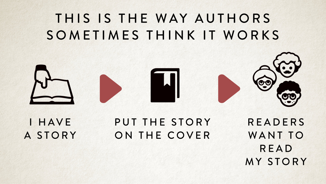
Over the last few years I’ve designed hundreds of commissions and something that pops up regularly is at the start of the process an author will tell me what they want on their book cover and about 50% of the time my honest response is:
I don’t get it.
Then that author will proceed to tell me all the completely convoluted reasoning for the idea they have for their cover. They will go into complex and lengthy intricate detail about how X is like Y and then Z happens. And A. And B. And C. And I just sit there somewhat dumbfounded because they’ve misinterpreted what I meant.
I can see the image in my head, they explained well enough but I don’t get it. It doesn’t grab me, I’m left feeling confused and cold.
And that’s exactly what any potential reader will feel too, because they’re coming at it cold, too. Just like me.
A book cover designer should be that first line of defence when it comes to stopping these confusion inducing ideas. It’s what I do.
I don’t blame authors for coming up with these dissociative concepts for a book cover. They’ve spent months working hard on their book, they’ve been subsumed by it, and their great story. They’re inside looking out.
But what they fail to recognise is the fact that potential readers haven’t read their story. Yet! In short, the author’s idea does match the story but it’s very much putting the cart before the horse. Yes, that book cover will match the story.
But if the story is going to stand any chance of being read it needs to connect to potential readers first and it does that through the book cover.

I get asked to do this back-to-front way of thinking a lot.
And my response is: let’s look at this properly. Let’s have a look at how we can make those connections.
Sometimes it’s my job to persuade them that they have a bad idea, because there is no connection. It connects with the story, but that doesn’t mean it will connect with potential readers. And what’s more important? Connecting with the story or potential readers? And a lot of the time authors need to understand that you forgo connecting with the story, to connect with readers. Suck them in. That’s what a book cover is for. Although a book cover can’t be some sort of bait-and-switch, it needs to reflect the story, the genre, the mood. But reader connection is the most important part.
How do we do that?
Well, in steps semiotics to save the day, by adding some connective tissue between the story and potential readers connecting with the book.
That’s how winners are made!

One Hundred People Were Surveyed
Semiotics is basically a fancy word for the connections people make with certain words, images and symbols. And these associations are super important, because it’s literally the only way we’re guaranteed to make some connection with potential readers.
But I hear you tell me: it’s all so subjective, people have different life experiences, everyone will have different associations with different concepts and imagery.
This is true. I agree. I won’t argue with that point. So we need to hedge our bets.
But how do we do that?
The best way to think about semiotics is to imagine that game show which in the US is called Family Feud and in the UK Family Fortunes. If you’ve seen neither, there’s loads of clips on YouTube.

But let me explain what it is.
It’s a game show where basically the questions always have the same sort of format. One hundred people were surveyed, top 6 answers on the board, name something you associate with X.
So as an example ‘100 people were surveyed, names the top 6 things people associate with witches’?
And then the families need to guess the answers to win.
So for our ‘witches’ questions the final board might break down something like this with the hundred people:
1 Witches Hat 33
2 Cauldrons 24
3 Black Cats 19
4 Spells 14
5 Broomsticks 6
6 Salem 4
That’s what the study of semiotics is, the understanding of the connections people make. How it breaks down across the board. The statistics of it.
And that’s how everyone needs to start thinking about their book covers. If you surveyed 100 people what would they think of your concepts? What connection they would make.
Making the Wrong Connection
A good way to explain this is probably to provide you with a bad example of how a semiotic connection can be a failure because it’s not been thought out properly.
A few months ago I had an author that had a book that was to do with a happy ending and they wanted a rainbow on the cover because there was maybe a rainbow in the story, I can’t remember. And I asked the author if it turned out that the main male character turned out to be gay and that was the happy ending and the author said ‘no’.
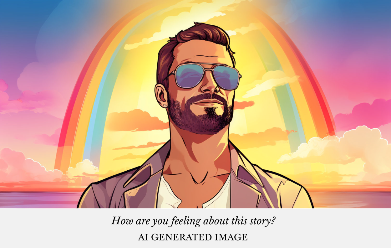
That was simply because as I came cold to the concept of a rainbow, I’m going to make my own connection. And I didn’t think that book was going to be about pots of gold, Noah’s ark, or any of the other things I’d associate with rainbows. I’d done the calculation in my head of romance + rainbow = maybe some sort of gay story.
It’s a blunt response, of course.
But that’s all we have to go on, when we send something out into the world. That connection people are going to make.
We could get into the neurological science of these cues we all have, but suffice it to say, brains are efficient machines, they make the quickest most efficient connections between concepts and the more we make those connections the stronger those concepts become stronger in our heads. It’s just how our noggins work! My word, I love these sort of nonfiction books. So I’ll shut up about it before I go on a real tangent.
Making the Obvious Connection
If you read my last essay about what makes a book cover intriguing then you’ll also realise that we can’t make things too obvious. You can’t just use the shortcut, i.e. your top answer, because people are not intrigued by that. It doesn’t offer enough fizz to your brain.
Imagine if every single romance cover just had a heart on it and was called ‘Falling in Love’ then Amazon would really be a dull place, or at least in the romance category.
I guess there is probably a good hunting or fishing analogy in here somewhere. If you’re trying to hook readers and you serve up the same bait all the time they probably get wise to that. You need to be a bit cleverer with your offering.
So there is a balancing act to be undertaken to make sure that your title and cover stand out somewhat, whilst still making good connections.
We have options.
Firstly, and thankfully, most author’s books aren’t just ‘they fall in love’, there will always be elements we can add to the cover to make it interesting, start making new connections with both things. And then we can balance the recipe of those connections to make them not too obtuse or too obvious.
Secondly, I’m a sucker for the third, or fourth, or fifth post popular answer on Family Feud style 100 people were surveyed-board.
And finally, if you’re designing your cover yourself, or you’re getting me to design that cover, the best thing to do is let go of that vision you had in your head, that scene from your book, or your whacky convoluted concept and start thinking in terms of how ‘out of 100 people surveyed, potential readers are connect to that image’.
It should look something like this:

Yep that’s right, not more than 2 or 3 concepts on there. Any more and the cover starts to get overly complex for the split second a potential reader will look at it. Seems simple right? Yeah, extracting the right ones and thinking how they’re going to work together is basically my job and half the fun of it cover design. It’s an art.
I’ve always tried to follow this way of thinking when designing my commissions or my pre-made covers, because what I understand without connection in the split second when I look at book covers, when browsing, I’m going to be left cold, confused and I move onto the next book.
No connection. No sale.
In Conclusion: My Advice to any Author
When you think about your ideas for a book cover I would sit down and play a little round of Family Feud / Family Fortune with each of the concepts you want on there.
Forget about your story, clear your mind and list the top five answers that people would associate with that image concept you have. If you’re coming up with a blank or if those associations have nothing to do with your story then you’re on the wrong track. You need to come up with a better book cover idea.
Because without thinking about how the wider world thinks and connects with concepts then you’re not going to sell as many books. No matter how wonderful your story is.
Thinking about it in this way is vital.
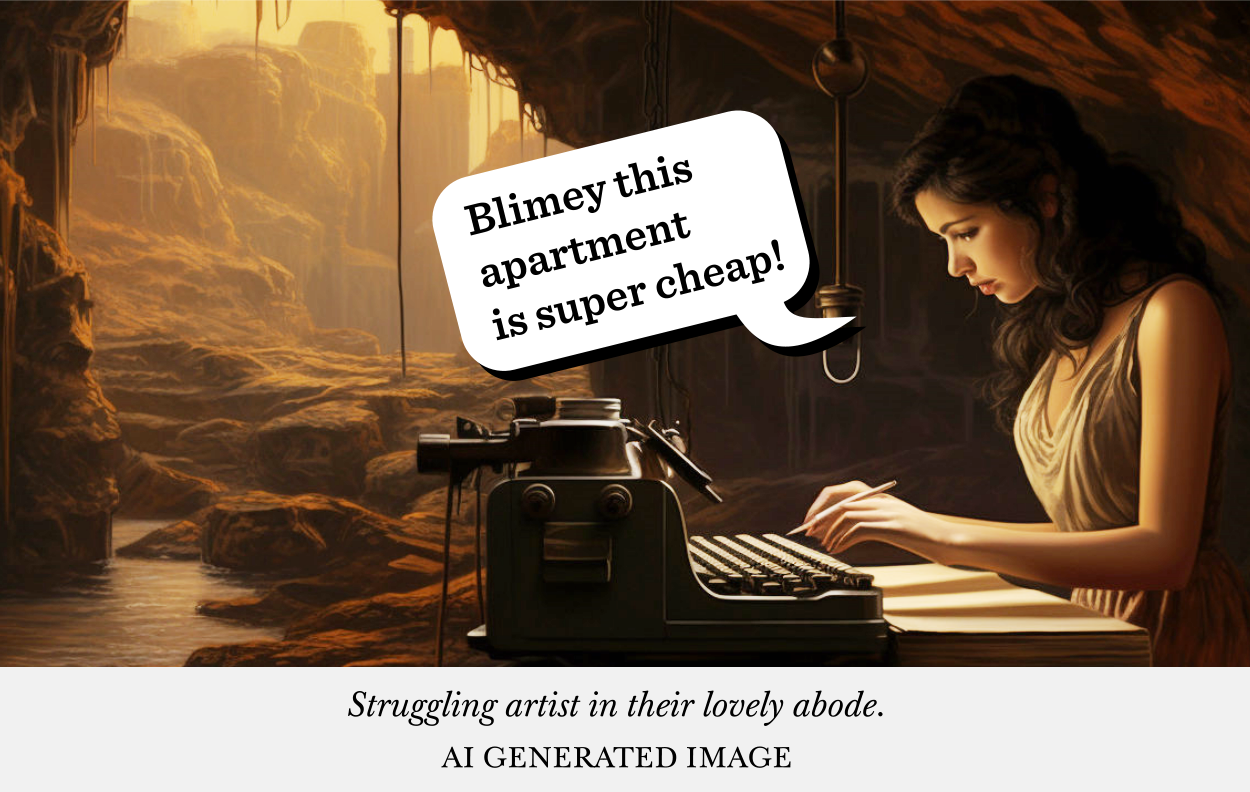
Book covers are the thing you do once you come out of your writing cave. Once you’ve left the story behind and you want other people to come into the world you’ve created. And you need to create the right signage outside of the place that is your story that potential readers connect with.
And that’s it. That’s what my job is. Working out those connections by talking with commissioning clients. It’s second nature to me.
But if you’re designing covers yourself, coming up with titles, it’s always smart to work out how those semiotic connections are going to play out.
And now you know how.
And that’s it. A short one today. That’s it from me.
And that person, well it’s …
James


Lisabet Sarai
/ August 20, 2023Lots of wisdom here, James.
And hilarious images.
Thanks for sharing your insights.